A ton of UI improvements landed this week. If you can’t find something to like in this post, I’ll eat my hat!
New Features
System Settings’ Firewall page now supports IP address strings with netmasks (Daniel Vrátil, Plasma 5.27. Link)
User Interface Improvements
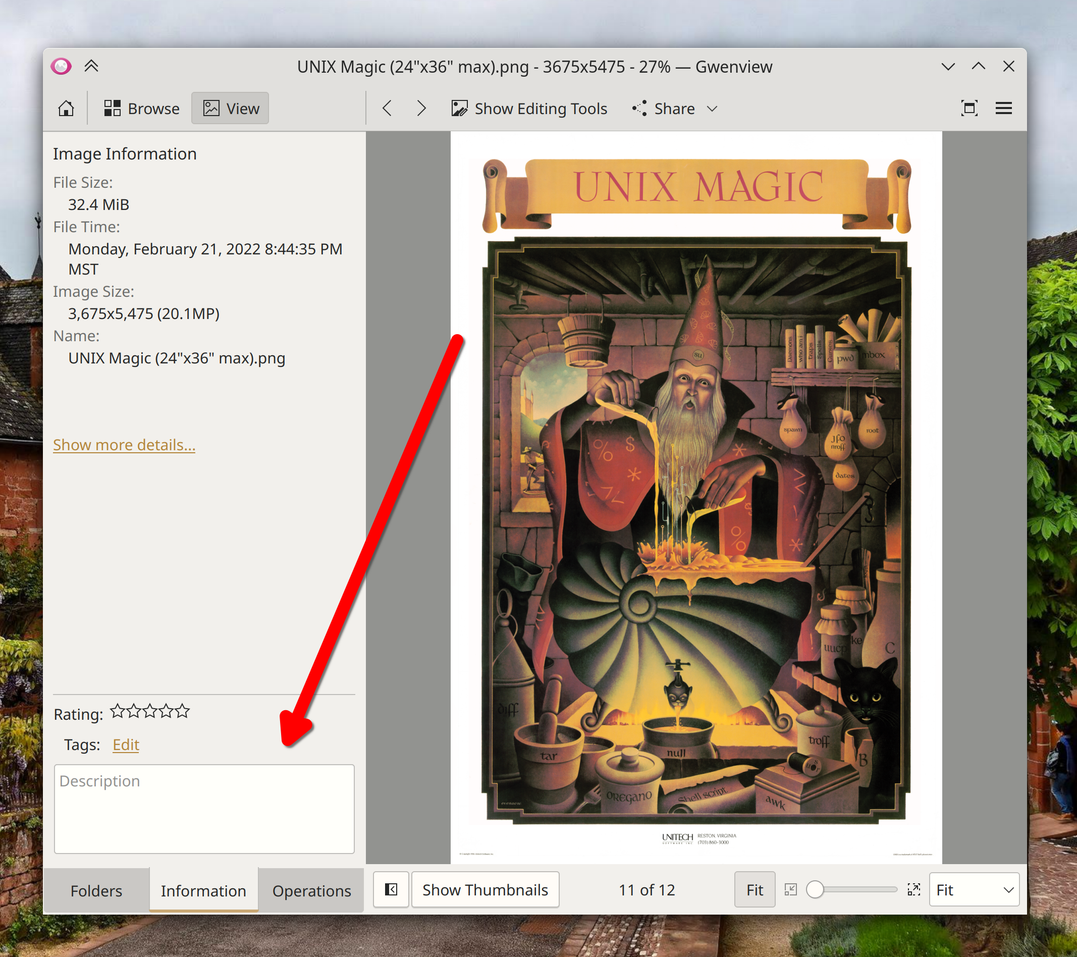
On the Information tab of Gwenview’s sidebar, you can now reduce the area taken up by the metadata and description section using a draggable splitter between it and the Image Information section that’s above it. The splitter remembers its position, too! (Corbin Schwimmbeck, Gwenview 22.12. Link)
Spectacle now remembers the last-chosen rectangular region area by default, even across app launches. This is configurable, of course (Bharadwaj Raju, Spectacle 22.12. Link)
Kate and KWrite’s welcome screen (which remains optional, and able to be permanently disabled using a checkbox right on the screen itself) now includes links to documentation (Eugene Popov, Kate and KWrite 22.12. Link):

In the Plasma Wayland session, opening Dolphin from the Disks & Devices popup now raises its existing window, if it was already open (Nicolas Fella, Dolphin 22.12 with Plasma 5.26.1. Link)
Dragging-and-dropping windows onto the Pager Widget now works a lot better, with less fiddliness (Niccolò Venerandi, Plasma 5.26.1. Link)
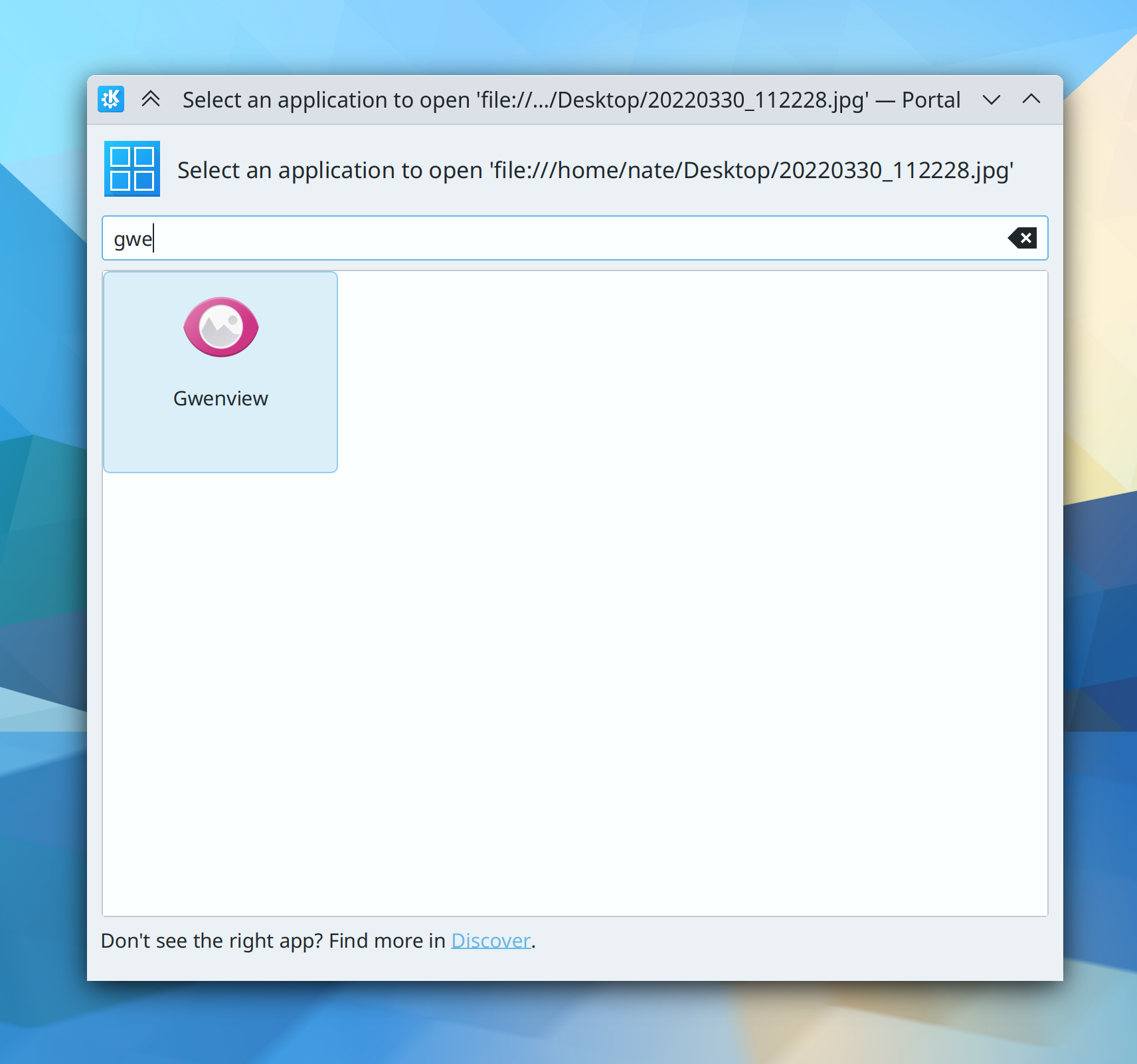
When using Plasma, the “Open file with app…” dialog now uses the XDG portal version for improved visual consistency and user-friendliness. The old dialog is still used when you invoke “Open this file in a different app” functionality from a KDE app that’s not being used in Plasma (Harald Sitter, Plasma 5.27. Link):
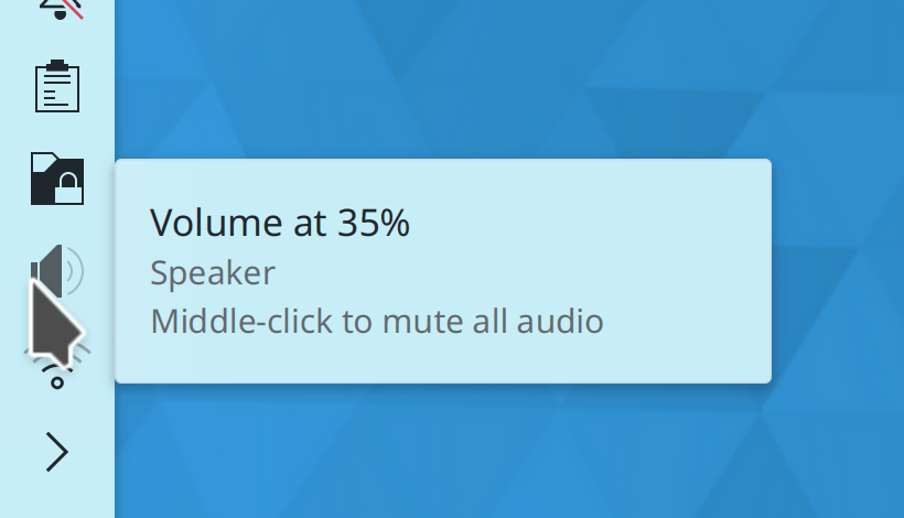
System Tray Widgets that can be middle-clicked to toggle something about them on or off now indicate as such in their tooltips (me: Nate Graham, Plasma 5.27. Link 1, link 2, and link 3):
In the Plasma Wayland session, Help Center is now able to raise its open window when activated by another app (Nicolas Fella, Help Center 5.27. Link)
The icon size popup in System Settings has gotten a UI overhaul to remove unused settings and make what it does do more comprehensible (me: Nate Graham, Plasma 5.27. Link):

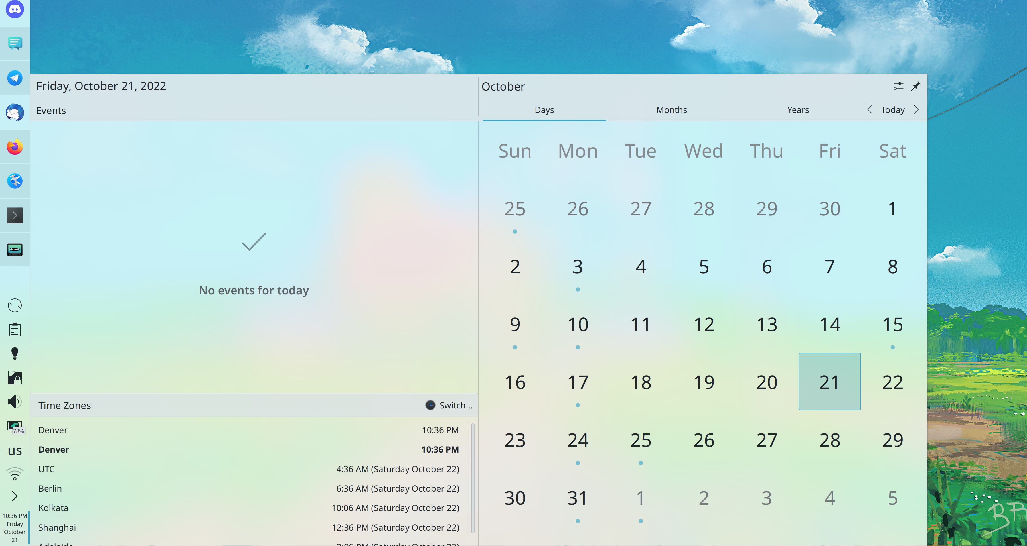
When you resize the Plasma calendar popup, text in the calendar itself now scales up and down appropriately (Fushan Wen, Plasma 5.27. Link):
The Overview, Present Windows, and Desktop Grid effects now try harder to pack windows efficiently, so hopefully you won’t see windows arranged like staircases anymore (Vlad Zahorodnii, Plasma 5.27. Link)
When viewing the page for a Flatpak app that has been marked as “end-of-life” by its developer, Discover now shows you the reason given by the developer (Aleix Pol Gonzalez, Plasma 5.27. Link)
Shadows behind the clock and date text on the login and lock screens are now a bit softer and prettier (Bharadwaj Raju, Plasma 5.27. Link):

The Lock Keys Widget now shows a different icon from the Keyboard Layout Widget, so can distinguish between them at a glance (Bharadwaj Raju, Plasma 5.27. Link):

In the Plasma Wayland session, the “Something is recording your screen” System Tray icon now uses a more correct “recording”-style icon (me: Nate Graham, Plasma 5.27. Link):

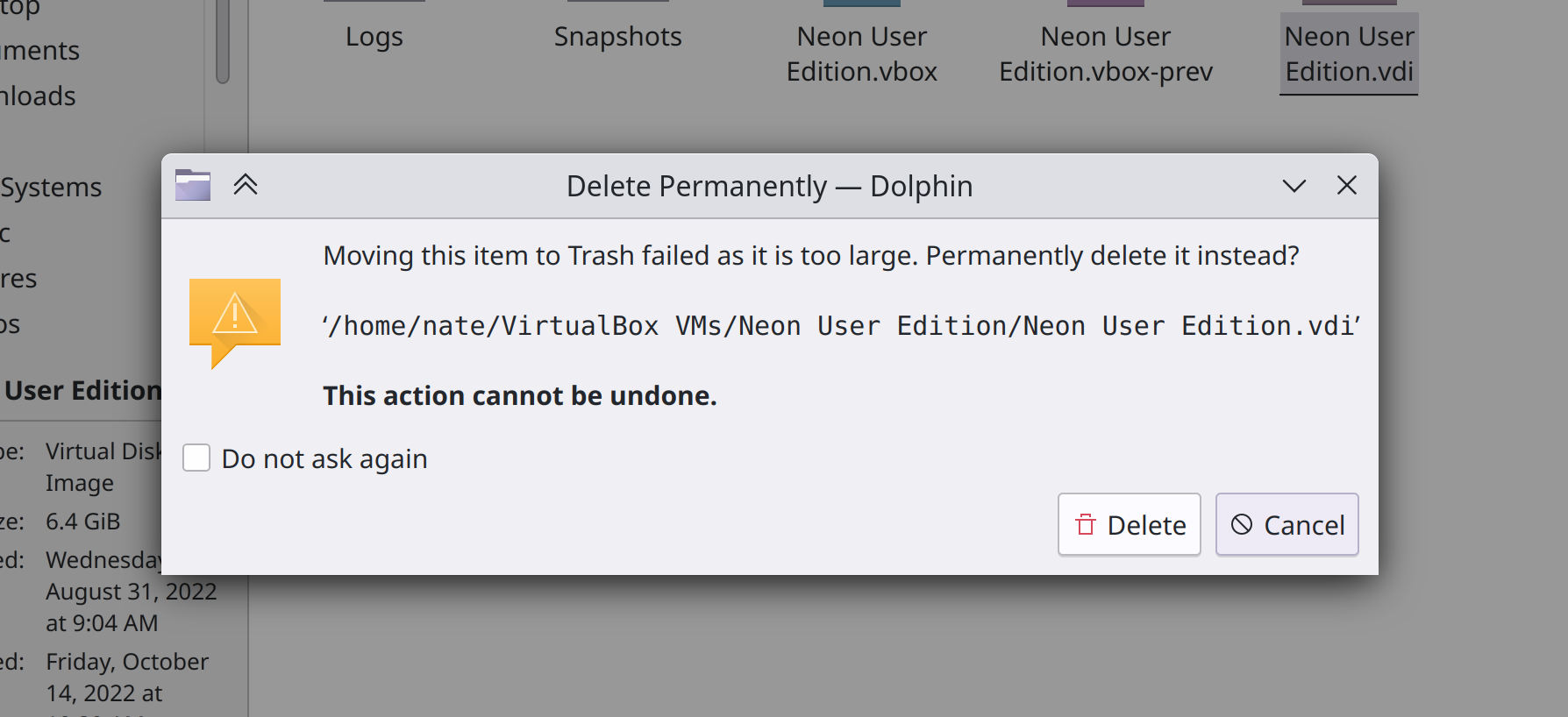
Trying to trash an item that’s bigger than the current trash size now gives you the option to delete it immediately if you want (Ahmad Samir, Dolphin 22.12 with Frameworks 5.100. Link):
Avatar images throughout KDE software are now sharper and better-looking when using a high DPI screen and screen scaling (Fushan Wen, Frameworks 5.100. Link)
Recent Documents lists throughout KDE software will now display appropriate icons for the recent files (Eric Armbruster, Frameworks 5.100. Link)
Significant Bugfixes
(This is a curated list of e.g. HI and VHI priority bugs, Wayland showstoppers, major regressions, etc.)
Fixed another cause of desktop widgets slightly moving around on login, which apparently has multiple causes (Aaron Rainbolt, Plasma 5.24.8. Link)
Fixed an issue that could cause input to not be detected when using the new mouse button rebinding feature (David Redondo, Plasma 5.26.2 with Frameworks 5.100. Link)
Plasma no longer constantly consumes high CPU resources when using an animated AVIF image as your wallpaper (Fushan Wen, Frameworks 5.100. Link)
Plasma no longer constantly consumes high CPU resources when disabling middle-click paste and copying certain content (David Edmundson, Frameworks 5.100. Link)
Other bug-related information of interest:
- 11 Very high priority Plasma bugs (up from 10 last week). Current list of bugs
- 55 15-minute Plasma bugs (up from 53 last week). Current list of bugs
- 144 KDE bugs of all kinds fixed this week. Full list of bugs
Automation & Systematization
This goal now has a Matrix room! Search for kde-institutional-memory:kde.org in your favorite Matrix client, or click here to access it in the web client.
The goal also has a team on https://invent.kde.org! You can join at https://invent.kde.org/groups/teams/automation/-/group_members. We’ll be using this for long-term task coordination via the task tracker at https://invent.kde.org/teams/automation/issues/-/issues.
There’s now a wiki page explaining how distros can package Plasma for the best user experience, full of accumulated knowledge over time (me: Nate Graham. Link)
On distros using gdb 12, the DrKonqi crash reporting wizard is now capable of dynamically symbolicating crash traces without debug symbols, which makes them actionable and reduces bug triaging work (Harald Sitter, Plasma 5.26.1. Link)
Added an autotest for the PNG metadata extractor (Kai Uwe Broulik, Frameworks 5.100. Link)
Added autotests for KWin’s DRM (Direct Rendering Manager) platform code (Xaver Hugl, Plasma 5.27. Link)
Changes not in KDE that affect KDE
RGB sub-pixel hinting for text is now enabled by default, which is good for users of KDE software since we respect the set of systemwide default settings rather than overriding it with our own value (Akira Tagoh, Fontconfig 2.14.1 Link)
…And everything else
This blog only covers the tip of the iceberg! If you’re hungry for more, check out https://planet.kde.org, where you can find more news from other KDE contributors.
How You Can Help
If you’re a developer, check out our 15-Minute Bug Initiative. Working on these issues makes a big difference quickly! Otherwise, have a look at https://community.kde.org/Get_Involved to discover ways to be part of a project that really matters. Each contributor makes a huge difference in KDE; you are not a number or a cog in a machine! You don’t have to already be a programmer, either. I wasn’t when I got started. Try it, you’ll like it! We don’t bite!
Finally, consider making a tax-deductible donation to the KDE e.V. foundation.


This is being nit-picky, but can the ” – Portal” be removed from the file picker titlebar? I’m guessing this ideally should be replaced with the application name, but at the very least ” – Portal” should be removed if not. Users should not need to care about “Portal”
Likewise when installing apps, etc, with Discover the prompt dialog has ” – PolicyKit1 KDE Agent”. Whilst I know what that it is, it does not seem very user friendly. Again this should be replaced with “Authentication Required – Discover”, or just “Authentication Required” (The dialog could also do with being wider when initially shown).
LikeLiked by 1 person
Sure, those are easily changed. We should probably stop showing the same text in the dialog’s titlebar and next to the icon too.
LikeLiked by 1 person
Really good points, I’ve often thought that too.
LikeLike
This kwrite welcome screen look amazing
Good work 👍🏼
LikeLiked by 1 person
There was some discussion in your discussion forums about the purpose of primary screen, let me throw in a curveball: Broken laptop screen. Many people use busted laptops connected to an external monitor. I have one where the screen is completely removed and the i5 processor laptop is connected to my 4k TV and is used as a media computer controlled with a portable keyboard with a touchpad, a WiFi USB dongle handles the interweb part. I had numerous issues with several linux distros because of that, many don’t understand what’s going on and there’s no rightclick menu to set the resolution to see any panel/desktop icons to even begin to install the damn thing.. Hate to admit it but Windows 11 is running flawlessly on that machine. That’s also one computer I don’t want to tinker with at all, it plays video and music, that’s it. In a perfect world it’s a prime candidate for a tiny linux distro but that’s not happening at this point in time.
LikeLike
Let’s play safe!
In case you need it, that’s how it’s done:
Ah ah ah ah.
Now, jokes aside! Another week, another great work done. KDE is the best!
LikeLiked by 1 person
> Trying to trash an item that’s bigger than the current trash size now gives you the option to delete it immediately if you want
This is great, however I think the dialog from the screenshot can be improved. If one doesn’t properly read the text and only looks at the action buttons, then it seems that “Delete” will still place the item in the trash, as the icon depicts a trash icon. I know there is a difference between a red and a black trash can icon, but that is quite subtle … Maybe the text on the button can be replaced by “Delete Permanently”?
LikeLiked by 1 person
I like this idea too.
Also, want to add that stuff that STAYS PUT after I move or adjust it is always a GOOD THING!
(I thought there was a Remember Window Positions setting somewhere, but maybe I’m lost.)
LikeLike
Lucky you, looks like Guilherme already submitted a merge request to change this!
https://invent.kde.org/frameworks/kio/-/merge_requests/1009
LikeLike
Yes, there’s some great UI work this week, I’m really thrilled about Gwenview having a splitter on the left panel sections, that is what I have been wishing for for a long while now. But great work all around, devs!
I’m also glad that this blog post gave me the opportunity to describe something that felt awkward to do so before. In two images that you posted, it demonstrates two differing ways that a file is represented textually:
https://pointieststick.files.wordpress.com/2022/10/image-5.png?w=658&h=616
https://pointieststick.files.wordpress.com/2022/10/image-8.png?w=751&h=344
I know it’s a small thing, but it has bugged me that one file path representation is very technical with the file:/// prefix, and another simply shows the full local file path without the transport. It’s also in a different font, making it stand out–nice.
I am wondering if it’s reasonable to ask that these representations be harmonized as a VDG convention? And if I’m going to go out on a limb, ask to only include the transport prefix if the file is not local (not file://) ? My reasoning is why make it so complicated for people to read? And one step further: if the file is within $HOME, why not just omit the $HOME part of the path? Keep it simple.
And plus, there are times where the $HOME part of a path makes the path just that much longer that it’s hard to see the part that’s actually relevant: the file name. I can already think of where this plays out in Okular’s bookmarks section.
Anyway, this post made me very happy to read this week 🙂
LikeLiked by 1 person
I had a lot of the same thoughts, actually.
In fact, I noticed this when I was taking the screenshot and went to go change it beforehand to make the screenshot nicer!
In the case of the portal dialog, I ran into a technical challenge: the text in the window is repeated in the titlebar. This means that I can’t use the special formatting since it will cause HTML entities to appear in the titlebar.
The obvious solution that came to mind was to not repeat the text in the title, and make the titlebar say something like “Choose an application”. This would remove redundancy and also let us use the special formatting. But that would require a bit of code refactoring, and I didn’t have time to do it on the night of the blog post, so it had to wait. 🙂
And in addition, yes, we should probably just show the filename, not the entire path. The user doesn’t care where it lives, they care about what it is!
LikeLiked by 1 person
Ah, you’re already on it, great! 🙂
LikeLike
Yep, submitted the merge requests this morning:
https://invent.kde.org/plasma/plasma-workspace/-/merge_requests/2255
https://invent.kde.org/plasma/xdg-desktop-portal-kde/-/merge_requests/132
https://invent.kde.org/frameworks/kio/-/merge_requests/1010
LikeLike
Love it! I just looked through all of the links and saw the improvements, much, much nicer!
LikeLike
Why is there no close button on the XDG portal dialog? I ran into the situation before where there where no app shown in the dialog or when I accidentally triggered the “open with” dialog. I had to kill the dialog in these cases…
thanks for all your work!
LikeLike
Seems like a bug specific to X11, as I don’t see it on Wayland. I’ll investigate.
LikeLike
https://invent.kde.org/plasma/plasma-workspace/-/merge_requests/2256
LikeLike
thanks!!
LikeLike