As we near the end of Plasma 5, a lot of people are putting thought into what’s next for Plasma 6, beyond simply porting it to Qt 6. The general consensus is to avoid big architectural changes, with most of the major changes being UI improvements and new features. So KDE’s VDG team has been busy planning for that future, which has yielded a lot of improvements for the last and best version of Plasma 5!
New Features
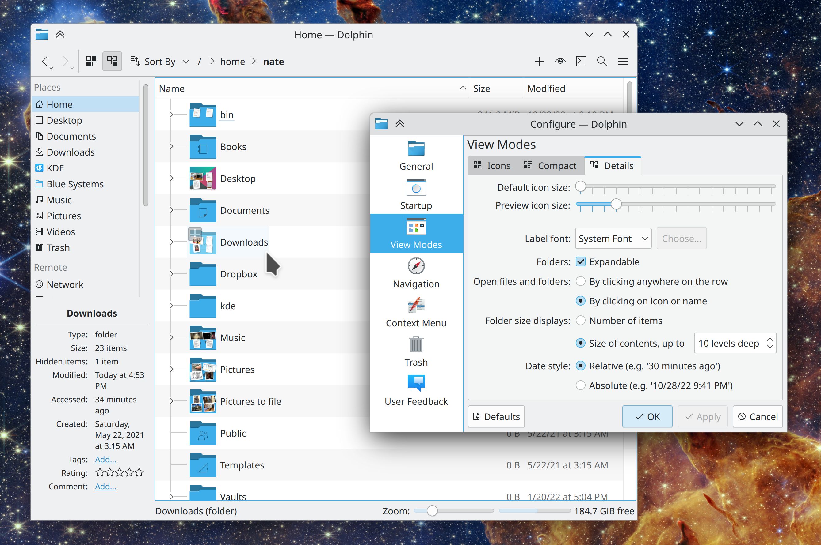
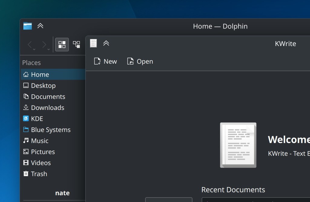
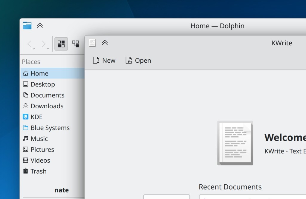
If you really don’t like Dolphin’s recently-changed list view behavior of selecting or opening an item when clicking empty areas of its row, you can now go back to the old way (Felix Ernst, Dolphin 22.12. Link):
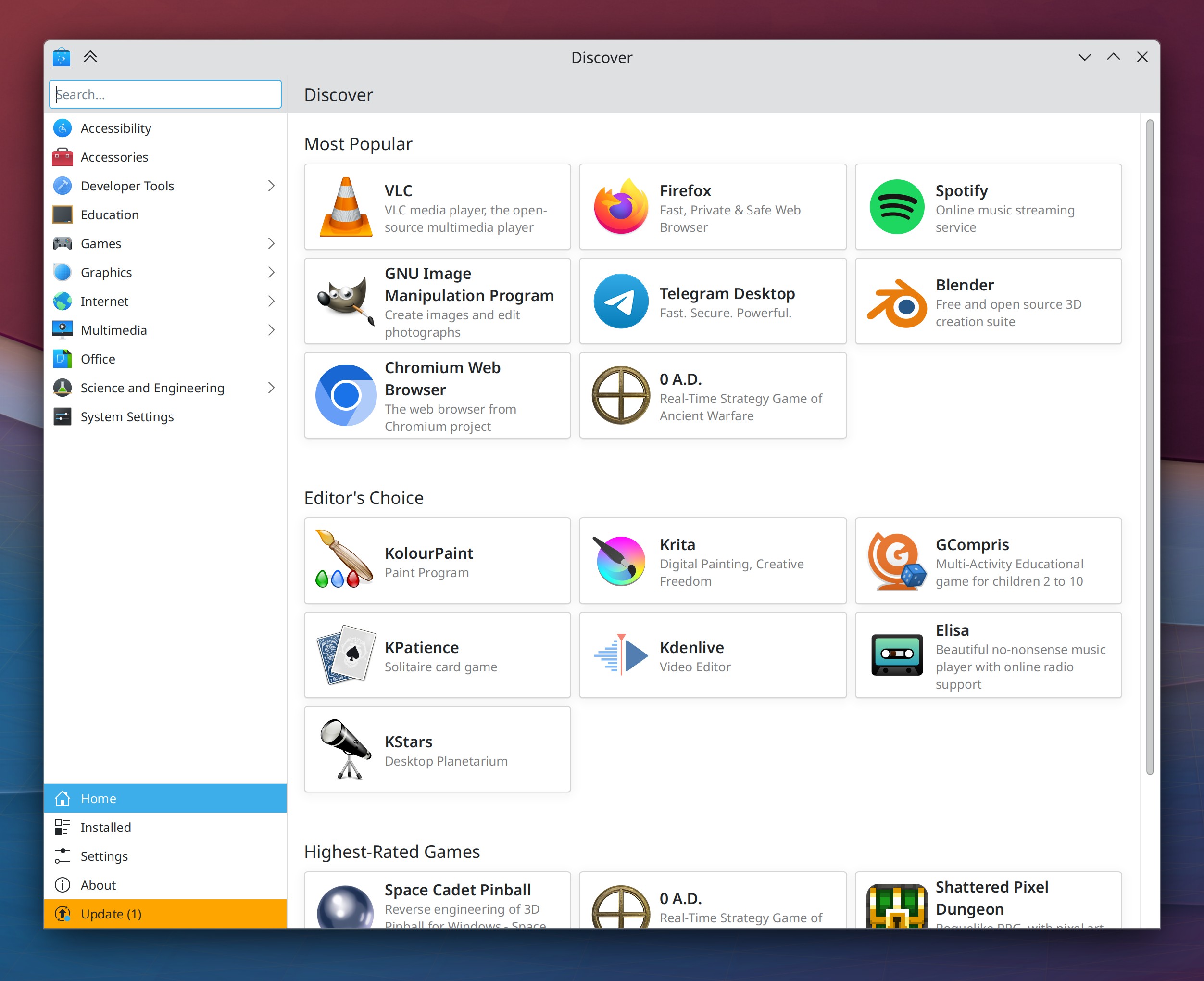
Discover now has a brand-new homepage design with dynamically-updating categories that shows popular apps, and a new set of featured apps that showcase the best of KDE (Aleix Pol Gonzalez, Carl Schwan, me: Nate Graham, and Devin Lin, Plasma 5.27 . Link 1, link 2, link 3, and link 4):
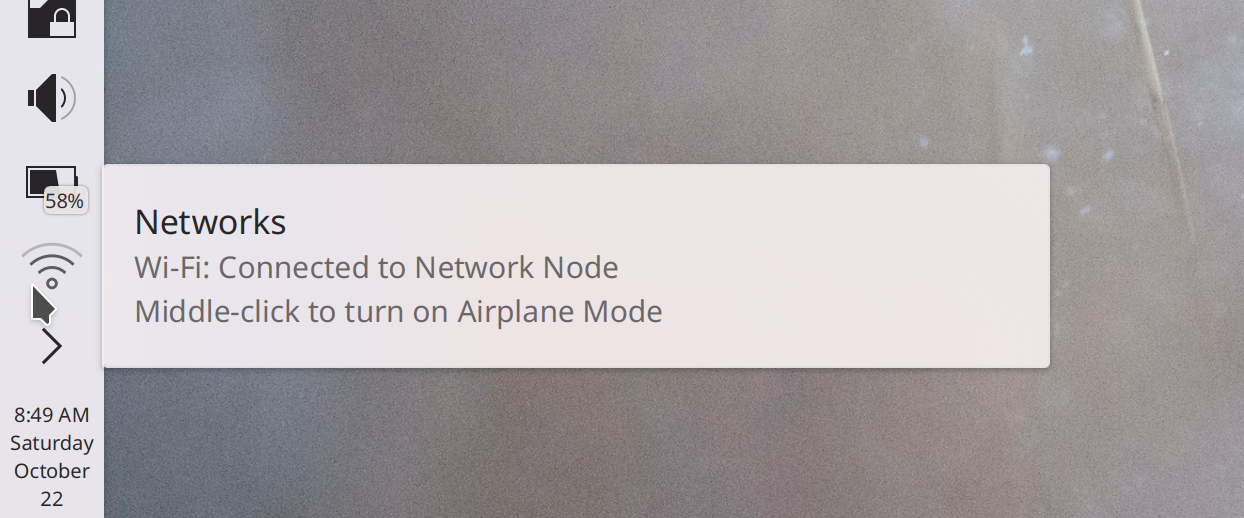
You can now middle-click the Networks icon to toggle Airplane Mode on and off (me: Nate Graham, Plasma 5.27. Link):
“Running” (i.e. clicking on or pressing the return key for) dictionary definition entries in KRunner’s results list now copies the definition text to the clipboard, and even sends a system notification about this so you know that it happened (Alexander Lohnau, Plasma 5.27. Link)
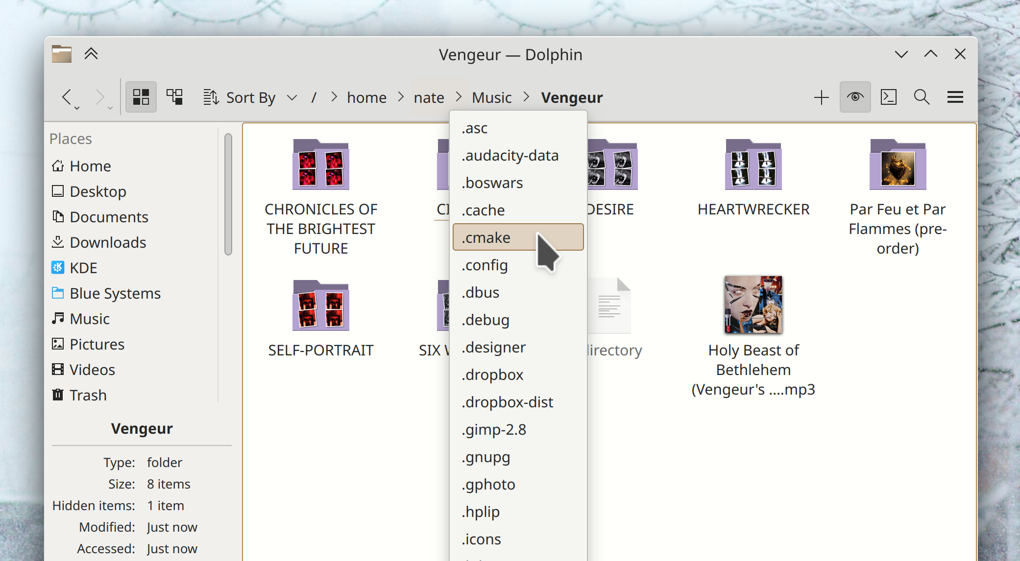
In the dropdown menus for Dolphin’s path navigator bar, now hidden folders will show up there if you currently have hidden files visible (Eugene Popov, Frameworks 5.100. Link):
User Interface Improvements
On Info Center pages that consist of monospaced text, the text is now selectable (and hence copyable) and no longer slightly overflows on the right side (Ivan Tkachenko, Plasma 5.26.2. Link)
In the Plasma X11 session, portalized dialogs shown by Flatpak apps no longer use the wrong theming and colors (Harald Sitter, Plasma 5.26.2. Link)
Breeze-themed windows now have a subtle outline around them, which not only looks classy as hell, but it also helps keep dark-themed windows from blending into one another (Akseli Lahtinen. Plasma 5.27. Link):
Floating Panels now de-float whenever any window touches them, and the margins they gain when doing so are now smaller and less weird-looking. This also makes Panel Widget popups touch the edge of a floating Panel (Niccolò Venerandi, Plasma 5.27. Link 1 and link 2)
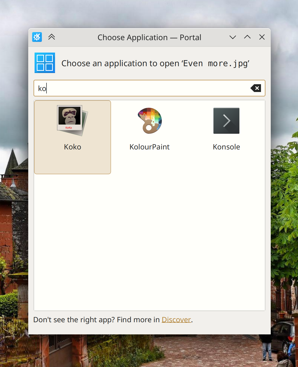
The new portalized Kirigami-based app chooser dialog now has more focused and relevant text in the header area (me: Nate Graham, Plasma 5.27. Link 1 and link 2)
You can now search in KRunner for “Save Session” to invoke the manual session saving functionality, and when you use KRunner to switch sessions, the message dialog it shows you is now worded more comprehensibly and doesn’t make what you’re about to do seem scary (Natalie Clarius, Plasma 5.27. Link 1 and link 2)
KRunner’s “Recent Files” plugin now matches substrings (Natalie Clarius, Plasma 5.27. Link)
You can now resize Kickoff’s popup to be smaller than it is by default, if you want that (Niccolò Venerandi, Plasma 5.27. Link)
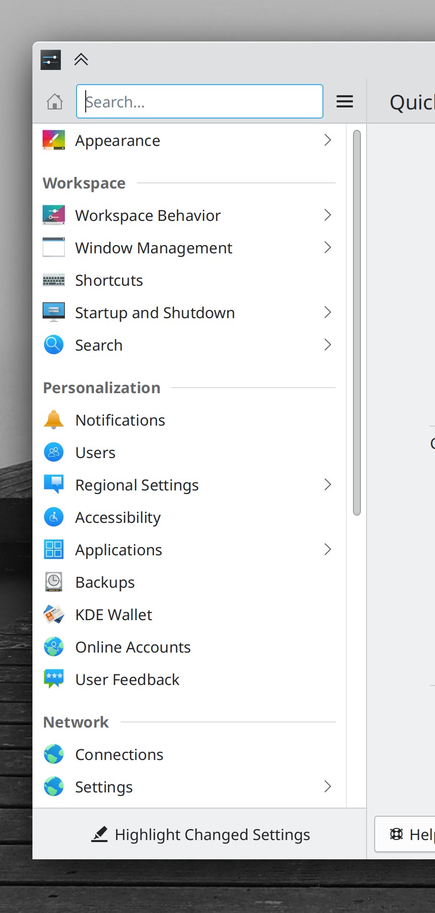
Title text in QtWidgets-based System Settings pages now has the same padding and alignment as those in Kirigami-based pages, so there’s no longer a weird jarring difference between them as you switch pages (Ismael Asensio, Plasma 5.27. Link 1 and link 2)
Throughout KDE software, the appearance of list views and list section headers is massively improved (Devin Lin, Frameworks 5.100. Link 1 and link 2):
Panel Widgets’ popups are now displayed centered on their Panel when they could be displayed as such without becoming disconnected from their Panel icons (Niccolò Venerandi, Frameworks 5.100. Link)
In dialogs where you can permanently delete files, the buttons to do so now say “Delete Permanently” so you can be absolutely sure of what you’re getting yourself into (Guilherme Marçal Silva, Frameworks 5.100. Link)
Significant Bugfixes
(This is a curated list of e.g. HI and VHI priority bugs, Wayland showstoppers, major regressions, etc.)
In the Plasma Wayland session, the “Flat” acceleration profile now works properly (John Brooks, Plasma 5.26.2. Link)
In the Plasma Wayland session, tapping the address bar in Firefox with a touchscreen now always makes the virtual keyboard appear as expected, without you having to focus another app and go back to Firefox first (Xaver Hugl and Xuetian Weng, Plasma 5.26.2. Link)
Fixed one of the most common Plasma crashes when using Plasma Vaults (David Edmundson, Plasma 5.26.3. Link)
Fixed a recently-introduced glitch that could cause it to become difficult to click the top-right-most screen pixel to trigger the close button of a maximized window (Arjen Hiemstra, Plasma 5.26.3. Link)
Fixed a recent regression in the X11 session that would cause maximized windows to not redraw properly when using scaling (Xaver Hugl, Plasma 5.26.3. Link)
In the Plasma Wayland session, clicking and dragging something in Firefox no longer causes the cursor to get stuck in its “grabby hand” state until you drag a tab (Vlad Zahorodnii, Plasma 5.26.3. Link)
Other bug-related information of interest:
- 11 Very high priority Plasma bugs (same as last week). Current list of bugs
- 56 15-minute Plasma bugs (up from 55 last week). Current list of bugs
- 144 KDE bugs of all kinds fixed this week. Full list of bugs
Automation & Systematization
Added a test case for Chromium web app icon display in the Task Manager, so it won’t break or regress again (Nicolas Fella, Plasma 5.27. Link)
Added a test case for panel/containment/screen mappings in Plasma, so we can start to weed out the issues in it without regressing things so often (Marco Martin, Plasma 5.27. Link)
We have a new wiki page that outlines some of the ways people can make a living working on KDE projects (me: Nate Graham. Link)
…And everything else
This blog only covers the tip of the iceberg! If you’re hungry for more, check out https://planet.kde.org, where you can find more news from other KDE contributors.
How You Can Help
If you’re a developer, check out our 15-Minute Bug Initiative. Working on these issues makes a big difference quickly! Otherwise, have a look at https://community.kde.org/Get_Involved to discover ways to be part of a project that really matters. Each contributor makes a huge difference in KDE; you are not a number or a cog in a machine! You don’t have to already be a programmer, either. I wasn’t when I got started. Try it, you’ll like it! We don’t bite!
Finally, consider making a tax-deductible donation to the KDE e.V. foundation.

When I tried to revamp Discover’s homepage I didn’t get much help, glad to see it finally happened!
LikeLiked by 1 person
Re: Qt6, Plasma6…
UI improvements and features are of course awesome. Can users also expect that bug-prone areas, and inconsistently- used areas of the design architecture would also be addressed, in accordance with sustainment of KDE goals?
LikeLike
As much as you generally see this, yeah. Plasma 6 is also just going to be a big normal Plasma release, in addition to being ported to Qt 6.
LikeLike
Please add filter and light adjustment
On Gwenview app
LikeLike
Lucky you: https://invent.kde.org/graphics/gwenview/-/merge_requests/160
LikeLike
18 years for adding a features , what a slow development https://bugs.kde.org/show_bug.cgi?id=82979
LikeLike
Feel free to contribute your time or money the next time the thing we provide you for free aren’t improving fast enough for your preferences. Otherwise I’m afraid you’ll just have to learn how to be more patient and grateful. Life is a lot more enjoyable when you can appreciate what you have and other people’s work on your behalf.
LikeLiked by 1 person
> Plasma 6 is also just going to be a big normal Plasma release
As a user since KDE 1.0 days… (whether it’s 5.x or 6.x) any “normal Plasma release” is still an extraordinary thing!
LikeLiked by 1 person
Regarding the outline of windows: Thank you, Akseli! I tried switching to Breeze Dark three times but always went back to Breeze Light. Dark windows having next to no discernible outline made overlapping windows look like slabs of dark bleeding into each other. I regularly asked myself: “Where does one window end and where does the other begin?”. I will give Breeze Dark another try thanks to this. 🙂
LikeLiked by 1 person
Even worse when it’s slabs of white bleeding into each other! 🙂
Yes, as one who uses Breeze Dark, I like this very much. Until they removed all the customization capacity, Windows could set a narrow color band around the active window, and I can attest that it is a very useful feature, in both dark and light themes.
LikeLike
Windows 11 can still do that.
LikeLike
Breeze Light was OK in that regard, because shadows on light colored windows are easily visible anyway, but dark shadows on dark-colored windows are barely visible, that’s why this new way to distinguish borders of windows is very welcome indeed.
LikeLike
I noticed yesterday evening that “everything is black without any structural hint” was partly the fault of my screen’s low brightness. I increased the brightness from 65 to 90 and I’m looking forward to testing this combined with Akseli’s fix even more now.
I also very welcome Devin’s change of the appearance of section headers in lists. It is a smallish change, but optically goes a long way in making Plasma more sleek and looking.
LikeLiked by 1 person
No problem at all, glad you like it 🙂
LikeLiked by 2 people
That’s why I’m using bright color for shadow with dark themes. It’s more like glow then.
LikeLike
Congrats Nate!
LikeLiked by 1 person
> Panel Widgets’ popups are now displayed centered on their Panel when they could be displayed as such without becoming disconnected from their Panel icons
How does this look like for a “normal” panel without centered applets? I haven’t tried it, but it feels like it may not make sense in all cases or does it? Could you share screenshots or recordings please?
LikeLike
There are some screenshots on the MR (linked above): https://invent.kde.org/frameworks/plasma-framework/-/merge_requests/624
LikeLike
Only the first screenshot in the MR reflects the final state. All others belong to “this needs to be fixed”.
LikeLike
I would like to see a new design in Kde Plasma 6, namely rounding and transparency, a modern design style.
LikeLike
I think such are fine as optional styles, but personally they annoy me… rounded styles look pretty but they often don’t quite work, for a host of reasons. And transparency gives me eyestrain. So I would not like to be stuck with that as the only option. (As it is, you can already have transparent elements if you wish.)
LikeLike
Hi Nate, might I suggst adding (if not already) a newly update section to Discover? That bubbles up old software that have been recently update to a new verison which gives new eyeballs a chance to look at.
LikeLike
It’s a good idea but unfortunately it would only work for either rolling release distros, or those that ship with Flathub or the Snap Store out of the box. The reason being that discrete release distros hold back feature updates according to their normal release schedule, so for these distros, the “recently updated” section on Discover would be static most of the time, and then show *everything* after an update. It wouldn’t be very useful.
We could perhaps do it if we detect that you have any Flatpak or Snap repos added, or if you’re using a rolling release distro.
LikeLike
That makes a lot of sense, thanks.
LikeLiked by 1 person
Hey, Nate! Is there a way to “ctrl+alt+scroll” shortcut do not change workspaces on wayland? It overlaps my daw shortcut that runs on xwayland
LikeLike
That’s extremely strange. I have no idea what system component is providing this functionality. It doesn’t even seme to work properly for me. I would recommend filing a bug report.
LikeLike
That’s not a default compositor shortcut? Yes, I’ll do it for sure.
By the way, it doesn’t happen on X11 session.
LikeLike
I really hope that for the upcoming Plasma 6, stability and usability is prioritized over fancy features that will likely only break things. Plasma is currently a very mature computer UI in my opinion, and polishing things up and de-cluttering things would be the main things I’d ask for.
I also liked the idea of middle-click for system tray controls a lot. Clever and super useful!
LikeLiked by 1 person
Thanks for all the great work being done in kde.
Is there any plans for merging the UI changes for dolphin done in the below merge request.
https://invent.kde.org/system/dolphin/-/merge_requests/253
LikeLike
Ouh, yes, please! Less frames, less lines! =)
LikeLike
Once it’s ready, absolutely.
The author disappeared, so at this point we need someone else to take over the work and drive it to a merge-able state.
LikeLike
> The author disappeared
Isn’t the original author back but with a new account?
LikeLike
Yes. The situation is currently complicated.
LikeLike
When will we get new folder icons? I mean there were talks and even screenshots/mockups of some really nice ones being worked on quite some time ago. Could change color too, they said. Those blue sharp corner ones have been there forever, they can retire now.
LikeLike
Once it’s ready, absolutely.
The author disappeared, so at this point we need someone else to take over the work and drive it to a merge-able state.
LikeLike
Hi Nate,
I’m trying to read this comment section on my Android phone (screen size: 6.5 inches, resolution 1080 x 2400 pixels, 20:9 ratio (~407 ppi density)). After a few nested replies, the children comments become just one long column with one character per line.
Can you please have a look at it?
Thanks!
LikeLike
I’ve reduced the maximum nesting level to 2, down from 5. Hopefully that should help.
LikeLike
Something funky going on with your site Nate? The fifth picture from the top is shaking, actually shaking, and the fan in my laptop is going crazy.
LikeLike
It’s a slideshow, not a static image. Dunno what might be up with it; it works for me. This is all bog-standard WordPress stuff.
LikeLike
“You can now search in KRunner for “Save Session” to invoke the manual session saving functionality”
Well, if it is considered an improvement to offer an additional way to use the manual session saving feature, it might be a good idea to make it work reliably, too: https://bugs.kde.org/show_bug.cgi?id=450756 😉
LikeLike
Not sure how I feel about the new list view design. Will it be good for accessibility reasons? Or have I merely gotten way too used to the list dividers…
LikeLike