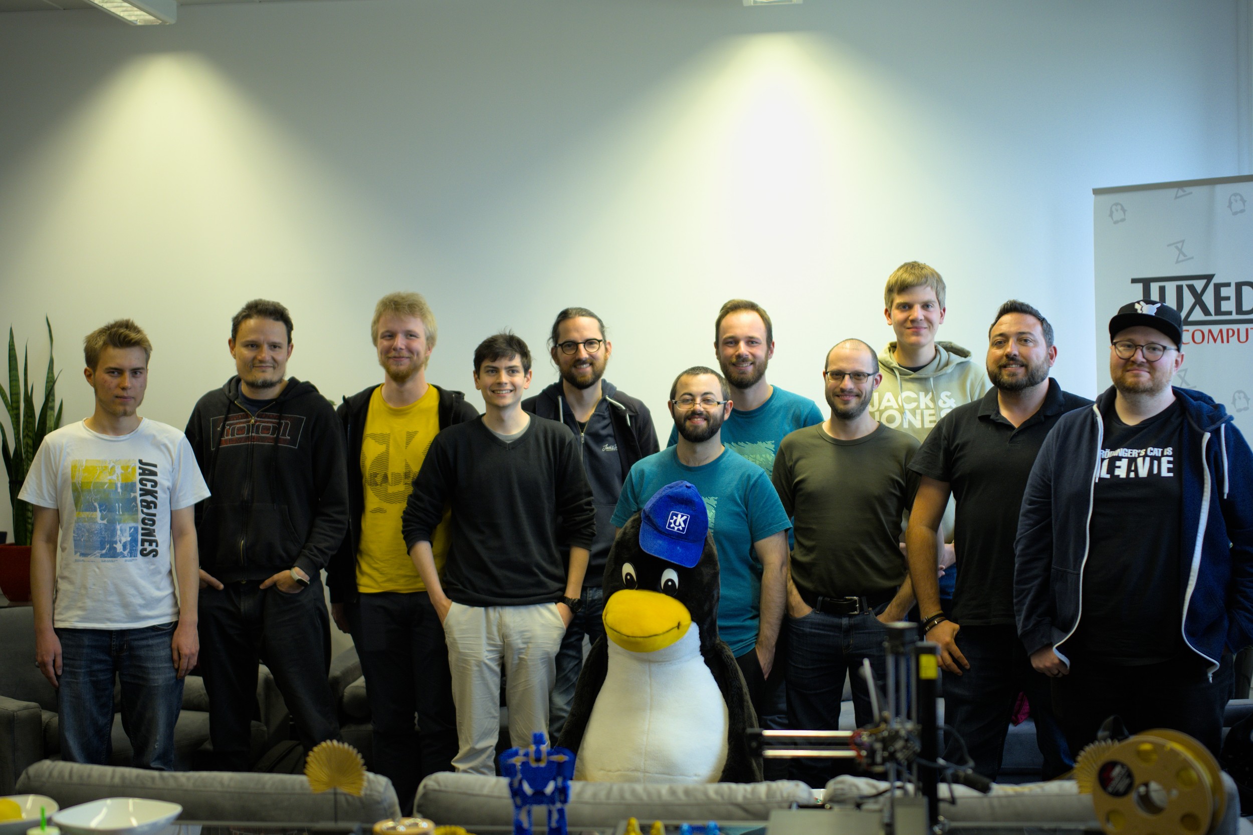
The 2023 Plasma sprint is now finished! KDE Patron Tuxedo Computers were kind enough to open their offices to us for a full week to do the sprint. We had some great conversations with Tuxedo employees, who were very friendly and excited to work with us, and made us thoroughly aware of just how much more complicated modern keyboard backlighting is than we had imagined! I’d like to thank KDE’s Software Platform Engineer Nicolas Fella for organizing this sprint, and Tuxedo Computers for providing the space and free pizza for lunch yesterday. 🙂
This won’t be a retrospective of the entire sprint, because I don’t want to steal anyone else’s thunder! People will be blogging and making videos about their own personal work and experience, so this one will be about mine.
The first thing was to get a Plasma 6 session working for daily driving. My colleagues have been working unbelievably hard on this, and I’m happy to report that I was able to live on Plasma 6 for the entire sprint without major showstoppers (from the perspective of a technical developer, of course). Almost everyone else there was as well, and I expect this to lead to extremely rapid stabilization despite the heavy code refactoring underway. I plan to continue living on Plasma 6 until its eventual release, and I encourage any adventurous developers to do so as well. If you try it out and submit any bug reports, make sure to add the “qt6” keyword to it.
I also did a bunch of technical work of my own, but I largely found myself in the role of facilitator, hosting discussions and meetings with different groups of people to bridge gaps.

New Default settings
As a result, we advanced a number of topics that had been stuck for a while. A major area of my focus in this respect became “Better default settings”. The 5 -> 6 transition is the perfect time to make significant changes to the default settings in a way that improve the UX out of the box. Among these are:
Double-click by default
Wait, did I just bury the lede!? I did indeed. This is because the work hasn’t actually been done yet… but it has in fact been approved! That’s right, Plasma 6 will default to opening files and folders with a double-click, not a single-click. Even though almost everyone in the room for the discussion actually uses and prefers opening with single-click, we had to admit that it’s probably not the ideal default setting for people who are migrating from other platforms, which is most of them. They can still learn the benefits of single-click later. 🙂
Wayland by default
We’re going to make a very strong push for Wayland to be the default session type for Plasma 6. The X11 session will still be there of course, and distros will be free to override this and continue defaulting to X11 if they feel like it suits them better. But we want Wayland to be our official recommendation.
To get there, we went over our “Wayland showstoppers” wiki page with a fine-toothed comb to refine what we really consider a showstopper. We decided that a lot of them are really more like annoyances rather than showstoppers, because X11 has plenty of annoyances of a similar severity too! The true showstoppers are down to five, plus a couple of NVIDIA issues that need further investigation. Many of these issues are in progress with a clear path towards resolution, so I do expect us to be able to achieve the goal!
Floating Panel by default
This feature has been optional since its introduction a year ago. In that time it’s become quite popular, but its visual fanciness alone wasn’t enough to tip this proposal over the finish line. Rather, it’s the fact that Microsoft has blatantly copied us in Windows 11, and as a result, people are starting to see Plasma as a cheap clone of Windows again. We see this all the time in the VDG room when some rando comes by and starts telling us why our design isn’t as good as what Windows 11 has; they’ve implicitly made the comparison and found us wanting. It’s the wrong mindset!
Making the panel float by default provides an immediate visual differentiation from Windows 11 and we hope this will help jolt users’ brains out of “ew, it’s slightly different from Windows 11” mode and into “wow, this is new and cool and I wonder what’s in it” mode. There’s probably more that needs to be done for that, but I think this is a good start.

Accent-color-tinted header area by default
In the middle of the Plasma 5 lifecycle, we switched to the Breeze Light color scheme by default, and we changed its appearance to use a medium gray header area, sort of mimicking the visually pleasing CSD headerbar look without actually using CSD headerbars. This appearance change has generally been well-received by users, but it faced a persistent criticism: diminished ability to distinguish the active window at a glance.
It’s a legitimate problem, and we decided to fix it by lightly tinting the header area with your current accent color (or the current color scheme’s selection color, if you’re not using Accent colors). This will distinguish the active window with a small amount of color, making it pop more without being visually overwhelming. Something like this:
New default Task Switcher
For a while, we’ve had a goal of switching our current default “Breeze” Task Switcher to something that doesn’t vertically scroll with even a relatively small number of windows, which feedback had indicated was bad for usability. We also wanted to make our default task switcher better for people who navigate primarily by looking at app icons rather than thumbnails or text. With those design goals in mind, we decided to use the “Thumbnail Grid” Task Switcher by default and make some UI changes. Here’s what it looks like at this point in time:

As a part of this work, we also deleted a bunch of infrequently-used Task Switchers in the kdeplasma-addons Git repo that were simply worse versions of other ones. And finally, we made our Breeze Global Themes no longer have an opinion about what they want the Task Switcher to be, so if you use a non-default one, you can safely switch Global Themes without having it reset your Task Switcher all the time! That makes it less annoying to use the Dark and Light buttons on System Settings’ Quick Settings page to switch the system’s appearance between those two states.
This work is already merged and was done by me.
No more scrolling on desktop to switch virtual desktops by default
We got feedback over the years that scrolling on the desktop to switch virtual desktops was disorienting, especially because you could switch to a desktop that you couldn’t switch out of in the same way because the desktop was covered up. So we decided to turn this feature off by default. If you really like it, you’re still welcome to turn it back on, of course!
This work is already merged and was done by me.
Clicking in scrollbar track jumps scrollbar to that location
This change makes it easy to scroll straight to a specific location without having to drag the scrollbar, which is worse from the perspective of avoiding repetitive motion injuries. The old style is still available as an option to can switch back to.
This work is already merged and was done by me.
Other discussions and decisions
Many other discussions were also had besides just default settings. Here are a few:
City of Treuchtlingen’s use of KDE software
We found out that the nearby German city of Treuchtlingen has been using KDE software for over 20 years for their government IT purposes. Two representatives came out to the Tuxedo HQ to give us a presentation and we all talked about how to continue this going forward not only for us, but potentially for a lot of other German governments. The possibilities here are quite exciting.


A slower-paced release schedule
In the beginning of Plasma 5, the release schedule was very fast–four releases a year. As it stabilized, we went down to three, which we kept for the whole lifecycle of Plasma 5.
Over time we’ve gotten a lot of feedback from distros in particular who have told us that this represents a hardship. It’s also been my personal observation that we often don’t have enough time to polish a new Plasma version before it’s released.
Now, a fast release cycle makes sense for a product under heavy development that breaks a lot of things and needs to fix them quickly. However, at this point Plasma is mature and feature complete after 8 years of hard work. It can always be improved, of course, but it pretty much does everything a general user needs at this point in time. So a fast release schedule isn’t as useful as it once was.
For Plasma 6, we’re going to try a slower release schedule of two per year once we feel like it’s stabilized enough after its initial release. And we’re going to be reaching out to distros with twice-yearly release schedules themselves to see if we can find release dates that will allow all of them to ship the latest version of Plasma soon after it’s released rather than skipping it in favor of something older. Making use of these lengthened release periods, we’re also going to lengthen our Beta releases and update them on a weekly basis, so there’s more time to find and fix bugs. We’re hoping this should result in Plasma 6 having a high level of stability and reliability throughout its lifecycle.
A wallpaper page in System Settings
We agreed that the status quo isn’t ideal because people expect to find wallpaper settings in System Settings. So we started sketching out a wallpaper KCM that will let people change their wallpapers in a central location, including the ability to apply them to the lock and login screens. You’ll still be able to access the wallpaper changing UI from the current method in addition to the new KCM.
Consolidate Desktop plugins
Currently we have two default desktop plugin types: “Folder” (the default) and “Desktop”. “Desktop” is just “Folder” without support for desktop icons. This is a bit silly, and internally they’re 99% the same because its prior developer also thought it was a bit silly and implemented them with the same backend code. So for Plasma 6, we’re going to collapse the distinction in the UI and instead expose a “Show desktop icons” checkbox somewhere. This will make it even easier for people who don’t like desktop icons to hide them, avoid putting implementation details in front of the user, and de-clutter the wallpaper choosing view.
Keyboard backlighting is hard
Taking advantage of the fact that we were in Tuxedo’s offices, we took the opportunity to ask many Tuxedo employees about their and their customers’ biggest pain points with KDE software. Happily, there were actually few complaints. But something that came up a few times was how we handle keyboard backlighting. Currently our code assumes there will be one keyboard backlight that affects all keys, so it only affects the first one it finds. But many modern laptops have more than one backlight, with some even giving each key its own! Needless to say, the result of adjusting a single backlight on such a keyboard looks somewhat hilarious. So we plan to put some effort into improving this.
That’s not all
This blog post contains only a small sampling of what was done and talked about during the sprint. There are many, many other plans and in-progress projects for Plasma 6, but I’ll let others talk about their own projects elsewhere, so look for them on https://planet.kde.org! I’d say that Plasma 6 promises to be a very large and exciting release.
Help make it possible again
Thanks again to Tuxedo Computers for graciously opening their offices to us, and for Nicolas Fella for organizing the sprint!
In addition, funding for the sprint was covered by KDE e.V., the nonprofit backing KDE. As you can probably imagine, transporting and lodging 20 people for a week is expensive, and most e.V. funding comes from individual donations. So if you’d like to see more of this kind of thing, please consider making a donation today! Every little bit helps!

Some good decisions there. Is it safe to assume the floating panel can be changed back to a fixed position?
LikeLike
Would assume so. It seems like a poor default because of Fitt’s Law. Mouse users rely on “throwing” the cursor to the corner of the screen for it to be in a position to open an applications menu, for example. So at first glance this feels like a step backwards and misunderstanding of interface design. Utility is (should be) more important than appearance, particularly on something so frequently used.
LikeLike
@ St Jimmy
I hadn’t considered Fitt’s Law but you’re correct. I’m probably an edge case as I have a right hand vertical panel, plain black desktop and Breeze Dark theme on all my machines. With a floating panel all I see is icons jumping a few millimetres back and forth every time I resize windows.
The other changes are all good for me.
LikeLike
It feels like another thing thrown in for touch screen and mobile fans at the expense of the vast majority of users not in those categories, and particularly users with accessibility needs.
LikeLike
What would be good is if there was a specific testing group to identify these sorts of issues early on before publicity, rather than affected users or those who support them only finding out later and essentially fighting a constant battle against breakage that isn’t intentional on the part of developers but puts appearance or mobile input first. It’s the same sort of thing with burger menus and with menus and toolbars that change contextually. A lot of users need or benefit from visual discovery and from consistency.
LikeLike
Fitt’s Law is preserved: clicks at screen edges and corners are redirected to the panel.
LikeLiked by 1 person
Indeed, Fitts’ Law is preserved. And yes, you (or distros) will be able to go back to a non-floating panel. The big margins around a de-floated panel are about to go away too; there are patches that I reviewed just yesterday which change this in a way that’s much nicer.
LikeLiked by 1 person
What advantages does the floating panel bring?
LikeLike
Good to hear. So if the panel is floated and shown in the upper part of the screen and if someone had the setup of their app menu widget on the left or right hand side, clicking the top left or right corner respectively would be treated as triggering it? And “throwing” the pointer to the top screen edge above a panel task manager button for an application window and clicking would be treated as triggering that application’s button to minimise/show it?
It sounds like the float is sort of equivalent to a transparent border in this scenario?
LikeLike
Latte had a nice feature with floating panel that it remained the same size but moved to the screen edge when a window is maximised. Currently the floating plasma panel just fills the gap…
LikeLike
@Alex “What advantages does the floating panel bring?”
— It no longer looks like Win11 but like the leaked screenshot of Win12.
LikeLike
“`
We’re hoping this should result in Plasma 6 having a high level of stability and reliability throughout its lifecycle.
“`
False. Stability doesn’t depend of release cycle at all. The problem is high number of options, so when new feature is introduce it should ensure to not break all other, that’s false, so release cycle cannot fix in any way.
LikeLike
Stability depends on many things, and release planning and cycle is one of them. If your beta period is too short, not all bugs will be found. If you release to frequently and don’t have time to test all the releases, you’ll mess it up.
Stability is a matter of testing and bug fixing. The amount of testing and bugfixing needed rises with the amount of options, and I feel like in this blog post again, there are a lot of unnecessary options preserved that nobody will ever use or even find in the interface (like restoring the old behaviour for scroll bars). But the amount of testing and bug fixing also rises with the amount of releases.
LikeLike
Superb ! You’re making very good progress.
If I can have a proposition too, what about the bouncing icon beside the cursor when launching an app ? My opinion, and I insist that this is just my opinion, is that it is distracting and feels like an “interruption” when working on an app and launching another to continue working.
Thank you all for all your work and have a nice day !
LikeLike
The bouncy icon feedback thing did come up, but the proposal to do something else was rejected. Partially on technical grounds (the thing we would want to change it to can only be done universally on Wayland, so X11 users would get a weirdly different UX) and partially because everyone in the room really liked it and felt like it contributed to Plasma’s branding.
We do want to make a new option to just use the standard busy cursor, but that’s the previously-mentioned thing that will only work on Wayland; on X11, the app controls the cursor shape and we can’t override it in KWin.
LikeLike
It’s good to know that there are people who think the same way as me. Because of launch feedback, I have been away since the KDE 4 period.
LikeLike
Looks great so far.
The 5->6 transition is also a good time to consolidate all config files into one place.
LikeLike
“[…] better for people who navigate primarily by looking at app icons rather than thumbnails or text” is a close relative to navigating between different windows of Konqueror by looking at the favicons of the websites currently displayed. A feature that Konqueror in cooperation with Plasma5’s workspace once had for task bars and task switchers – and that I have to patch back in workspace to continue to use it at the time being.
Are there any plans to bring this feature back in Plasma6?
LikeLike
This is the first time I’m hearing about this feature, heh. We might be able to bring it back via plasma-browser-integration, for those not using Konqueror.
LikeLike
Congratulations on a well-rounded sprint! I wish the small icons switcher specifically stayed, as the large icons one has icons that are simply too large and the small one is the only one that can show me all open windows at once (I have 40+ most of the time). Please consider having a compromise, maybe as a icons switcher with a size setting? I’d rather not switch to the compact switcher.
LikeLike
I’m curious to know how the Small Icons task switcher works with 40+ windows. Since it shows app icons and not window thumbnails, and because I’m guessing you have far fewer than 40 apps icon, I imagine the icons will become a visual soup. And about 40 windows do fit on the screen at once for me with the Compact switcher. So I think this might be a “try it, you might like it” sort of thing.
Additionally, because Task Switchers are just QML, anyone could check the code out from the `Plasma/5.27` branch of the `kdeplasma-addons` repo and upload the final version of the Small Icons switcher to store.kde.org so people who liked it can still use it.
LikeLike
I’m sure it’s more of an habit, but no for me most of the icons are clear (about 25 unique icons on the 40 windows). The issue I’ve got with the compact style is that it takes basically the whole screen when opened and doesn’t always show all apps; although this is overall very minor as most of the time I’ll use “Present windows” and type a few characters.
LikeLike
“I’m curious to know how the Small Icons task switcher works with 40+ windows.”
I use the Large Icons task switcher and it scrolls horizontally when there’s more icons than screen space. Intuitive and works for me.
I also set up the Large Icons switcher for people coming from macOS. It looks very close to what they’re familiar with.
I hope it didn’t get axed. And if so, is it a burden for the devs to keep this code around?
LikeLike
Yep, Large Icons is sticking around. In fact it’s what I was using as well until we re-did the Thumbnail Grid switcher. One of the ideas behind making the icons bigger was to make it appeal more to the kind of people who currently navigate primarily by icons–the current audience of the Large Icons task switcher.
LikeLiked by 1 person
Did you talk about activities? I read somewhere that it isn’t well maintained and confuses new users.
LikeLike
I hope they did. Activities belong to the main reasons why I use Plasma. My whole workflow depends on activities.
LikeLike
We did. I think we successfully fended off efforts to kill the feature and instead decided to push a bit more on the “next generation activities” concept that’s been being explored and developed intermittently over the past few months.
LikeLike
Wayland is not ready for intel graphics, it suffers from a major slowness and laggy mouse with high CPU usage. Many useful apps are not working well on it and it’s not polished and smooth like X11. I think that triple buffering thing was recently implemented by GNOME to tackle the slowness of Mutter on iGPU, may be the team can inspect and improve their solution for Kwin.
LikeLike
Yes, triple buffering is probably going to end up happening before Plasma 6 is released.
LikeLike
Wayland on Intel graphics has been working fine for me for several years. I don’t remember seeing laggy mouse except a couple of times Fedora was about to go out of memory due to a Firefox bug.
YMMV
LikeLike
For me, Wayland on Intel graphics is fine. My mine issue is the clipboard. Every time I give Wayland a try, something is not working correctly when non-KDE-apps are involved.
LikeLike
And please, for the love of God, turn off the bouncing icon when you launch an app. It makes KDE feel slow and sluggish for some reason.
LikeLike
https://invent.kde.org/plasma/plasma-desktop/-/issues/61
They will change it soon.
LikeLike
A religious argument for turning off a feature? I actually know of non-technical people who come to Kubuntu and really like the bouncing cursor. No DE is going to be a one-size fits all at installation time.
LikeLike
Great choices. One thing though: last time I used floating panel it had kind of an 30% opaque border right where it would be if it fully covered the bottom. Like a division line between the panel (a few pixels up from where it sits when it floats) and the rest of the desktop. That was so ugly I had to turn it off. I don’t see it anymore in that screenshot but the resolution isn’t great, so I’ll try turning it on again to see if it disappeared. Otherwise I’ll file a bug report.
LikeLike
This’s a bug that we thought we’d fully fixed by Plasma 5.27. If you’re still experiencing it with that version, please submit a bug report and also mention your platform (X or Wayland), screen scaling, font dpi, and Plasma theme.
LikeLiked by 1 person
It’s fine now, thank you!!
LikeLike
> “A wallpaper page in System Settings”
By coincidence, I’ve again been experiencing an intermittent bug where my solid color desktop “wallpaper”doesn’t fill my external monitor and a few days ago when updating bug 422717 I tried for several minutes to find my wallpaper setting in System Settings before realizing it’s in the context menu of the desktop background (which for me is always completely hidden by a couple of snapped windows and overlapping windows).
If you can’t set wallpaper directly from the Displays system setting for arranging and configuring external monitors, then I hope that page has a link to it.
LikeLike
Not gonna lie, there are rumors that the next version of Windows will have a floating panel, similar to plasma :P.
LikeLike
Floating panel used to be cool af until it started to get thicc every time it contacts with some window. And yeah, no way to scroll virtual desktops using mouse cursor pointing at that tiny line between floating panel and the edge of the a screen is also a bad UX I guess. This could have solved the problem people have when they navigate to a cluttered virtual desktop with a mouse scroll.
Need moar options 😉
LikeLike
The thicccccness is about to be removed!
LikeLiked by 2 people
I mean, floating should keep float even if some window is maximised or touching it. Or at least there should be an option to keep it floating despite the proximity of adjacent windows.
LikeLike
We may end up doing that too, yeah.
LikeLiked by 1 person
Thank you for the development.
I wonder if there will be new icons in Plasma 6, are you working on it?
LikeLike
They are being intermittently worked on. Hopefully we can have them ready for Plasma 6, but I’ll let others provide more details.
LikeLike
Nate,
I also wanted to ask, in Plasma 6, will the theme be Breeze or will there be a new theme and a new theme name?
LikeLike
Floating Panel by default makes absolutely no logical sense whatsoever. It takes up more space and has no practical advantage. I think you may have become swayed by the vocality of its creator.
If you want to improve the appearance and usability, make the default window decoration more like the defaults in Klassy. The Breeze window decoration arrows are a usability nightmare for new users. I also like the Klassy scrollbars.
LikeLike
“Floating Panel by default makes absolutely no logical sense whatsoever.”
Yes, and that’s the point. It’s an emotional decision to create a visual brand, not a logical one. Artists do non-logical things all the time, and no one is telling them to be logical. No DE is going to be a one-size fits all at installation time.
LikeLike
“Clicking in scrollbar track jumps scrollbar to that location”
Considering you don’t have arrows by default in the scrollbars, how is this going to work for those who just want to scroll a small increment? Doesn’t seem like a sane default to me when you can already middle click.
LikeLiked by 1 person
This is already the default behavior on GTK apps and honestly I find it very practical and intuitive and it’s still possible to get the old behavior by right-clicking (which is more accessible than middle-click in general). It would be nice if KDE/Qt apps did the same thing, so that this feature, which can be useful to some, is not lost.
LikeLike
Yes, it’s terrible (particularly with windows with a lot of vertical content such as documents or web pages) and fortunately fairly easy to work around with most existing GTK applications. I have more confidence that Plasma will ensure that it remains optional than certain other desktop environments will.
LikeLike
Speaking as one who tutors noobs in computer environments, I notice that they click on the arrows on the scrollbars to scroll in increments. That’s very intuitive for them.
If we’re going to be serious about adjusting the defaults to be be more amenable for users from other desktops, like for double-click by default, we would be wise to keep this basic GUI literacy.
LikeLike
Agreed, scrollbar arrows help both for discoverability and users who may not have as much control over an input device. The Gnome trend of hiding scrollbars is also a nightmare for a lot of users. A scrollbar is a position marker as well as a piece of UI to be interacted with.
LikeLike
Floating panels without floating popups looks weird.
LikeLike
True!, Floating popups with or without a pointing triangle.
LikeLike
Would be nice if Task Switcher could include all opened tabs in Firefox… just sayin’
LikeLike
As an option, yes. But by default, hell no!
Some people (bless their hearts) have 100+ or even 200+ tabs open at any given time. Organizing them is a great chore on its own, if they start to individually appear in Task Switcher or any system UI trying to show them, that UI is now cluttered beyond usability.
Besides, the workflow of some users depends on having a few browser windows open, with different tabs in them. This proposal would break that workflow as they would have to memorize which tab belonged to which window.
Also, having multiple tabs open of the same page is sometimes a thing, and I’m not sure how this would distinguish them.
LikeLike
This is all so very exciting ! Looking forward to see more on Planet KDE ❤
LikeLike
I have never commented before but this time there were just so many things that blew my mind away and I feel I should stop by this time.
Double click by default initially shocked me even if I use it, it is nice to see that bold changes like these can be made. Wayland by default would be AMAZING if Nvidia is also included, IMO Valve is waiting for this to happen before releasing SteamOS 3. Plasma’s similarity to Windows is a great strength for newcomers, I would expect them to say “oh nice, it isn’t that much different” than “why is it worse than win11” so the people were another surprise. Floating panel sort-of also exists on win11 as well, making the default doesn’t achieve its purpose. I am completely alien to the “Intel iGPU slow on wayland” complaints, I ran Wayland on 10 year old Intel GMA something (4300?) which PREDATES Intel HD graphics and it was just fine. Finally, government representatives taking their time to give a presentation and using KDE for 20 years was the icing on the cake of surprises.
LikeLiked by 2 people
I love how the KDE community turns a topic that could have been uninteresting («better defaults») into something exciting. It’s really heartwarming to see Plasma, with small but important changes, becoming better for newcomers and long-term users alike. I’ll be waiting impatiently for these changes!!
One thing, though: I have two screens, use BorderlessMaximizedWindows and use most of apps maximized. I often type into the wrong window, because there’s no easy way to see which is focused in third-party applications. I could use the Desktop Effect to shadow unfocused window, but then it’s reducing legibility or just annoying when watching a video on the side. I wish there was some visual indicator that could tell me if a window is focused without relying the titlebar or reducing legibility.
LikeLike
I love X11 since early windowing system age, I know, it is time to switch to Wayland, but my show stopper is the lacking of a proper management of trackpad gestures, mainly 3, 4 and 5 finger gestures, pinch, swipe, etc.
I use libinput on X11 and touchegg to handle this problem in a satisfactory way. I hope to see an viable alternative on Wayland soon, to make the complete switch to it.
LikeLike
I hope you can change the floating panel back to normal panel because if not it’s goodbye KDE. I hate the floating panel. And single click FTW. Double click is bloat.
LikeLike
Yes, you can change it back; actually it indeed says so explicitely in the blog post. Have you read it at all? 😉
LikeLike
Apparently not. Must have overlooked it. Thanks for the reply.
LikeLike
I understand it is early development still, but is there any reason the thumbnails are not the same size in the “Thumbnail Grid” Task Switcher? Looks a bit strange to me. Some of the thumbnails looks like when I watch a portrait photo on my TV.
LikeLike
I would love for tap-to-click to be enabled by default. 🙏🏻
LikeLiked by 1 person
Yes! I always have to turn that on for my new installs on people’s machines.
LikeLike
Since others are pitching their ideas here I want do do it too: KDE Plasma 6 should make the highlight colors darker. It’s been such an annoyance in Breeze menus to have to search for your selected item since the release of Plasma 5. The highlighting of your selected option was way better done in Plasma 4’s default theme IMO. What is the right place to discuss this? I guess not KDE Bugs and I don’t know how the organizational process in Phabricator works.
LikeLike
Firstly, I appeal the devs to ignore the keyboard warriors in comments who are doing borderline harassment in the name of freedom of speech.
Secondly, I am really happy to hear about the new defaults and the release cycle changes. I actually made a comment in the famous “kde dictator” Reddit thread explaining why release cycle changes and longer beta periods could be beneficial. Surprising to see devs at the sprint think the same way … only better 🙂
However, I do feel that Kirigami framework for apps (with suggested UI guidelines) needs more promotion and online video tutorials for people to start developing loads of new apps for KDE.
Here’s what I hope to see in next two years –
Newer icons, simpler UI & settings (already doing great work here), great gestures and solid Wayland support.
LikeLiked by 1 person
Why do you think your suggestions matter when you call other people with opinions “keyboard warriors” who should be ignored?
LikeLike
I don’t understand why floating panels are considered a “better default”. It’s better neither in terms of functionality, nor in terms of the looks. And also its state should depend on the placement and state of the windows, otherwise there’s a gap and it looks horrible, so it’s not consistently floating either.
Instead of implementing such useless anti-features, why not focus on improving the functionality of the panel and adding some of the most useful features from Latte Dock, such as the ability to drag windows from panel? This was something you could do on Plasma 4 with Active Window Control plasmoid.
Panel is also super buggy once you place a couple of plasmoids ans spacers on it and start moving them around — they just jump all over the place. I tried switching away from Latte since it’s no longer supported, but after an hour of trying to replicate my layout, I gave up and went back to Latte, because nothing was working! It’s incredible that Latte manages to have a WAY more features and it’s still A LOT less buggy than the Plasma panel.
LikeLiked by 1 person
It’s about visual branding, which I get. No DE is going to be a one-size fits all at installation time.
LikeLike
Very interesting. Most interesting part of Plasma 6 is, however, complete full support of multiple highdpi screens and fractional scaling. Highdpi screens and multiscreen configurations have been in use for many years now, but support is still not complete and bugs keep appearing. For example the new outline feature broke each and every window in the latest release. Pretty severe bug. I saw it as soon as I booted. Hope Plasma 6 can fix everything!
Awesome work anyway and very interesting article Nate. Thanks!
LikeLike
I’ve been using wayland daily for about 2 years now. SDDM is utter trash and there hasn’t been a release in forever. Pretty sure it’s abandonware at this point. If you’re aiming for a polished integrated desktop experience for windows converts, a SDDM replacement should top the list of wayland showstoppers. This doesn’t affect me personally but it makes linux desktop a hard sell to fresh windows converts when your recommended 3rd party software doesn’t work well with the rest of the system e.g. SDDM service locking the shutdown for 1.5 mins until the systemd timeout kills it.
LikeLike
Plasma Wayland session? The bug you mentioned is fixed in sddm master branch, install sddm-git package on Arch Linux AUR (idk other distros) and you are good to go.
LikeLike
@mr-victory I know it’s fixed in git. Is has been for a while actually. What concerns me is that the maintainers don’t bother tagging new releases for huge bugs like that. Which is why I’ll stand by my conclusion that sddm is abandonware and needs a replacement.
LikeLike
It’s definitely not abandoned; it has lots of development in master. The issue with no new release in a long time is real, but this is caused by unclear scopes of responsibility now that KDE developers have basically taken over the project. We’re going to try to make a new release soon.
LikeLike
KDE (and desktop linux in general) has matured in my opinion, and I’ve been using it since KDE 3.5. The only thing I hope to see someday is better font rendering. KDE with MacOS-level font rendering will be my dream desktop.
LikeLike
Can this bug be added to 15-Minute bugs, now that Wayland will be default? https://bugs.kde.org/show_bug.cgi?id=424485
LikeLike
“To get there, we went over our ‘Wayland showstoppers’ wiki page with a fine-toothed comb to refine what we really consider a showstopper. We decided that a lot of them are really more like annoyances rather than showstoppers,”
So you removed a bunch of stuff from the list without actually fixing them. Awesome.
“Even though almost everyone in the room for the discussion actually uses and prefers opening with single-click, we had to admit that it’s probably not the ideal default setting for people who are migrating from other platforms, which is most of them.”
As a single-click user myself, do you think even a single person switching from another platform is going to give that option a chance if it’s not the default? No, you’re probably going to wait a few years and then remove it while calling it a “niche, non-default option.”
LikeLike
Continuing to mull this over, I may have gotten a little harsh at the end there. Still, a room full of actual users with one preference collectively deciding that they’d better trust VDG (or whoever else that suggestion came from) over their own preference seems counterintuitive. And saying you’d rather match other platforms better than have a standout difference by default seems contrary to switching to a floating panel specifically to differentiate yourself. You also cited avoiding repetitive motion injuries as a reason to break away from standard scrollbar behavior, and it seems like double clicking is more repetitive than single clicking. This change just doesn’t make sense to me, beyond some “planners” wanting to tick a checkbox on a list of things people from other platforms are used to.
LikeLiked by 1 person
This is such a small hill to die on, really wanting people to try out single-click icons. It’s not worth it for the amount of confusion it will cause.
LikeLike
No, Michael, acting like the current default (which Nate admitted was preferred by most of the room) is causing “confusion” is the small hill to die on. YOU are the loud minority here.
Single-click has been KDE’s default forever. Of course only people who prefer double-click are going to say anything, which automatically makes you/VDG think it’s some giant issue that needs a “fix” and a blog post.
I presented two actual arguments that were applied to other items in the post for single-click by default (it reduces strain and it’s a differentiator.) I have yet to see any real arguments for double-click by default. Where are these supposed incoming users who get confused when clicking on an item does something?
LikeLike
“YOU are the loud minority here.”
Dude, relax! Just relax.
“Of course only people who prefer double-click are going to say anything, which automatically makes you/VDG think it’s some giant issue that needs a “fix” and a blog post.”
Huh? I never said that I prefer double-click. I prefer, use, and promote single-click to all the people whom I set up Kubuntu on their old PC’s. Stop jumping to conclusions.
LikeLike
“I prefer, use, and promote single-click to all the people whom I set up Kubuntu on their old PC’s.”
So why are you here defending changing the default to double-click? This is exactly what’s so ridiculous about this, everyone seems to just be listening to some higher authority who’s made a vague reference to a unicorn demographic they’re trying to capture.
Don’t tell me to relax, I checked your site out and I’m not signing up for one of your meditation classes.
LikeLike
“So why are you here defending changing the default to double-click? This is exactly what’s so ridiculous about this”
First of all, you’re not going to get people to want to converse with you after you blast them. And it’s not ridiculous. That’s subjective. There are reasons, but no one will want to talk with you because they’ll be afraid you’ll blast them out of the water and call their ideas ridiculous.
“Don’t tell me to relax, I checked your site out and I’m not signing up for one of your meditation classes.”
🤣
LikeLike
Jacob, this kind aggressiveness is not tolerated here. One more comment like that and I’m banning you permanently.
Make your points, but do it calmly and respectfully, or take your show elsewhere. Final warning.
LikeLiked by 3 people
Wayland has too many bugs still, methinks, especially for us nvidia users.
LikeLike
I salute the sane default choices you’ve come up with, especially double click in spite of your personal preferences.
The only choice I would differ with is the floating panel. Personally I think it looks odd and is a sub-optimal use of space. For me “it’s different to Windows” is not a great justification. Still no biggie.
Great work. Keep it up.
LikeLiked by 1 person
Floating panel is going to be one of those “let’s do activities, for reasons” moment, IMO. Weird choice, but as long as it can be turned off – go wild, I guess.
LikeLiked by 1 person
Not the fan of floating points. Just don’t get them.
But what about panel at right side? IMO it’s the best panel location. Our monitors in most cases have bigger width than height. Bottom panel steals a lot of space and a lot of panel just empty. Vertical panel steals less space. Also with web activity as most modern sites use column view it steals space that wouldn’t be used anyway, but for height we have title bar, tabs and address bar that already stealing space — bottom panel is just another vertical space thief.
Also right side location is better because of habits. If people used to look to bottom right corner for current time — it still there. And system tray is also not far from old location.
With ultra-wide screens bottom panel makes even less sense, while right one is nice.
So, any chance for right-side default? At least some discussion about it.
LikeLiked by 1 person
I’m a panel on the right side person myself, as I think it makes for a low-cognitive-burden-desktop, and I’ve often thought it would be an interesting way to differentiate KDE from other DE’s and OS’s. People would glance at it and immediately think, “that’s KDE”.
LikeLiked by 1 person
Better defaults I would like to see: disable by default akonadi and baloo.
Those resource hogs make new users think Plasma is bloated and sluggish therefore they give up quickly. They’re ok as opt-in features.
Less releases means reading this wonderful blog will be more frustrating (aka features and bugfixes you’ll need to wait for twice longer).
LikeLike
Wow… Lots of feedback here.
(that’s what you get for not giving us the weekly update!!! Ah ah ah ah)
Well… Probably you won’t get this far but here goes my 2 cents on the subject (just because, since I’m not a dev, I’m not sure if I should spam the related task with my ideas):
Considering that “wallpaper page in System Settings”
(OMG, FINALLY!!!)
You talk about wallpapers…
1 – What about the rest of the settings we get when we go to “Configure Desktop and Wallpaper”???
I mean… *All those configs should exist in “System Settings” (somewhere)!!!*
2 – Considering the GUI layout of the KCM page, I mostly agree that Activities should be included like it was proposed in https://phabricator.kde.org/T12622#290977
Naturally, point 1 is *a lot* more important than 2!
(2 is just my nerdy side screaming Ah ah ah).
LikeLike
It would be great to port the “Thumbnail Grid” Task Switcher to the Plasma 5.27.
LikeLike
After Windows 10 went out, and I happened to cross an area of a store that sells laptop, I looked at screen and and I though “Wow, they sell computers with KDE now? Ah, no, wait, that’s a windows logo here.
LikeLike
It’s strange that you justified the change in scrollbar behavior by saying it’s better with respect to repetitive stress injuries, but changed to double-click by default, which is significantly worse from that standpoint. I really hope that you will revert that latter change. It’s 2023, not 1998, we really shouldn’t be worrying about what Windows does or assuming that everyone comes from it or wants the same.
LikeLiked by 1 person
I’m a person with a disability who’s used to double-clicking. Please allow easy adjustment of the double-click speed. As far as I know, Plasma currently has no such setting–at least, not by default. It’s frustrating.
Thanks for your consideration.
LikeLike
There’s ongoing work to add this back in, actually. Should be present for Plasma 6.0.
LikeLike
Good job on the double click of course, but the other decisions are leave KDE with even more gimmicky defaults that was previously the case. The floating panel by default is the most gimmicky design decision I’ve seen from any linux desktop project probably ever. “To distinguish ourselves from windows” isn’t a good enough reason for a change guys.
LikeLike
How about adding the ability to change wallpaper on all screens by default? I’m having to click through the change wallpaper dialog 10 times every time I want to change wallpaper, only to have the old wallpaper pop up again and again. The code that tracks wallpapers across all possible display configurations must be huge PITA to maintain. Why not get rid of this gimmick already and make it easier on everybody?
LikeLike
Sounds like some great changes are in the pipeline! While you are digging in the UI… can the clock be made something sensible again? It has been tied (no, welded) to the “locale”. I happen to live in a country that believes in am/pm but I like my time Euro 24hr. This one misfeature has kept me from looking at KDE Plasma for the past few years, I chose another DE.
LikeLike
For several years, the Digital Clock widget has has a setting to override the locale and choose AM/PM or 24-hour time. See https://i.imgur.com/S6lZkSC.jpg. So you can give Plasma a try again! 🙂
LikeLike
I’m glad we’re getting a central wallpaper KCM. I was going to suggest a more central area to change the wallpapers for the main desktop, the lock screen, and the login screen at once since I found it rather un-intuitive beforehand, but it looks like you all beat me to it lol
LikeLike
“instead expose a “Show desktop icons” checkbox somewhere. ”
Yes, yes, yes. Because there’s a bug somewhere that sometimes makes switching virtual desktops with the scrollwheel not work unless the one with no icons is in use. Thinking it gets toggled wrong and can’t fix itself, so maybe this will do it.
Um. I hope scrollwheel still works to switch desktops.
Win11 needs to copy KDE more, then maybe it would be less annoying. 😉
LikeLike
Here is the one thing I wish we had back from the Olden Days (and for a long time kept me using Trinity instead) — the ability to user-select colors for all the window elements.
This lack alone is why my Windows use stalled with XP — because for my eyes to be really comfortable, I need warm greys, not black or white, and more distinct control elements. I’ve cobbled together something usable from a mix of Breeze Dark, Oxygen, Plastik, and Obsidian Coast, but it’s not ideal.
I thought we had a theme generator, but couldn’t find it.
LikeLike
We do have this already, in fact. System Settings > Appearance > Colors > Click on the color scheme you’d like to modify or use as a template > Click on its “Edit” button that looks like a pencil > change all the individual colors to be whatever you want.
LikeLike
I can’t seem to reply to Nate so I’ll talk to myself… thank you, I did not realize the color edit function was there! Tells you how long it’s been since I even looked in settings. 🙂
LikeLike
Hello Nate, congratulations on the beautiful work with Plasma, a question.
Has the new idea for a universal theme in Plasma been discussed? How is the current progress of this debate?
https://phabricator.kde.org/T13467
LikeLike
There’s broad agreement on the deliverable, but unfortunately we currently lack the resources to pull it off. So probably not for Plasma 6.0. But maybe later!
LikeLike