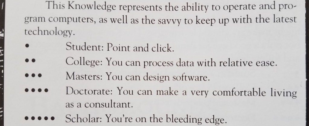
As a teenager, I played a lot of Vampire the Masquerade (VtM)–a tabletop role-playing game. One of the skills in which your character could become experienced was Computers, with ability measured from 0 to 5 dots:
This little table has stayed with me over time. As simple and crude as it is, I think it provides a reasonable measurement scale that can be used to guide software development: you need to decide how many dots in Computers a user must have before they can use your software, which helps you organize the user interface and prioritize features.
My sense is that currently most Linux-based software targets people with three dots in Computers or more, but is often usable for people with two dots. My wife is a solidly two-dot user who is happily using KDE Neon as her distro.
But how many zero and one dot users are out there? What fraction of the market are we abandoning by requiring two dots?
This question was answered a couple of years ago when the Organization for Economic Co-operation and Development commissioned a massive a study of adults’ computer skills, with over 200,000 participants (!!!) across 33 high-income countries. The Nielsen/Normal Group summarized the results, and here I’ll condense them even further:
- 25% of users cannot use computers at all. AT ALL! These people have zero dots in Computers according to the VtM scale.
- 14% can can perform easy and obvious button-driven tasks in single simple apps, such as sending or deleting an email. They also have zero dots in Computers, but would be on the higher end of zero. Maybe a little more than half a dot.
- 29% can use more advanced functionality in individual apps, such as searching for data that is not currently visible, or writing an email reply to multiple people and not just the sender. They have one dot in Computers.
- 26% can perform multi-step tasks involving more than one app, collate information from external sources, overcome minor errors and obstacles that occur during the process, and do some monitoring of background tasks for activity. They have two dots in Computers.
- 5% can perform complex tasks involving multiple data sources and apps with lots of navigation, transform imperfect data with tools to make it suitable for the required work, and succeed at ambiguous tasks with more than one correct outcome or possible approach to get it done, overcoming significant roadblocks along the way. These people would probably have three dots in Computers (even if they are not software engineers).
Let that sink in: almost 40% of adults in rich countries have practically no computer skills at all. This isn’t mentioned in the summary, but my personal experience with people in the lowest-skill group (25%) is that they can only use smartphones and tablets, while those in the next skill group (14%) still strongly prefer them over computers.
Another 30% of people have effectively one dot in Computers on the VtM scale. Taken together with the two lowest-skill groups, this means 70% of people’s computer skills are non-existent or very basic. Those with more advanced skills–two dots in Computers and up–are only about 30% of the population.
Maybe the dominance of the smartphone makes a bit more sense now…
KDE is never going to achieve world domination with software that can only be used by at most 30% of the market–those with two or more dots in Computers. To broaden our appeal, we need to make our software usable by at least the people in the next level down (one dot in Computers), which doubles the potential to 60% of the market–going from a minority to a solid majority.
BUT WAIT! Won’t this “dumb down” KDE’s software? Won’t we alienate our current audience of 2-and-3-dots-in-Computers users? After all, smartphone software optimized for zero-dot people is indeed really simple and limiting. So it’s a risk.
But I think good design and high customizability can make software elastic, suitable for users with a range of skills. Software with little or no customizability or poor design can probably only straddle two categories, so decent phone apps would be comfortably usable by people with 0-1 dots in Computers, maybe 0-2 dots with exceptional design. This pretty much matches the experience of myself and many people I know: those with more technical ability find most phone apps to be limiting and prefer using a computer for heavy lifting.
But well-designed software that’s customizable and has good default settings can accommodate a wider range of skill levels: people with 1-3 dots, or even 1-4 dots!
We can deliberately exclude the zero-dot people from our target audience, who are probably never going to be happy with KDE software. Our focus on power will bleed through in even the simplest apps, and just never appeal to them. GNOME and ElementaryOS can have those users. 🙂
This is what I think we should shoot for in KDE: software that is simple by default so it can work for 1-dot users, but powerful when needed via expansive customization, so that it can appeal all the way to the 4-dot users–which includes many KDE developers. This is currently a strength of KDE software, and it won’t be going away!
Essentially we need to fully embrace Plasma’s motto of “Simple by default, powerful when needed” all KDE software, not just Plasma.
I see a lot of this already happening via our simple-by-default Kirigami apps gaining power and customization opportunities, and our powerful-by-default QtWidgets apps gaining better default settings and a streamined appearance. So let’s keep it up!
Edit: check out this follow-up post: https://pointieststick.com/2021/11/30/more-about-those-zero-dot-users

Absolutely 110% agree Nate.
There’s no point in making fantastic, safe, stable, fast software, if 70% of the population can’t figure out how to use it.
And again, absolutely agree, it’s not a choice. It’s not a choice between software being simple “OR” powerful. Software can be simple “AND” powerful, in many cases by having sane defaults, and customisation/extra settings available for those who need them.
Beyond sane defaults, there’s plenty more which can be done to reduce the number of dots someone needs to use software, to make the user experience more intuitive. A lot of it comes down to good visual design by an experienced designer.
They say a picture says a thousand words and it’s true. Good visual design, thoughtful deliberate and consistent application of ‘visual language’ in design can achieve wonders for improving UX.
LikeLiked by 3 people
I don’t mind things made simple as an option. Ideally there should be a “Control Panel” option or Preferences option that says: KDE Interface (*) simple ( ) advanced. Clicking one place should allow advanced users to set it how they want for their user account. In that case I would be fine with it. Gnome 3 is a pain because just to get back to normal working desktop requires quite a bit of tinkering. A desktop is not equal to a smartphone. I don’t mind the interface on my iPad for basic things, but would HATE to do a spreadsheet on it or many other tasks. Options are good as long a one setting can easily allow them to choose. The only other possibilty would be KDE Interface Level, with a dropdown of Basic, Intermediate, and Advanced.
LikeLiked by 1 person
Many people (including me) have thought of the “basic/advanced” toggle, and it introduces more problems than it solves in most cases. See https://community.kde.org/Get_Involved/Design/Lessons_Learned#Basic.2Fadvanced_modes
What should be in Basic mode? Would users underestimate, or overestimate their level? Would Basic users think “we are not toddlers, we can handle this”, go into Advanced mode, and get lost in the settings? Would an Advanced user be too afraid to go into Advanced mode, missing out on a lot of features? What is the right nomenclature that is crystal clear but not condescending? What about users who are Advanced in setting up their audio devices, but Basic in customization or networking?
Showing a few common options and a “more options” button for each piece of software (each app, each KCM, etc.) is the better solution, and the KHamburgerMenu component is probably the right tool for that in apps.
LikeLiked by 2 people
As a ~3dots (2 at times!) user I find the Plasma Breeze ui elements like sidebars, toolbars and general spacings way too big and space consuming. I mean, take the krunner results. With Plasma 5.23 I can only get a maximum of 8 results per category whereas with previous releases I could get 10 results per category. Also, applications with many menu items can accommodate fewer items per menu and windows in general consume more desktop estate than ever before. This is particularly visible with non-hidpi displays. I have a feeling that all of this has been done to accommodate future less-then-3dots users with a touchscreen interface as their primary UI.
Tldr: Although I am happy to see KDE attract a larger user base, I would like to remain a Plasma user with an interface primarily designed for the desktop with productivity in mind. Maybe this could be accomplished adding customisable UI defaults per device type (desktop/tablet/convertible).
LikeLike
Larger UI elements aren’t just beneficial for touch users; they provide larger click targets for mouse and touchpad people too.
This question of high density or low density just seems like one of those irreconcilable things. You can see that someone else in this post’s comment section is complaining that the UI is “too cluttered!”
But “too cluttered” and “too sparse” are mutually exclusive. What I have been thinking about for this matter is a global density setting, kind of like how we now have a global animation speed setting. People who like high density could simply ratchet it up, and instantly list items will be thinner, paddings will be reduced, and so on, all so you can squeeze more information onto the same amount of space.
LikeLiked by 4 people
The global density setting is a really nice idea! Hope that it can be implemented soon.
I am eager to see my java applications side to side KDE applications with similar UI densities. As of now the difference has become more and more noticeable to the point that I appreciate the java apps’ higher density more despite the uglyness of their toolkit.
LikeLike
The density setting is a good idea. I would also like to implement a feature where if a touch input is detected then decrease density. If mouse input is detected again then decrease density again.
LikeLike
We already kind of do that actually, sort of. There’s a “Tablet Mode” in which list items get a bit taller. We could perhaps make it activate on any touch input, when it’s not already active.
LikeLike
Problem is when people are using a 13″ touchscreen laptop, and using touch and mouse at the same time. UI elements would jarringly jump around (even if the transitions are butter smooth)
LikeLike
Great article! KDE and Neon FTW! ❤
LikeLiked by 1 person
I wholeheartedly agree but I wonder if this is something that KDE can do on its own. Sometimes I feel like you need quite a lot of integration to be able to deliver good UX. I’m not sure how it is on Neon, but on the last couple of distros I used, I had to manually install an out-of-memory management tool if I didn’t want my laptop to freeze to death if I ever ran out of memory. My point here is that for 1-dot (or 0-dot) users to be able to use software, any problem they encounter should be solvable with their skills. So if KDE software improves at this, and manages to be very user-friendly and understandable, but the Linux system itself would still require 2-dot tinkering at times, the 1-dot user still wouldn’t be able to use it well.
I admit I’m not too knowledgeable on the current state of things in the ecosystem or in KDE Neon. I see the improvements in KDE software and I really appreciate them, and I hope you can figure out how to attract more users.
LikeLiked by 1 person
Agreed. KDE is just a DE, not an OS. As for KDE Neon, it is a nice and shiny show case for KDE, but pretty shitty OS.
LikeLike
I agree somewhat. The issue is that you need to control the entire stack. That means that the “distribution” you are based on needs to be rethought with UX in mind and strongly integrated with the DE. Neon is great for getting the latest KDE, however, the underlying ubuntu based distro is the same old stuff. (This is why ChromeOS is more successful than any other linux DE ever created.)
It’s too bad that the LSB failed and the major distros were (and still are) split along lines of package formats – stupid thing to argue about if you ask me. deb vs rpm, vs tgz – short sighted thinking. Everyone should have just picked one, rallied around it, enhanced it and be done with it. Unfortunately, flatpak or snap won’t save us. I always thought that what should happen is a very small core rolling distro that everyone uses and that serves as ‘upstream’ for all of the other “distros.” It would set the standard for base OS technologies like package formats, config file formats, filesystem layouts, init systems, etc. with a focus on excellence of usability by downstream secondary distributions, which then worry about layering on the DE, unique tools, user experiences, etc. They could layer whatever they wanted on top. If we want to have the year of the Linux desktop, and we really want world domination, we need to stop getting stuck flame warring about the plumbing, and instead focus on innovating where it matters – the user experience, IMO.
Unfortunately, probably the only person that could accomplish this is Linus himself. He is the only one with the community respect and gravitas to start an initiative like this and bring all of the major distro’s to the table.
LikeLiked by 1 person
I agree with you completely. If the problem is that “Linux is not a platform” then this would go a long way to making it a platform.
Politically, the way this would probably have to work out is if something that everyone already uses got extended to do more of this stuff. So it would have to come from the Kernel or Systemd or something with a similar level of universality and depth in the stack. LinuxOS? SystemdOS?
Otherwise we’d just be back in the realm of https://xkcd.com/927/.
LikeLike
Yup, completely agree. Maybe Linus can be persuaded to start a LinuxOS effort – although I doubt he has much interest in that. I believe I asked him a question somewhat along those lines at the Linux Summit in Ottawa many years back and his response indicated that other than not breaking user space he had little interest in work in user space.
LikeLiked by 1 person
That sounds like Fedora Silverblue with Flatpak apps.
Fedora is the only distro putting serious resources into addressing Linux computer users’ pain points with initiatives like Linux Firmware Service, Pipewire, out of memory handling, etc. Unfortunately Fedora is quite committed to Gnome.
LikeLike
There are quire a few committed KDE folks working on Fedora, as a matter of fact. They they produce Fedora Kinoite, which is the Fedora version of Silverblue. I haven’t trieed it myself but it seems like a promising project.
LikeLike
KDE has an “almost out of disk space” monitor, but not one for memory. I think it’s because memory is an inherently more technical concept than storage space, and it’s also not as easy to fix. What if the thing consuming all your memory is a thing you’re using? Simply killing it is a bad option; you’ll have to live with the situation. But then you’ll see the warning all the time!
For normal people, I don’t know how common OOM situations are compared to low disk space. Even if they open tons of apps and forget to close them, typically the system is okay about shuffling memory around to prioritize the apps that are in use. And if it isn’t, well, that’s something that would need to be fixed at the kernel level.
LikeLike
Just enable systemd-oomd or earlyoom or one of the other implementations. Fedora has systemd-oomd in the default install since Fedora 34, and before that it had earlyoom, and things mostly “just work”. Trying to implement this at the level of the graphical layer doesn’t make sense. The only thing the graphical layer should do is present a notification when things are killed. And the kernel doesn’t have enough information, its oom killer only cares about the kernel not getting deadlocked, and not about userspace being semi-frozen due to excessive swapping.
LikeLike
It’s like armchair manufacturer dreams big about world domination in aircraft industry. ‘Our armchairs for air-planes will make using air-planes much easier!’
LikeLike
In my experience, the numbers are even worse.. and the people that “can” only use a smartphone or tablet, actually can’t do even that properly. They can click the camera icon and then the shutter, but if I remove the icon they will never ever again be able to take one picture. In fact, most of them would probably buy a new phone if the icon disappeared. These are the same people that call me and say their computer is “broken” and I already KNOW the problem is they can’t access facebook for whatever reason. These are people in their late thirties/early forties. They don’t care and they don’t want to care, how tech works has zero meaning to them. Their kids are the same, and you’d think the younger generation would be on top of these things. Think again. It’s not a good idea to dumb down the tech, because it can never ever be as dumb as the users. Harsh but real.. And me, I’m a TWO on your list and I’m considered by my friends and family a complete computer geek supernerd that knows how to hack the hubble telescope and the NSA in a matter of seconds using a stopwatch and a microwave. I’m just a guy with too much free time and knows how to Google stuff. So nope, no idea trying to reel in the AVERAGE users, it will never happen.. Focus on the ALMOST number twos and you’ll be fine. The ones that know the difference between windows, android, mac and linux but still haven’t had the courage to try something else.
LikeLiked by 1 person
^^^ what he said 🙂
LikeLike
Yes, my personal experience with normal users has also been quite eye-opening. For many years I ran a one-man “I’ll fix your computer for $100” type of business, and the tech level I saw even of very intelligent and wealthy people was generally *extremely* low. And these are people who have been around computers for most of their adult lives, own many digital devices, and interact with them on a daily basis! For poor people, the elderly, recent immigrants, those on the margins of society–forget it. They’re almost all in the “can’t use computers” category.
I think we can get the ones, though–especially with KDE software pre-installed on hardware. Ones aren’t ever going to install another OS and have a very product-focused mindset (“My phone is acting weird, time to buy a new one”), which is why products that our software on them are so important IMO.
LikeLiked by 1 person
Agreed 100%. Getting KDE preinstalled on affordable and good devices is key. That will teach the kids and hopefully open the eyes of the adults. The harm crappy computers with windows has done cannot be understated. The amount of frustration because of the extremely poor performance and user-hostile OS is just mindblowing, not to mention the amount of e-waste it has caused. I think everyone knows by now how crap windows is but still the general opinion is kinda “oh well, it is what it is and that’s just how computers are”..oh and then there’s that strange belief that money solves everything, that if you buy a mac you get GOOD stuff or a high end pc will somehow make windows better.. and we all know that the most expensive Samsung phones have the best Instagrams and Facebooks yes? I think it’s wonderful there are companies that ship linux on their laptops and those NUC-type small computers, but it’s such a shame those things still cost very much money AND are also almost impossible to stumble upon even accidentally online..The marketing is lousy. So yeah, why and HOW would a normal income (read: low) parent buy their kid a 900 euro KDE laptop when their favorite online store is selling a “seemingly” identical thing for 299 euros? Oh and if they would buy one, their kid wouldn’t know how to use it because all their stolen windows games and stolen photoshop won’t install =) It’s a steep uphill for linux when you’re fighting money, prejudice and old habits. Luckily microsoft are now helping by making their OS worse and worse and worse for the users with every new release.. so yeah, a silver lining !
LikeLiked by 1 person
“Luckily microsoft are now helping by making their OS worse and worse and worse for the users with every new release.. so yeah, a silver lining !”
First time I saw this “Users will see how bad Windows is and flock to Linux!” mantra was circa 1999 when Windows 2000 was due. Rinse and repeat for Windows XP, Vista, 7, 8, 10, 11…
LikeLike
Also true, but back then KDE did not have Plasma 5.24 up their sleeve =) 2022, bring it on! Now someone get Adele on the phone, we need a little push here.
LikeLike
Im my LUG I deal with a lot of older people (60 +). They grew up with the likes of Windows 95 and I notice quite a few of them are lacking the skills to use a … smartphone because the modus operandi is foreign to them. They als tend to go with DE’s like KDE, Cinnamon, XFCE because those DE’s look and feel familiar. I rarely see a Gnome UI on their machines.
But the Computer Skills for these Linux users is only a one dot. Why? The DE and its underlying mechanism is foreign to them and the apps that they use are written for a much younger public. The new approach on smartphones is more difficult than meets the eye for them.
So it is not the DE but the apps that makes it difficult for them to work. Each app has its own set of rules and that’s the main reason they stay with what they are used to for 30+ years.
LikeLiked by 1 person
This is a great point. I would say that some of them are are even likely to even be zero-dot users who were trained to use computers. You can distinguish these folks because they’re the ones who never want the UI to change, ever. They have memorized the position and appearance of things they need to use, rather than understanding how anything works. As long as nothing changes, this generally works fine. These people can be trained to use MS Office, Outlook, even Photoshop. But training breaks down when the real-world environment doesn’t match the training environment. So when the UI changes, they’re lost, because their spatial/visual memory is broken and they don’t know how to actually find anything.
I think these are the target users for LTS distros where nothing ever changes for years and years.
LikeLike
I don’t beleive I fit in that user base that you described. Of course, I could be the exception to the rule. but I’m not. I’ve seen various users around the forums older than me that are quite sucessfully using Linux. About me (Warning WoT!)
I’m 58 (second to last year of the “Boomer” generation). Learned some DOS the last year of high school. Took Electronics 1 & 2 freshman year, 3 & 4 my sophmore year (aced all 4 semesters getting straight A’s after being warned not to take it by the counselor “because seniors are having a hard time with it”). Then Chemistry junior year, and finally Physics in my senior year. Math started with Geometry as a freshman and ended with Calculus senior year. Got 1260/1600 on the SAT. Graduated from high school and worked until the present day doing carpentry. Started gaming on console around ’91 on the NES. Internet starts popping off and I get a Pentium 1 133 Mhz desktop from a customer as a partial payment. It’s on now, start catching up and learning everything I could. Being such a noob for having to call my friend on how to open a .rar archive. USENET. Getting my first hacked console (a PS1) downloading and burning games. Getting my second one (an X-Box with a Team Xecuter chip, 2 250 Gb HDD’s and the Team Avalaunch dasboard. XBMC. Downloading T3CH builds from xbins.org via Mirc and FTP (Flash FXP, FTW!). Editing XML files. Torrents with Vuze. Downloading firmware and flashing it over the serial port to my freind’s satellite boxes. First X-Box 360, a dev kit. Game ISO files had to be altered with ABGX360 (make devkit) and FTP’ed into the box to be playable). Second 360 (this one with hacked DVD drive, thanks C4EVA for the firmware) and then I got 300 360 ISO’s with Vuze, TPB all over AT&T DSL! Burning and ripping games with an internal DVD drive running more C4EA firmware (sorry Gamestop,Netflix). Free GaryOPA!. Building my first gaming computer. Building a SFF Intel Sandybridge system in 3.5 hours (box of parts to end of Windows OS install) for my sister. Fixing my friend’s PC’s and setting up wireless networks for older people. Losing all my shit in 2017 for nonpayment of the storage fees (big shout out to Purdue Pharma!) Mods and patient readers, the biographical back story is releavant for what follows. My apologies for the WoT.
Fast foward to 3 years ago. getting this Alienware M14xR2 laptop from the electronics recycle place my buddy worked at for $100. Downloading 64bit Mint Cinnamon and making a bootable flash drive with Rufus at my sisters’s. Installing Mint. Installing programs with the software manager and from command line. Installing STEAM and gaming. VirtualBox, Kali, Debian Buster, KDE Desktop. Building apps from source – SQRL (has a DOTNET installer now), CPUMiner, AntiMicro. My point in this whole, semi rambling diatribe is this – If the bug bites you, you are hooked. And the opposite For those A & A users (Apple & Android) #1 on your VtM scale ofusers, they just don’t effin care. They have no desire to learn how ANYTHING works. Will it play a Tik Tok video? Post on Instagram? Most of these people can’t tell you the cycles of a four cycle engine much less the process node of the CPU that’s in their phone. You want desktop Linux acceptance? I can see only one way to make that a reality. Do what Google did with Chromebooks. Get free laptops to children in grade school. If they grow up learning it, maybe they will continue to use it when they graduate. Maybe some of you really smart guys with a little free time can go teach a free night course at your local community college called “Introduction to Linux” Maybe you get together and standardize the coursework and lesson plans. People LOVE free stuff. They just need to be shown how free Linux really is. If STEAM succeds with PROTON/STEAM Deck I will never own a computer with a Windows OS again.
LikeLike
JFYI I was an Apple user for 20 years before I moved to the FOSS world. People often take circuitous paths to get where they’re going.
LikeLike
KDE works right out of the box for me. I don’t have to tweak lots of stuff.
LikeLiked by 2 people
That’s great!
LikeLike
Awesome article, like always.
I wonder how the toyful/joyful default style in Plasma plays a role into this.
LikeLike
I haven’t heard that term before, but I like it! Could you explain a bit?
LikeLike
If we compare the different default configurations in: Plasma (upstream), Windows 7, Windows 10, Windows 11 and MacOS, Breeze feels a bit more like a toy (this is not a pejorative term). The color palette, the margins, the fact that there is an accent color and the tone of it, some animations… All of it sums up into being being toyful. Another term we use in the industry is cartoon which is closely related, like toyful it also has to do with the utilization of borders for clear and explicitly defined boundaries, the use of shapes to differentiate the nature of elements, animations that put the accent into where things came from (or went to), etc.
Overall a cartoonish/toyful interface is usually easier to use since boundaries are clearer, animations help you learn how the layout works… But it tends to be less pleasant to use because of the excess of information your brain has to process, again large (in size and time) animations, many lines that separate things, etc.
Now that I think about it, GNOME for example also has a more sober and serious style.
The tendency overall (this is just my own bias) is from more joyful/toyful (Windows Vista) to less toyful (Windows 11), this pattern can also be seen in the mobile spectrum or even in video game consoles and infotainment. Oh, the web left this port long ago as well.
These terms are common in the industry I come from (video game creation and animation), but I am sure you can relate to those in some way and apply them to apps.
LikeLiked by 1 person
Thanks!
LikeLike
I really like the moto “Simple by default, powerful when needed”
But it brings some challenges with it, currently you can open a app and instantly see which features it has without deep diving or customizing the software.
But this of course also adds complexity, but if we hide all this from more advanced users it will be pretty annoying if your not already familiar with the software.
So i see the advantage and think as well that we have to strife to make KDE easier to use, but as it looks like now it will definitly be a challenge.
LikeLiked by 1 person
The one thing that would stop me recommending KDE to non developers is: Questions during installation.
Installations and upgrades should never ask the end user to solve configuration conflicts in the installation process. If the developer cannot resolve the conflict, how should the end user be able to do it? And no, a diff tool does not help.
LikeLike
I agree for updates/upgrades. See for example https://invent.kde.org/plasma/discover/-/merge_requests/208#note_348975
However first installation is always going to have to ask the user some questions: language/keyboard layout, installation destination, username/password, and so on. I think the best way to solve these for people who are allergic to initial configuration is pre-installation on hardware. Then all they need to do is establish a password.
LikeLike
I’m a 4 dots and I personally find the KDE interface too cluttered because it can’t decide whether to focus on the new user or the consummate expert of that particular software. As said in the recent video from your developer Niccolò Veggero, I think KDE’s strength could be having a simpler layout and interface that can be expanded and customised for the power user, because in effect every user eventually becomes a power user as their mastery grows. My hypothetical grandma if she would stick to KDE would eventually need to add a Konsole pane to her Dolphin window.
I’m a GNOME user, and saddened that it focused only on the 2 dot aspect. KDE instead should start on the 2 dots, and give the option to expand the interface as one becomes more comfortable, but it is currently too focused on the “overly-complicated demo showing every single feature on the main window” UX.
That said, as a GNOME user, I love these World Domination articles. Keep them coming!
LikeLike
Yeah, this is our goal and direction.
We’ve made a lot of progress and I think Plasma itself is now quite good in the “simple by default, powerful when needed” department. But many of our apps have a long way to go. The older QtWidgets apps are often very heavy and overwhelming, and our newer QtQuick apps can be quite limited. Bridging this gap is a major challenge going forward.
LikeLike
When we look at all those numbers about how many people don’t know very much at all about using computers, we should temper our reactions by asking how many of them are unhappy about it. If someone knows how to do what they want to do, isn’t that OK?
(Implementations of desktops like KDE have to configure a specific default environment, with post-install changes left to the user. When they do that, users think in terms of adding/changing capabilities, not in terms of labels like “Input Devices” or “Compositor” or “KDE Wallet”. Users like me think in terms of “My mouse cursor is too small and not dark enough” or “The bold faced text looks bad” or “Why did you let me set up an email account if it’s not going to work?”)
LikeLike
Indeed, most of them are perfectly comfortable with their current skill level–or else that would have already leveled up.
I think your observation that people think in terms of capabilities rather than structure is a wise one. The best way for these people to satisfy is generally by using the search, but we have anecdotal evidence that a lot of them browse instead and fail to find what they’re looking for. So we tie ourselves in knots trying to come up with better organization, but maybe what we need to do is emphasize searching more. Somehow.
LikeLike
Hi Nate.
Whatever you do just please don’t pull another GNOME 3 on us. There are real consequences when you start treating your users like they are dumb. The main one is most users are not dumb and you are starting to make dumb assumptions and decisions that will affect all users. The dumb minority will happily play along and that will work for a while. But over the years the frustration of all the dumb decisions will accumulate and will start to work against a dumb project. This is exactly what happened to GNOME 3. Stability (zero crashes), aesthetics (sane look and feel), low footprint (memory consumption), high speed (no perception of lag) and modernization (like Wayland). Continuous work on this areas should cement KDE as the preferred choice. From time to time don’t forget to call out the wider community to push KDE as preferred choice. Compared to other solutions that are lacking compared the KDE and are dumb.
LikeLiked by 1 person
Please stop this. GNOME never have treaten its user like that.
GNOME focus is on power users – users who work with the PC and need a sane configured environment, rather then options to configure everything. It’s ok if you need more and if GNOME is not for you. But please don’t be an asshole for that reason.
LikeLike
I was a GNOME user for more then a decade and hence i know how i was treated. It has nothing to do with being able to customize things or not. You can customize GNOME. It’s their views and actions that drove me away.
LikeLike
I think it’s pretty clear there is no desire in KDE to “pull a GNOME 3”. 🙂 We are all about evolutionary improvement for things that work.
However, I would ask you to treat GNOME more kindly. It’s not for me, and evidently it’s not for you either, but it’s a big, popular, successful projects that achieves a high level of stability, consistency, and user interface polish.
LikeLike
Hi Nate.
I can understand your proposal on lets be kind to each other. As for treating GNOME more kindly. The main problem here is GNOME didn’t treat me kindly for a decade or so. I was treated like i am dumb and should endure dumb decision for i guess some higher goal. A higher goal that was never defined, never happened and i don’t even know anymore on what it was meant to do in the first place. Basically i was a victim of some people egotrip that more or less lead me on and claimed they know better then me on how i should use a computer. Now i guess i worry that their views and actions might pollute other projects. Like KDE. If now that i finally found a safe haven and made the switch for the better. If now i would need to endure another decade of the “GNOME 3 approach” in KDE. In that case i am prepared to leave Linux behind. But all in all i understand that this blog is not the right place for me to fight GNOME, their views and their actions. Will do that elsewhere. As for some final thoughts. Don’t believe for a second that what GNOME is offering is in any way better then what KDE already is. Keep up the good work.
LikeLike
This is pretty much the reason why I gravitate towards FerenOS. FerenOS is what Zorin OS is to GNOME. It makes things very simple. And better than Zorin: it doesn’t make complex changes harder either.
By default, it looks good, it’s familiar to many users, and it points towards simple customization users can do while making complex changes simple.
I can very easily get the macOS UX I want by just choosing the Mac n Cheese Desktop Layout. At the same time, Global Theme is on a separate tab in the Appearance settings, so the change desktop layout is much more visible than by using a small tickbox at the bottom and user can mix things up.
So please take what Feren OS do, combine it with GNOME’s on-boarding, and make choosing Desktop Layout part of the on-boarding process as well as a separate menu on Settings (which could include all the typical layout user wants). Hell, Ubuntu Budgie has a very great UX with regard to the whole thing.
Also, while I think the Setting keyword is a step in the right direction, I still find the Settings menu to be daunting. I think that what the KDE team could do to improve it would be to create a small [?] button that when hovered/pressed gives a good explanation of what the menu/option does. This is already partly a thing, but I think it could use more of it.
Also, I think that there is merit in the new Setting Menu that Windows 11 has. I think the amount of categories that the Settings app is dizzying for new users, never mind the sub-categories within sub-categories. Honestly, I usually use search in KDE Settings because I *do not* want to browse through the categories menu. Windows’ new setting app OTOH makes it clear at a glance as to what you could expect out of each categories. We can even make each categories has its own entry in the application launcher.
Those are my two cents regarding making KDE easier to use for more users: Desktop Layout Switcher, and a better Settings menu. I have huge hopes in KDE, especially since the team seems to be ready to take on huge projects like the new System Monitor which really embodies the “Simple-by-default, powerful-when-needed” philosophy.
LikeLiked by 1 person
Really My biggest annoyance is that I am a keyboard user. Lot of the interface changes result in you attempt to operate KDE without mouse and go into a program you don’t know the short cuts for you are screwed.
Like there is no set keyboard short cut for the hamburger menu. Like in dolphin there is not means to have hamburger menu and old menu on screen at same time.
Now getting out side my biggest annoyance. The 5 dot system I see as wrong. Everyone of us can be having a very forgetful day. This is like a classic fault of mmorpgs. The question should be how well as a one dot user can you find your way to being 5 dot user of an application without reading manuals. Basically how well does the interface of the system inform and guide users to what features the system in fact has.
I don’t see this as needing remove functionality.
There are little things that are really annoying in my eyes and don’t help new users.
Like mouse over something wait for tooltip to appear then be told you can use shift to expand it. This behavour has many issues. 1 if a am person who is a point a click non keyboard user(could be tablet) how am I going to press shift simply. If I have triggeted a tooltip with a mouse I should be able to view the complete tooltip just using mouse.
Now for more advanced keyboard/mouse user how is this bad. I need to read the tooltip for some reason I run mouse over point that would trigger tooltip to appear press shift before tooltip appears and waits there like a fool as the tooltip does not expand. So yes KDE tells you to see the expanded tooltip press shift but then does not support this if you press shift before the tooltip appears.
There are many interface things like this in KDE that are bad or all levels of users. Yes that shift one on tooltips cuts the point and click people off the the information they need to progressively learn the system by interaction.. Also advance user could have hand on mouse and other hand on coffee. Yes that 5 dot user can be 1 dot user due to only using 1 hand to control the computer at the time.
LikeLike
Hello, I am the person who implemented the “Press Shift for more” thing without which there would be hardly any way to discover many of the contextual help texts in KDE applications. I agree with your way of seeing users as learning people that will become more proficient in using an application if a task demands for it and the application allows to learn more about it in manageable learning steps.
You are of course correct that tooltips don’t work for devices that don’t have a mouse cursor like tablets. One solution to this is a help button like the one that is available by default in Dolphin’s title bar under X11 currently. Users can click that “?” button and then on any user interface element to get an explanation for it.
Unfortunately, most KDE applications do not have any help texts available for most of the user interface which is why we had to hide the “?” button’s functionality to be only available through the help menu/what’s this-action. Writing more help texts is one activity with which I think people can have an extremely high impact on the usability of KDE applications while only requiring some proficiency in English and some very very basic programming knowledge.
I have some more things in mind to further improve the discoverability of such help texts but it doesn’t make a whole lot of sense for me to put more work into this until there is a bigger number of contributors who are interested in writing help texts at all and less contributors who are against having discoverable help features. The “Press Shift for more” functionality came to be because many people were vehemently against having exhaustive multi-line tooltips. It is a compromise in favour of 2-5 star users to a slight detriment to 0-1 star users and users that typically prefer to only use a mouse.
About the hamburger menus: I agree that it would be great to have a universal keyboard shortcut for opening them. Someone would have to find a way to make this not clash with the individual keyboard shortcuts of all the different applications using hamburger menus. Keyboard-only users are really better off using menu bars currently.
LikeLike
>The “Press Shift for more” functionality came to be because many people were vehemently against having exhaustive multi-line tooltips. It is a compromise in favour of 2-5 star users to a slight detriment to 0-1 star users and users that typically prefer to only use a mouse.
Except its not really a help to 0-1 star users at all. Or more advanced users like me who at times only have hand mouse so I would be in the 2-5 range it is also a problem. “Press Shift for more” what about it also allow click for more. That way you can get the extra information without need to take hand to keyboard. Basically shift for keyboard users click on button in tooltip for mouse/touch user.
Being against having exhaustive multi-line tooltips shoved in face all the time I agree with is a problem. Yes have to-do something so the long tooltip displays is fine in my eyes. Important thing that that something is able to work for all users. Yes all users touch, mouse and keyboard. Shift option is little too restrictive.
>About the hamburger menus: I agree that it would be great to have a universal keyboard shortcut for opening them. Someone would have to find a way to make this not clash with the individual keyboard shortcuts of all the different applications using hamburger menus. Keyboard-only users are really better off using menu bars currently.
The thing here hamburger menus really should not have started being implemented in mass without agreed short cut. But hey we have that mess now.
Yes the annoy part here is know that most hamburger menus are arrow key navigable.
Also do note as keyboard user at times the extra screen space getting rid of the menubar is useful.
https://defkey.com
This is a useful site with huge list of application short cuts. alt-pause would only disagree with dosbox and ctrl+pause would only disgree with WinDev of course neither of those have hamburger menus at this time.
There are some odd things like win+f5 that by defkey used by no body.
There are a handful of lightly used shortcuts left and a very few no body using that remaining. After that its then we need to add a key.
Yes the longer the choice on on what will be the universal hamburger menu key is to be the harder it will get to have one.
LikeLike
>Except its not really a help to 0-1 star users at all. Or more advanced users like me who at times only have hand mouse so I would be in the 2-5 range it is also a problem.
Well at least they have a way to know now for which controls more exhaustive help texts even exist.
>users click on button in tooltip for mouse/touch user.
Tooltips not disappearing while the mouse moves/moves towards or over them is AFAIK also somewhat unpopular for sane reasons. I wouldn’t be against it.
LikeLike
Nate,
I mostly agree with you, though don’t turn it into a GNOME3 please. The better and easier software is accessible, The more people that will use it, and this is a good thing. As long as KDE still retains all the advanced customizability options it currently has I don’t see any issue there at all.
Idea: What if you greet the user the first time they log in with a wizard or with a pop-up or or a window or something in a similar fashion that asks whether you’re a normal computer user or a advanced user or a developer and set configuration defaults accordingly? When the user selects regular user they get a minimal deskop without the advanced functionality and options (while it still can be enabled through a setting or configuration flag to change to advanced mode). With the other 2 options everything is visible but you just have different default settings, which you can customize further yourself after?
Perhaps the text and labels should be different from normal, advanced and developer, but I hope you get the point.
LikeLike
I was recently thinking just that! And also some fears that eventually KDE software could run down the gnome path on removing choices and the “powerful when needed” part of the motto.
Why? One thing that bothered me when they came along but I thought would mature and change with time but didn’t: the same kirigami apps. Particularly, their common customization:
* they don’t have a toolbar, which one could move to his/her preferences;
* they don’t offer labels/icons choices on that toolbar equivalent component (I don’t know what you call that);
* they don’t let you move buttons to your likings, let alone show/hide them as you wish; and
* you can’t resize the (considering LTR env) left “panel” (and according portion on that “toolbar”).
I *can* live without some of these and just adapt to whatever is offered, although I don’t think I *should* on software that should be “powerful when needed”, but I had my share of texts that, translated, would not rightly fit that left “panel” and I could not adjust it or move hamburger menu to left, where it’s most useful to me, or at least hide it, since I use the application’s menu as a button in breeze decoration, anyway.
And this last one, hamburger menu, is a pain for me since its current form debuted in dolphin, itself not a kirigami app, which feeds that fear I mentioned.
I do hope KDE can stick to “powerful when needed”, as it’s my Linux GUI and apps set of choice since I experienced my first distro, Madrake 7, and any other DE / apps set clicked to me the same way. I even tried to contribute, and still currently do have 2 itches I’d like to scratch and get implemented, but couldn’t get the time, yet.
So, thank you for you efforts, especially you, Nate, and for bringing this subject up to attention of all, which I hope eventually gets these rolling and KDE to fit for all (and world domination).
LikeLike
I must agree with Nate. Such decisions have consequences. Gnome is horrible. I feel like it treats me like a child. It continuously confronts me with what its developers think I should not be doing, even though that is what I want. Barely any advanced options, little configurability, etc. Gnome has elevated the principle you are advocating to a dogma, and your idea would result in the same for KDE, regardless of how much you think it wouldn’t – the usability police would be relentless in their quest for simplicity – and what would KDE have to offer over Gnome if it tried to compete on that level ?
The pillars on which the open source world is built, is the effort of 1000s of developers. Those are the three to five dot users that open source depends on. They are the ones that pay for the software to exist, with their time and effort. They want a sufficient level of complexity, and configurable applications. The open source world is not built on millions of dollars paid by zero and one-dot users that want simplicity. And anyway: those users already have Gnome to suit their needs.
One pitfall that is very easy to fall into, is concentrating on what KDE is currently not, and trying to achieve it, without due consideration for what KDE is now, and trying to preserve the strengths it currently has. IMO KDE is not in the zero and one dot usability niche. That is Gnome’s niche. KDE’s niche is the users that are fed up with the limitations and simplicity of Gnome, and want something better. Let’s avoid forcing those users to start looking for another desktop environment.
LikeLike
Yes, we are absolutely not going to alienate our current users who appreciate the power. Those users include us the developers, so I’m not sure it’s likely to happen. 🙂
LikeLike
Edit: Typo: I agree with the user identifying himself as ‘opinion’…
LikeLike
EDIT: Formatting above correctly (adding “less” and “more” instead):
Natham, your are one of the diamonds of the Linux-community, and what you and the team of KDE has done the last years is nothing but outstanding!
To achieve “world domination” we have to understand the majority of the users;
* Population group who’s main job is to remember linux terminal commands, configure kernels and configure computer desktops: less than 0.00000000000000001% ?
* Population who has a main job where the computer is just a tool and must consume as little resources as possible: more than 99.999999999999999% ?
To ask a user to use the terminal is like asking the average car owner to open the hood and manually align the alternator on a car in order to start it. It is then more valuable for the owner to just change the car (or DE) because their time is not worth the trouble.
It must therefore be as effective and efficient as possible (consume as little resources as possible and provide the correct result). I think you are on the right path. Next problem is how to make Microsoft Office work properly, because this is a blocker for majority of the users.
LikeLiked by 1 person
The problem that I see rolling in is this one:
Stage 1: Apps will hide more advanced options and settings
Stage 2: More advanced options and settings become less used, less tested and more broken
Stage 3: More advanced options and settings who are broken for a longer time will get removed within bigger/ infrastructural updates
The motto “Simple by default, powerful when needed” is nice on paper, but the downsides are there. I’m however full in with the KDE Apps should become more easy to use and especially have sane defaults and should just work.
LikeLike
You are leaving out one very important aspect. KDE needs a stable distro too.
For experiencing KDE now and then, KDE neon is fine. But, it is not really a distro I want to install in my PC(Old base) or, others(bleeding edge DE).
KDE requires a very stable distro maintained by KDE team. Most favorably rolling based because it prevents breakage in major upgrades and rock solid KDE (like not updating KDE release till it reaches *.*.3 version.)
It is a long shot, but it will give KDE more flexibility and better hardware support and provide an experience that won’t perplex new user.
LikeLiked by 1 person
I really believe “Simple by default, powerful when needed” is a good motto. I think that overall, being “clear” is more important than being “clean” when it comes to UI-design and defaults. I also like to prefer applications defaulting to “Show as standard, hide as an option” for important and useful things. One of the selling points is functionality – where KDE definitely is in the lead and many users from all those groups mentioned above would probably find many of these features cool – if they just knew about them or would discover them.
There are various ways to go about this of course, and I don’t believe starting every program with a long stage presentation (like many modern smartphone apps do) is a good way to go about this. Having features discoverable on their own is important, but I can also agree having too many features displayed from the start can make the software daunting. This isn’t a problem for “Pro”-software, where this is the norm and users expect advanced functions (like in LibreOffice, Kdenlive, Krita or Inkscape), but is definitely important for Dolphin, Gwenview, Okular, etc.
I think KDE is quite good at striking a balance: having icons with text next to them displaying important (and sometimes also cool and useful) functions from the start invites the user to use the software and more functions can be found while exploring. I personally believe dropdown menus should be on by default though, as they make discovering new functions very obvious and clear since they present logical grouping of functions with clear text describing what they do – all visible from the start (which isn’t true for a hamburger menu). If I want to Edit a picture in Gwenview, for example, clicking on Edit on the menubar automatically shows me options like Rotate, Crop or Reduced Red Eye – very clear commands easily discoverable.
As someone who often sells computers with KDE on to 1 or 2-star users I can say that the current configuration is very good for most people. I usually display menubars as well as add a few shortcut buttons here and there, and make sure most icon buttons have text labels, but besides that the main configuration works for most poeple and I have gotten a lot of feedback from even 1-star users who likes the system and finds it easy to use. Only for the zero-star group do I actually start removing/hiding things from the current defaults. 🙂
LikeLiked by 1 person
Debian, then Ubuntu-core are chosen as the base operating system for most creators of Linux operating systems. This fact had been verified many times, in my comments on Distrowatch, using their datab lessases.
Canonical offers the standard KDE default in Kubuntu, and another modification of the Gnome (non-standard) was well. Fedora is closest to the default Gnome DE.
Kubuntu socially tries to adhere to KDE applications. Neon is updated more regularly than Kubuntu.
There are other less popular Linux code bases, such as Arch, or many of the other “independent” versions of Linux.
KDE does not need a boring Fedora type of standard version. KDE just needs to speak to where the end-user is now, without forcing them to change. Most end-users are ok with the WIMP standards set by Microsoft Windows (XP, 7 or 10?), Apple or Android.
KDE is flexible enough to offer “themes” that emulate any or all of these user standards.
LikeLike
I’m retired after 40+ years in IT, and spent ½ that time as a Microsoft developer, so I’m probably a 4 dot user. But I use ElementaryOS rather than KDE, mainly for aesthetic reasons. I hate it that you prepend everything with ‘K’ on the menu. To me, it’s cognitive noise – it’s KDE, I already know that, no need to hit me over the head with ‘KTerminal’ . Elementary just uses ‘Terminal’ and ‘File’ in the menu, though that is not the executable name.
I also think you should take a look at TwisterOS, I use it on my raspberry. They have you select a desktop theme – Windows, Mac, etc. I select Mac, because I prefer a global menu, while my wife prefers a Windows theme. Make one for KDE Power User. Give the power to your users, they can decide what they like.
LikeLike
Unless the zero-dot users know and understand what Linux is, and why they would want Linux, there’s no point targeting them. Even Linus Torvalds makes the remark, that the average person doesn’t want to install an operating system, they expect the device to be ready for use as soon as they buy it. It’s been that way since the dark ages.
I find KDE Plasma less usable than Windows 7, but more usable than Windows 10. Windows 11 seems to be designed to look as if it has bugs in it. Despite all this, Windows is Windows, which is the software that comes with the computer, and this is what we’re up against.
I think there are a few things that could be improved for the one-pointers (eg. Discover and update installations, the date/time/currency format settings dialog, a way to calibrate touch screens) and the five-pointers (eg. the barrier for entry to KDE development). Some of them can be done by KDE, but others (eg update installations) may need some system components to be improved.
The discovery of features is another area worth looking into. For example, Windows had things like the “Tip of the Day” dialog, the tour application, or some other tooltips that would show users “Here, try this!” Many of the features even I don’t know how to use, or what to use them for, just like how European cars come with hundreds of buttons that nobody knows what to do with them.
LikeLike
As Shane commented (2nd comment),
a Beginner – Intermediate – Expert view option in the Settings would be great to mitigate the situation for those who are overwhelmed by complexity, enabling the powerful when needed portion with a single click.
Almost every Router Web Interface that I know of does it, and I think it might work for Plasma as well.
LikeLike
I forgot to add previously:
I actually have a few novice (in the range of 1 – 2 dot) users using KDE without them knowing this and this is actually thanks to it’s configurability. Initially I gave them a GNOME based desktop, but they actually didn’t understand how it functioned as it was too confusing and I couldn’t tweak the way it the way it should be. The Gnome logic didn’t appeal to them / they didn’t understand it. Right now they have a PC with a desktop witout any bars and only a few icons on it that are named: Web Browser (which is Brave), Document Viewer (Okular), Document Editor (LibreOffice) SpreadSheet Editor (LibreOffice)
All they use the PC for is web browsing, opening PDF documents and writing very simple documents and sending e-mail (via webmail) and this works perfectly for them and never crashes. That’s actually all the 1 dot desktop user and perhaps some 2 dot desktop users need.
LikeLiked by 1 person
Great article, thanks!
Maybe there is no need to simplify KDE?
Just put the web browser picker on the desktop like in the Windows XP and make user to choose the preferred web browser then put this web browser’s icon on the desktop. It will solve 90% of problems 🙂
Most people need access to web pages, facebook, mail, bank – all through browser. That’s it.
Making libreoffice default for documents and presentations will solve another 3 pp of problems 🙂
LikeLike
Wonderful post!
One pattern I’ve used more recently in customizing my desktop and apps is that certain apps benefit from a simpler-by-default UI while other apps benefit from more functionality exposure by default.
So for a relatively small set of basic DE apps like the File Manager, Text Editor, Software Center, Web Browser, Image Viewer, Document Reader, Media/Music Player, Calendar, Contacts, Calculator, and even Terminal (Konsole) I do the following:
1. Hide the menubar and add the “Show /Hide Menubar” button (with a separator) as the first button on the toolbar wherever possible – unless the app already implements a hamburger menu pattern. Now this is the only other pattern for me to remember other than the hamburger menu to expose more powerful functionality.
2. Customize the toolbar to expose functionality that I find most useful out of the box (and if not already easily discoverable via right-click/context menu). No more than 6 or 7 actions on the toolbar + the Show/Hide Menubar or Hamburger menu. Mostly icons-only unless I see value in showing icon+text, or text-only for a specific function. Buttons visually balanced across the toolbar using expanding spacers to get some natural grouping (minimizing the need for visual separators where possible).
3. Edit the applications menu to put the application name as the prefix in the Description and the generic name as the Name. That way these apps show up in the launcher with the generic name (e.g. “Calculator”) with the description showing actual application name and the description (e.g. “KCalc Scientific Calculator”). Now if I hand my laptop to a family member their first encounter with these apps in the launcher is something a tiny bit more recognizable.
Anything outside of these types of apps, I treat as specialized tools rather than basic DE tools. These apps include tools like kdenlive, digikam, inkscape, calligra, libreoffice, freeCAD, etc.. I think they are rarely ever referred to generically by most 1-4 dot users on any OS (they’ll say “Adobe Premier” not “Video Editor”). They often have specific workflows and custom UI conventions (and use various UI toolkits anyway). I leave menubars on and leave the interface with whatever functionality as exposed by default. These are more complex, powerful applications and I’m fine with the power they expose. The only one I’ve found myself customizing to make a bit simpler is libreoffice.
All that to say that I think only a small subset of basic DE applications really need some short term, low effort changes to improve the experience for 1 dot users. When I look at these applications across linux DEs and other OSes we’re not *super* far off from that place in KDE land. With the user-side customization I made above, it comes pretty close to me. Go look at MacOS; even with all its vaunted claims of consistency, those basic apps, while arguably more consistent than their KDE counterparts, they still have significant UI pattern variance.
Anyway, great and inspiring post (as usual) Nate!
LikeLiked by 1 person
Thanks Andrew!
I pretty much agree with most of your customizations. This is exactly why I’m such a fan of KHamburgerMenu, and why I’m happy that it’s implemented for Dolphin, Gwenview, and Okular now (I hope we can get it turned on by default in Okular soon; hopefully Albert won’t kill us!). I’ve been working on implementing it in Konsole. But I have been tearing my hair out trying to do it for KWrite. There is just so much in the menubar that implementing KHamburgerMenu would hide 80% of it in the “More Actions” overflow menu.
I agree that we’re close here, though!
When it comes to apps’ names, I see things a bit differently. GNOME uses generic names for their built-in apps and personally I found it terribly confusing when I had to look for help online. Because then I had to create mental mapping that “Files” was “Nautilus”, “Text Editor” was “Gedit” and so on. If we did this and people installed both Gedit and KWrite, it would be pretty sucky if both were called “Text Editor” with only the caption to disambiguate them. And then the difference between a basic built-in app and a branded app becomes blurry, since the default set of apps is determined by distros, not us. I think showing the caption by the name is probably good enough. Or at least, I hope.
LikeLiked by 1 person
Makes perfect sense Nate.
Oh and I wholeheartedly agree on not *renaming* the app itself to something generic for exactly the reasons you state. That’s why I’ve found the launcher-only customization useful.
I see “File Manager” in Favorites or “File Manager Dolphin [Description]” when I browse or search, and when I open it the application titlebar says “Dolphin” not “File Manager”. So I, or someone using my laptop, know immediately that I’m using the Dolphin application for file management. The launcher-only customization basically just shifts the generic name towards the front of the discovery chain that connects the user to the specific application.
So [Generic name] > [Specific Application] > Open [Specific Application] VS
[Specific Application] >[Generic Name/Description] > Open [Specific application] in its current form which makes the generic name relatively less useful for discovery unless I search. VS
[Generic name] > Open [Generic Application with unknown specific application name] if we renamed the actual app. I agree, not a fan for exactly the reasons you state.
Not saying it is something KDE should do. Just a quick change I’ve found useful. 🙂
Thanks for ALL your hard work and the wonderful software developed with love by the KDE team!
LikeLiked by 1 person
Unrelated to KDE, but one thing that bugs me is when a distribution installs a million apps that appear in the “start” menu. Basic users don’t need a million apps.
Also, and I know this is a complaint as old as the earth, but I’ve always hated KDE apps that started with a “K”. KDE needs to stop doing this IMO. It may have been cute and cuddly 10 years ago, but not now.
I haven’t used KDE for a while as my employer switched to a virtual dev environment when covid hit. My main complaint with KDE is that some apps have have so many menu options or gui widgets, which could confuse basic users. I don’t know if my inlaws could switch from windows as I don’t live nearby to support them.
Having said all that I’ve always preferred KDE but it hasn’t reached the point where I could say “I can try to migrate my friends and family from windows”. It’s getting there and this article is a good step forwards.
LikeLike
I’m not a huge fan of hamburger menus. My wife has used an Android phone for a number of years and still doesn’t realise that the hamburger icon is a menu and that she should look for one on the app/page. I expect her parents are the same too. Don’t try to make the desktop or its apps like a mobile device.
Maybe offer an option during installation “Simple” or “Advanced”, which installs different apps for things like a text editor, one is more complex and has more features than the other.
LikeLike
You claim that KDE won’t be dumbed down, but considering why this whole discussion has started I find that difficult to believe.
A clickbaiter e-celeb, known to break things to bring more watchers to his ad-driven content, has explicitly chosen to write “Yes, do as I say” into a prompt saying that doing so would break things. Moreover, if you pause the video at 10 minutes 32 seconds, you can see a little bit of a browser window, showing a bug report. It said exactly that the breakage will happen, meaning this was an undeniably intentional move by the e-celeb.
And yet, despite this clear evidence, apt has been changed. This single change has become catastrophic, because there is now a precedence for what I call “clickbaiting e-celeb driven development”.
If that is KDE’s target user, instead of someone actually trying to use it, then I’m out.
LikeLike
Nate. It’s a relief to see appreciation of the various user types. Too many in the Linux community have a binary, “if the user is not IT skilled, then they must be a newbie/stupid/lazy/casual user”. I have a suggestion for your clarification of a dot scale though, I’m likely a 2 dot user, very experienced in apps and tricks in the “user” realm. But as I don’t memorise magic IT words or use IT tools, if I have to go into the IT realm, (CLI, config files) that’s a showstopper. (E.G there is no ‘user’ way to mount a LAN share in Plasma, so no backups.) The dot scale should differentiate the two different worlds for IT insiders and IT outsiders.
LikeLike
La mayoria de los usuarios se aleja al ver nombres raros en las aplicaicones y se confunden por no tener algo que los dirija hacia la facilidad que todos los usuarios buscan y al encontrar una aplicacion que els ayuda en algo se unden en la desesperacion de no poder hacerlo mediante una forma grafica un ejemplo de una aplicacion intermedia como es flashrom como ejemplo no hay en modo de interfaz gráfica de usuario, algo tan practico. y asi muchas otras asi sean basicas debe haber ese inicio donde el usuario deba llamarle la atencion y elejir cual le conviene segun la experiencia adquirida.
Most of the users get away when they see strange names in the applications and they are confused by not having something that directs them towards the ease that all users look for and when they find an application that helps them in something they join in the despair of not being able do it through a graphic form an example of an intermediate application such as flashrom as an example there is no graphical user interface mode, something so practical. And so many others are so basic, there must be that beginning where the user should call their attention and choose which one suits them according to the experience acquired.
LikeLike