After years of using Phabricator, KDE has officially begun the migration to GitLab! So far we are using it for patch review, and developer task tracking will be migrated soon. We are still using Bugzilla for bugs and feature requests as migrating those functions to GitLab is a significant project in and of itself! Already the KDE community is enjoying GitLab’s smoother workflow; why not take advantage of this and submit a merge request? 🙂
But that’s not all: big changes for Plasma 5.20 have started to land too. It promises to be a very significant release! Check it out:
New Features
- When you right-click on an underlined file in Konsole, the context menu now displays the standard “Open with” menu so you can open the file in a non-default GUI app (Tomaz Canabrava, Konsole 20.08.0):

Pardon the visual glitch in the menu; I’ve been trying out 125% scaling lately and it’s still not perfect - The Free Space Notifier has been re-implemented as a critical notification, so it’s now less likely to be missed. Also, it now monitors the root filesystem if you have your home directory on a separate partition (Kai Uwe Broulik, Plasma 5.20.0):

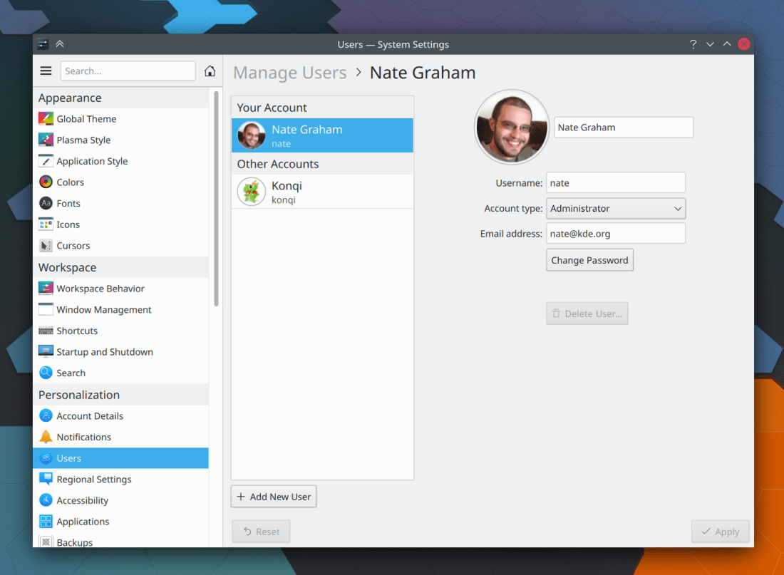
- The System Settings Users page has been rewritten from scratch, which fixes most of the open bugs with the old one (Carson Black, Plasma 5.20.0):
Bugfixes & Performance Improvements
- When a document opened in Okular’s Presentation View is re-loaded on disk, it no longer repeatedly shows notifications about wanting to be opened in presentation view (Arshad Husain, Okular 1.11.0)
- Discover no longer always opens on login when session restoration is in use (Aleix Pol Gonzalez, Plasma 5.18.6)
- The “Apply” button in the System Settings Night Color page is now always active at the correct times (David Edmundson, Plasma 5.19.0)
- The emoji picker window now starts searching as soon as you start typing (me: Nate Graham and Aleix Pol Gonzalez, Plasma 5.19.0)
- Fixed a crash unplugging screens on Wayland (Méven Car, Plasma 5.20.0)
- The Global Menu applet now has the correct hover behavior: you can slide the mouse over to the next menu to close the current one and open that other one (Carson Black, Plasma 5.20.0)
- When using a low-end system with only software rendering available, desktop files and folders now have an outline under their label so that they’re always visible (Bruno Gonçalves, Plasma 5.20.0):

(This is just a fallback; shadows are still used when hardware rendering is available) - System Settings no longer crashes when opening external apps listed in the sidebar, such as openSUSE’s YaST (David Faure, Frameworks 5.71)
- The “Get New [thing]” windows no longer shows error messages twice (Dan Leinir Turthra Jensen, Frameworks 5.71)
User Interface Improvements
- Dolphin’s elision behavior has been refined; it no longer middle-elides long file and folder labels, but rather elides on the right, and always keeps the file extension (if present) visible after the ellipses (Méven Car, Dolphin 20.04.2)
- After taking into consideration user feedback last week about Konsole’s colorized tabs feature, the appearance was adjusted for greater usability and aesthetics (Gustavo Carneiro, Konsole 20.08.0):

- When Discover is loading more results, the “Still looking” label is now positioned properly, and both of the placeholder-style messages that include spinning busy indicators are now consistent in appearance (Aleix Pol Gonzales and me: Nate Graham, Plasma 5.19.0 and 5.20.0):
- Feedback OSDs for things like volume and brightness changes are now more compact so they don’t obscure the main view so much (Kai Uwe Broulik, Plasma 5.20.0):

- The Battery and Brightness applet now has a more comprehensible user interface for displaying apps which are preventing lock and sleep, and allowing the user to override this (me: Nate Graham, Plasma 5.20.0):
- Menu titles/section headers now look the part (me: Nate Graham, Plasma 5.20.0):
- Breeze style tabs are now two pixels taller, making them consistent with the height of buttons and text fields (Noah Davis, Plasma 5.20.0)
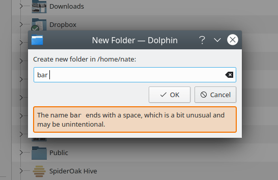
- You’re now warned if you try to create a file with a space at the beginning or end (me: Nate Graham, Frameworks 5.71):
- The mouse icon has been re-done and is now distinguishable against both light and dark backgrounds (Chris Escargot and Noah Davis, Frameworks 5.71):


- SpinBoxes in Plasma can now have their values modified by scrolling over them or clicking/tapping-and-dragging on the number (note: this only affects SpinBoxes in Plasma, not in apps; scrolling is already implemented there and click/tap-and-drag-manipulation will be coming later) (me: Nate Graham, Frameworks 5.71)
How You Can Help
KDE Software is made by people just like you, often on their free time! If you know a KDE developer, send them a kind note. Developers like to put on a logical face but they need love and care too, especially during trying times like these.
More generally, have a look at https://community.kde.org/Get_Involved to discover ways to help be part of a project that really matters. Each contributor makes a huge difference in KDE; you are not a number or a cog in a machine! You don’t have to already be a programmer, either. I wasn’t when I got started. Try it, you’ll like it! We don’t bite!
Finally, consider making a tax-deductible donation to the KDE e.V. foundation.

I am a bit sad about the osd thing, I really like the old design and the s all ones seem like a random shape on the screen
Is it configurable so I can switch back to the big design or is it forced to the small ones?
LikeLiked by 1 person
I agree. The small volume bar looks out of place. For fullscreen applications like video players, I would expect larger UI elements, not smaller ones.
LikeLiked by 2 people
You might expect that from a logical perspective, but we got a large number of complaints about the OSD in full-screen apps. People didn’t like now much of the content was covered up by the OSD.
In the future we might be able to have customizable OSD themes so that people can use whatever style they want.
LikeLike
>In the future we might be able to have customizable OSD themes so that people can use whatever style they want.
+1000 🙂
LikeLiked by 1 person
Kind of agree with this,
maybe could it be made “unobtrusive” only when covering full-screen apps?
LikeLiked by 1 person
Indeed, making them “unobtrusive” only when covering full-screen apps seems to me the right way.
Otherwise I think I like how they were before to clearly see what is being changed.
Also I’m not sure that displaying just the icon is always so intuitive, especially when it’s smaller.
LikeLiked by 1 person
Yeeeeah, Plasma 5.20 is starting to take shape, and what a nice shape.
Yesterday in the evening, I chatted a bit with Aleix Pol via Telegram, and something really beautiful happened, he told me that Wayland sharescreen already works with Chromium/Chromium-based web browsers, so today in the morning, I used Disroot, to use Nextcloud Talk, tried to share the screen with a mate of mine and it worked!!! It “only” allows me to share Firefox or Brave, (I was using Disroot on a Brave tab, obviously), but this is a huge improvement in my personal use case, because I would love to knew much before this was possible. It looks like Wayland is taking better and better shape, and that’s something to be really happy about, at least from my personal point of view.
Other things, I started to file the bugs I wrote the previous “This week in KDE:” post i would do it that day (sorry about the delay), i started with one about Spectacle auto copy to clipboard under Wayland, and i’ll do about 3-4 more, if there’s nothing about that already, of course.
And the last thing I would love to share with you is that Aleix encouraged me (thanks again Aleix) to start with my first patch to KDE, being a really tiny patch to solve the bug i reported about 1 year or more at KDE Bugs, which basically is the inverted of y axis at KDE Connect when you’re using the virtual mouse/touchpad on Wayland session. I already completed it, so I’ll have to compile it with CMake, verify and test that it’s solved and realize the PR on the GitLab, that’ll be awesome, even being such a tiny first patch, but I really hope it’ll become the start of my collaboration to KDE Community, Software, etc, I’m really excited about all this.
To finish, as always, I would love to say a huge thank you, to everyone, you really do something that matters and impact us, you really do amazing software, an amazing and terrific community and much more things, which really give me happiness, so that’s it, a huge thank you for you :).
You really rock a lot!!
I really hope you’re everyone fine, healthy, you and of course your beloved ones, your friends, your family, etc.
I send you a huge, warm, sincere and virtual hug to everyone ^^.
LikeLiked by 1 person
Have to agree with how far the wayland session is coming along. My only obvious papercuts are no highlight to copy clipboard and rdp sessions in KRDC open in new window of xfreerdp, which I believe is an architectural problem with embedding a window inside another. Oh and no DRM Leasing support yet for SteamVR.
We’re so close
LikeLiked by 1 person
Yeah, the clipboard is really close or almost finished (I hope I’m not saying anything I shouldn’t xD), at least, that was what Aleix told me.
Wait, maybe it’s “only” about KDE Connect :?.
I can almost feel being at Wayland session without suffer any lacking or issue.
I will report if it’s not reported yet, one of the most annoying issues I suffer quite often under Wayland, “the mouse input bug when I try to drag & drop a Firefox/Brave tab”, whenever I try to do that, that instant, the interaction of the mouse click, mousewheel or any other thing, apart of moving it in the screen, being unable to interact with anything, man, that’s so annoying.
I really think and hope you’re right mate, I almost can sense it, we’re almost there.
Bests Matt ^^.
LikeLike
That’s great! Starting to fix the issues that are annoying is incredibly empowering and I look forward to seeing what you come up with!
LikeLiked by 1 person
Thanks for making the OSD changes! This will make a big difference when watching videos on the laptop. Would be nice to have some configurability of orientation, size, position, etc., but a great start.
LikeLike
Konsole tabs’ colors now look much better!! Thank you!! 🙂
Question: Could one make the colors scriptable? Like “Remote Session = Green”, “Local session = blue” or whatever?
LikeLiked by 2 people
“This is just a fallback; shadows are still used when hardware rendering is available”
Would be great if it was a user option — prefer an outline and have modified the files, personally.
LikeLike
I prefer the first version with the colored backgrounds if I can choose the colors of the backgrounds myself instead of the colored underlines, but I would be happy too if a user option would exist to choose which version you prefer.
Also what Steffen said, with different colors for local and remote sessions would be very nice.
And if they want to add more different colors depending of what is happening in the terminal, I would want also to add 2 different colors for the exit code of a command.
Right now I have modified my PS1 variable to display a smiling or sad emoji face depending of the result of the previous command.
But let’s think about the following use case:
Start in Tab 1 a long running command or process, let’s say copy recursively a large folder.
Start in Tab 2 working on something else while waiting for the command in Tab 1 to finish.
Instead of losing time to continuously checking every few minutes if the command in Tab 1 finished by switching to it and back, it would be very nice if the Tab 1 color’s would change accordingly to the exit code.
If we use tree colors, we can say:
Yellow while the command is in progress (coping the folder is still running).
Green if the command exited successfully (copying the folder succeeded).
Red if the command exited unsuccessfully (copying the folder failed, because of no more space or something else).
Blinking Yellow or Grey if the command paused to ask for superuser password or another question
LikeLike
> But let’s think about the following use case:
> Start in Tab 1 a long running command or process, let’s say copy recursively a large folder.
> Start in Tab 2 working on something else while waiting for the command in Tab 1 to finish.
Until then you could do something like
> cp -r a b; notify-send –expire-time=0 “Konsole” “Copy job finished – $?”
or make it even more complex.
LikeLiked by 1 person
I’m very glad that the Free space notification will appear from now on.
i had to reinstall Kubuntu 3 times at least because I ran out of space and the whole system could not be booted all.
X server refused to start because it could not write something somewhere, like something to a log file.
I have never seen such a problem on Windows when you remain out of free space in C: partition.
I was wondering myself why I didn’t see the free space notification like before and had no idea that I have not seen it because I have started to use a separate /home partition, which was because when I had this problem the first time I decided to use the separate /home partition to quickly get back the OS in a working state after reinstall.
I’m glad this is fixed!
LikeLike
About “The Free Space Notifier”:
-Will it be possible to switch from MiB to GiB when the free space can be divided by 1024, or maybe show something like “MiB (GiB)” or “GiB (MiB)”
-Will it be possible to configure the levels at which it warns?
LikeLiked by 1 person
A lot of great improvements, but I was worried about the new sound/brightness notification icon. I absolutely hate the simple, boring and ugly, simple slider like on Windows. On the example above it looks just ugly and primitive as if you were using LXQt or i3 or even old looking XFCE. I always loved the big, cool and nicely looking icons, and they never bothered me, because they show just for a short moment.
So for me this is a huge regression.
I hope there will be a way to personalize this so even if breeze will keep it ugly, boring and simple, other themes will keep it attractive and noticeable, or there will be a way to decide the style (minimalistic and full icon).
LikeLiked by 2 people
Well, I’m one of many people bothered by the old design. I think it’s clunky and way too big. And there’s nothing genuinely interesting to it, it’s just one massive, very simply icon.
And I timed it, it shows for well over 2 seconds (from first button press to vanishing) – which doesn’t seem like much, but if you’re watching a movie, *a lot* can happen in 2s, especially in the middle of the screen. So I, for one, am very thankful for this patch. (and to me it could be even smaller at the very edge of the screen, without the audible feedback for volume control – as unobtrusive as possible).
LikeLike
What are/were the reasons of migrating to GitLab?
LikeLike
Perceived friendliness to new contributors, integrated CI that works well, path towards migrating away from Bugzilla, more responsive upstream developers, easier patch merging workflow.
LikeLike
Couldn’t Keyboard and Mouse icons change from light to dark color on the base of the chosen theme?
LikeLike
It could. But in general for colorful icons, we prefer to make them look good no matter the color scheme, rather than tailoring them for light or dark colorschemes.
LikeLiked by 1 person
So you could preserve the dark theme for those input icons in general light theme such as Breeze, and the light icons for the general dark theme such as dark Breeze. The dark theme of the mouse is really good.
LikeLike
Thanks for the hard work. Typo here: You’re now warned if you try to create a file with a space at the beginning OR end (me: Nate Graham, Frameworks 5.71):
LikeLike
Thanks, fixed!
LikeLike
About the “You’re now warned if you try to create a file with a space at the beginning of end”: if the screenshot is representative of what the thing really looks like, it shows no quotation marks for the file name. Those would be of great help in clarifying what the name being input is, though, and I highly recommend including those for better clarity!
LikeLiked by 1 person
I thought the same. At first I thought there was a typo seeing the double spaces after the filename. Maybe it is also not necessary to display the filename in the info box. That might reduce redundancy.
LikeLike
Wow, lot’s of great improvements here! Thanks always for the consistent community reporting you do! I look forward to this every week.
I can see from some others who think the old OSD’s were visually more pleasing, but practically, I have to say that making them smaller by default is better for me. I didn’t even realize until this bug was fixed at how much it annoyed me that the indicators were so large and obtrusive when I was watching a video. So although it’ll take me a bit to get used to their appearance, it’s a win for me.
LikeLike
Nice to see you moving to GitLab. I hope migrating from Bugzilla won’t take too long and will not cause problems.
Having everything in one place will hopefully increase the ease of following development and related issues. Not sure whether this will also replace Phabricator (I hope so). I did not really get the separation of Phabricator tasks and issues. To me all seemed like issues and having them separated was creating some sub space making it harder to see the connections between those. At least for the GitLab team it seems to work pretty well not distinguishing between “user” issues and “developer” issues.
LikeLike