This week we have a lot of large and impactful user interface improvements across multiple apps and Plasma, not to mention progress on the big bugs!
New Features
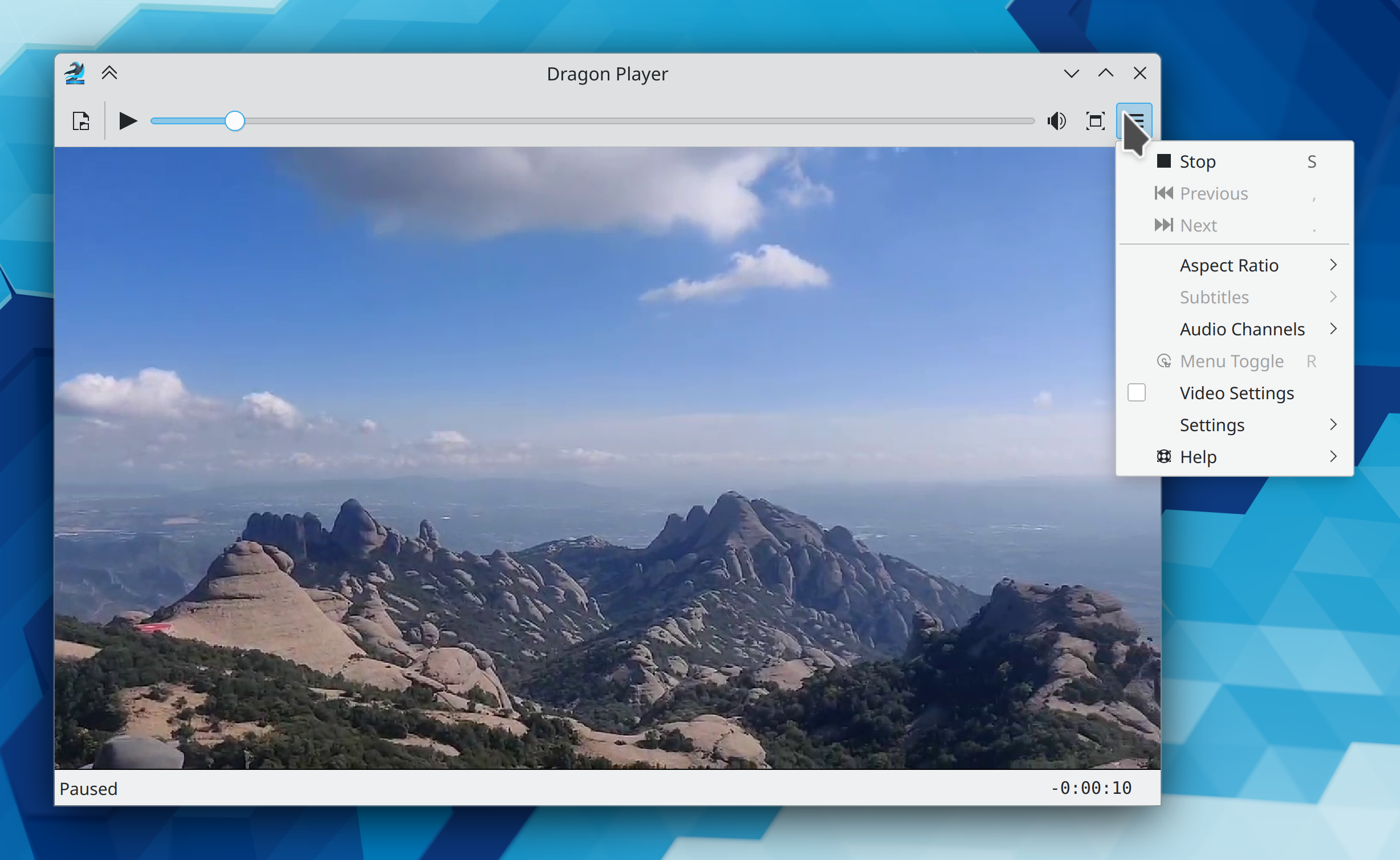
Dragon Player–KDE’s venerable minimalistic video and audio player–has undergone a major UI overhaul, including adopting KHamburgerMenu and a welcome screen, a streamlined and more intuitive set of default toolbar buttons, and less glitchy behavior when opening videos in the Plasma Wayland session (Harald Sitter, Dragon Player 23.04, Link 1, link 2, link 3, link 4, link 5, and link 6):
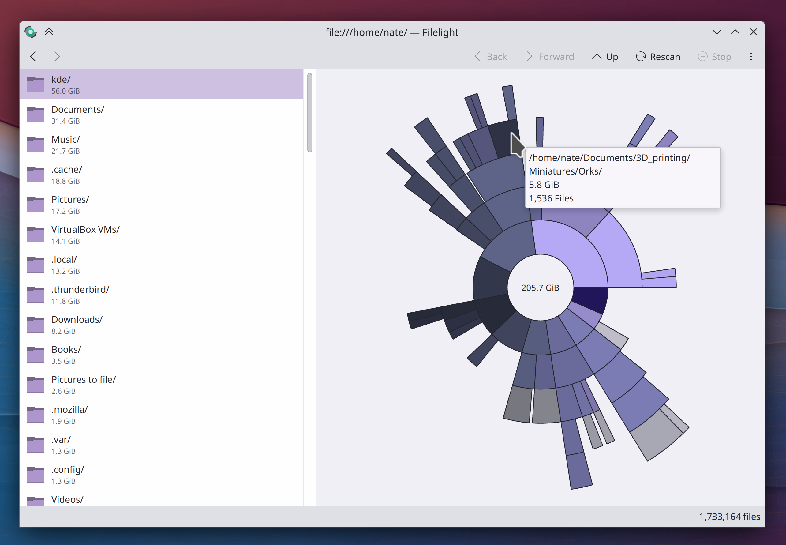
Filelight now has a list view on the left side of the window, providing a simple text-based method of viewing size information. This also fixes multiple bugs with the tooltips and eliminates blurriness in the radial graph view! (Harald Sitter, Filelight 23.04. Link):
Ark now supports extracting Stuffit .sit archives (Elvis Angelaccio, Ark 23.04. Link)
There’s now a new “Touchscreen” page in System Settings that lets you disable touchscreens and choose which physical screen their input gets mapped to (Nicolas Fella, sponsored by TU Dresden, Plasma 5.27. Link)
In the Plasma Wayland session, screens now get a default scale factor that more appropriately matches their DPI, based on what kind of device they are (me: Nate Graham, Plasma 5.27. Link)
You can now autostart apps multiple times (e.g. to launch multiple instances of it) and it also shows you the paths where autostarted scripts live (Thenujan Sandramohan, Plasma 5.27. Link)
You can now configure Folder View to show hidden files if you want (Willyanto, Plasma 5.27. Link)
System Settings’ Drawing ‘Tablet’ page now lets you map physical buttons on your drawing tablet’s pen to keyboard shortcuts (Aleix Pol Gonzalez, Plasma 5.27. Link)
User Interface Improvements
When you unlock the screen by providing your fingerprint, you no longer have to redundantly click an “Unlock” button afterwards (Janet Blackquill, Plasma 5.26.4. Link)
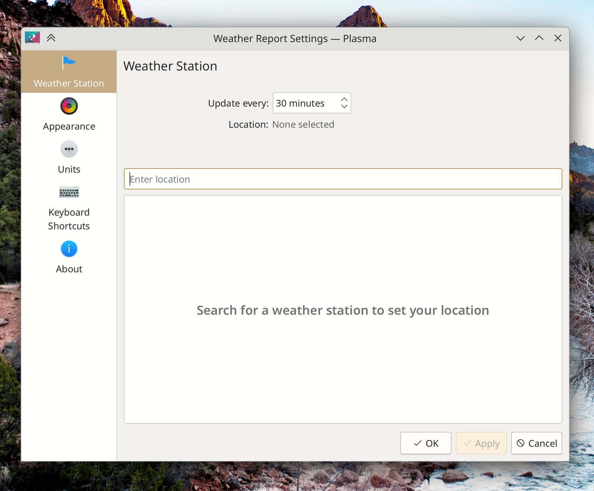
The way you choose or change a location in the Weather widget is now simpler and more direct (Ismael Asensio, Plasma 5.27. Link)
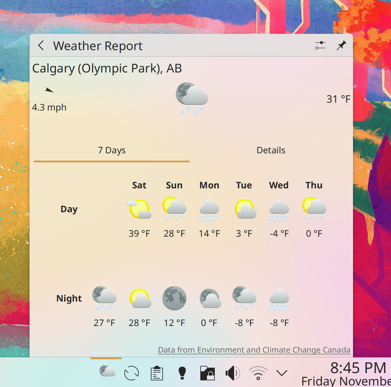
When using the Canadian weather provider, the Weather widget’s layout is now much better and clearer, and no longer sometimes gets visually cut off (Ismael Asensio, Plasma 5.27. Link):
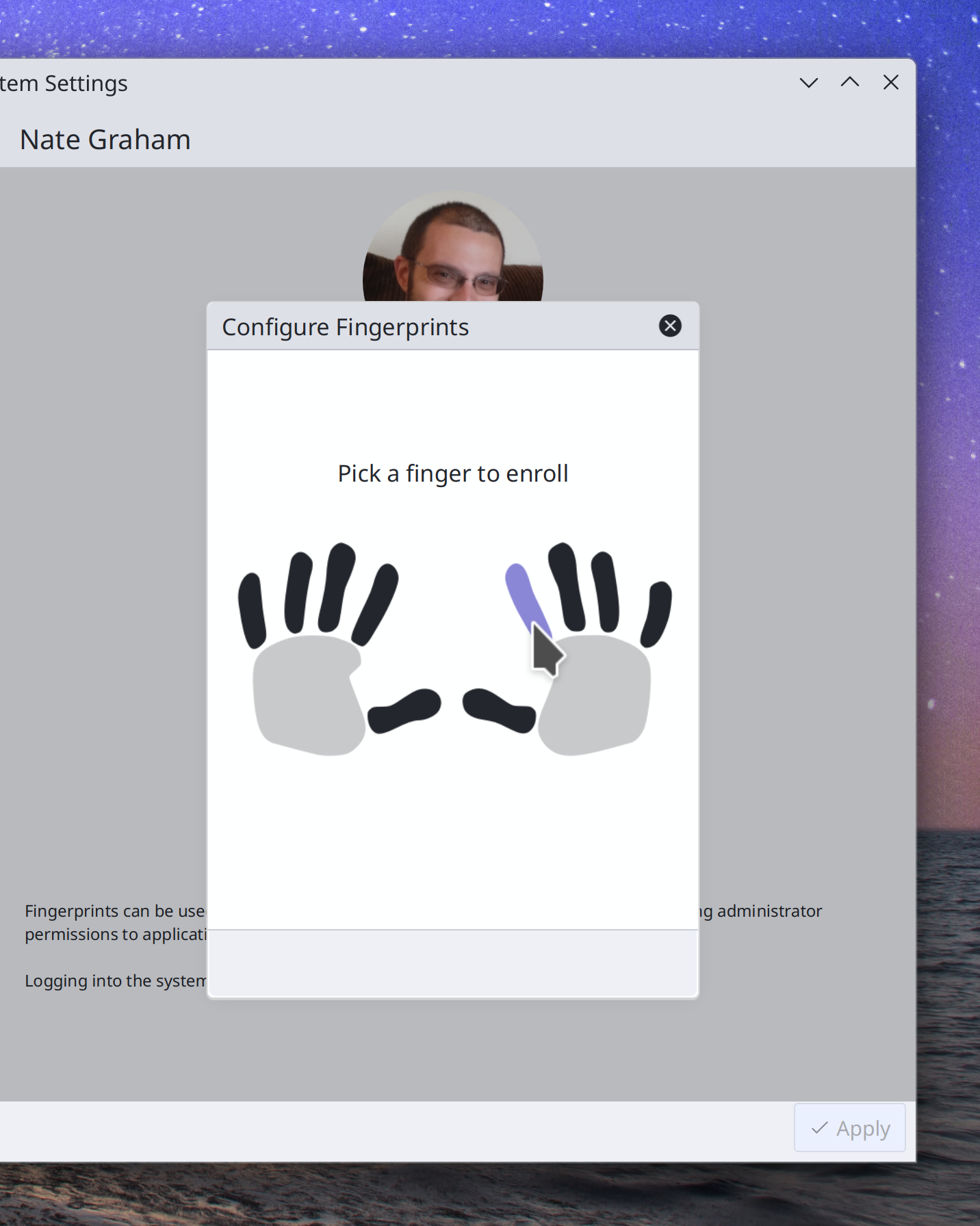
On System Settings’ Users page, the way you choose fingers to use for fingerprint authentication is now much more visually intuitive. In addition, you can now un-enroll individual fingers, and when you change your password, you’ll no longer see the “passwords don’t match” message until after you click the “Set Password” button, or a few seconds after you stop typing (Janet Blackquill and Devin Lin, Plasma 5.27. Link 1, link 2, and link 3):
On System Settings’ Display Configuration page, screens are now required to be touching and not partially overlapping, which prevents various weird bugs from being able to happen (David Redondo, Plasma 5.27. Link)
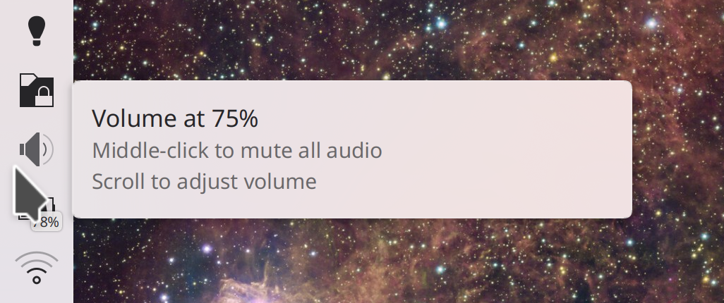
The Audio Volume widget’s tooltip no longer unnecessarily tells you that output is playing on “Speaker” when there’s only one output device, and instead mentions the fact that you can scroll over the icon to change the volume (me: Nate Graham, Plasma 5.27. Link 1 and link 2):
Breeze-themed Plasma popups now have a larger corner radius that matches the corner radius for windows (Niccolò Venerandi, Frameworks 5.101. Link):
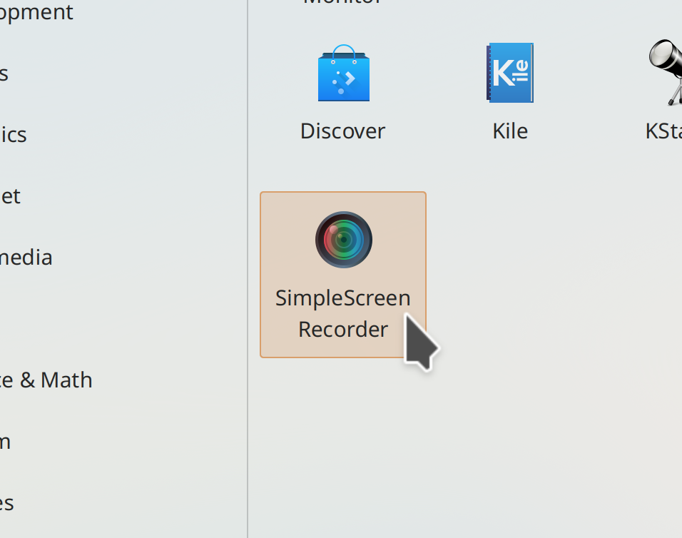
The Breeze Icon theme now includes a themed icon for SimpleScreenRecorder (Manuel Jesús de la Fuente, Frameworks 5.101. Link):
Significant Bugfixes
(This is a curated list of e.g. HI and VHI priority bugs, Wayland showstoppers, major regressions, etc.)
In the Plasma Wayland session, tapping a touchscreen after disconnecting an external screen no longer crashes KWin (Xaver Hugl, Plasma 5.26.4. Link)
Plasma notifications no longer have inappropriately sharp top corners (Niccolò Venerandi, Plasma 5.26.4. Link)
In the Plasma X11 session, disabling compositing no longer leaves an empty area around Plasma Panels (Niccolò Venerandi, Plasma 5.26.4. Link)
Searching using the KRunner-powered search in Overview no longer sometimes crashes KWin (Alexander Lohnau, Plasma 5.27. Link)
Landed a better fix for the problem of maximized XWayland apps sometimes having a one-pixel empty border on the right screen edge in the Plasma Wayland session (Aleix Pol Gonzalez, Plasma 5.27. Link)
Other bug-related information of interest:
- 6 Very high priority Plasma bugs (down from 10 last week). Current list of bugs
- 47 15-minute Plasma bugs (down from 50 last week). Current list of bugs
- 152 KDE bugs of all kinds fixed this week. Full list of bugs
Automation & Systematization
Added some autotests surrounding Plasma wallpaper loading and assignment (Fushan Wen, Plasma 5.27. Link)
Added some autotests around the KFileFilterCombo UI component (Nicolas Fella, Frameworks 5.101. KFileFilterCombo. Link)
Changes not in KDE that affect KDE
In QtQuick-based apps, scrollable views where all content fits horizontally no longer shows a pointless horizontal scrollbar anyway. We had previously worked around this bug in most KDE apps, but now it’s fixed upstream so we don’t have to anymore! (David Redondo, Qt 6.4.2, but backported to the KDE Qt patch collection. Link)
…And everything else
This blog only covers the tip of the iceberg! If you’re hungry for more, check out https://planet.kde.org, where you can find more news from other KDE contributors.
How You Can Help
If you’re a developer, check out our 15-Minute Bug Initiative. Working on these issues makes a big difference quickly! Otherwise, have a look at https://community.kde.org/Get_Involved to discover ways to be part of a project that really matters. Each contributor makes a huge difference in KDE; you are not a number or a cog in a machine! You don’t have to already be a programmer, either. I wasn’t when I got started. Try it, you’ll like it! We don’t bite!
Finally, consider making a tax-deductible donation to the KDE e.V. foundation.

Hi Nate thx for the clear overview again. Am I correct that the 5.27 audio widget will present me with THREE lines of text whenever I change the volume, of which 2 lines are advice you need to see only 1 time? Or is that some special newby mode you are showing?
LikeLike
So what ? it’s important that such features are discoverable to the user.
LikeLiked by 2 people
In my experience of putting KDE on regular people’s laptops, they need a lot of repeated explaining of the features. They are not experts like you and I who read technical blogs and who have a rich history of incremental knowledge. Regular users need to have things repeated to them often before it sticks. I applaud having the note in the pop-up that actually tells you how to interact with the icon, instead of never knowing about it at all. Not an issue to me and the people I train.
LikeLiked by 2 people
Michael, I’ve had the same experiences with normal people and hidden features.
We often significantly overestimate users’ levels of skill and interest in computer systems. I think it’s helpful for us to keep in mind the study results I talked about in https://pointieststick.com/2021/11/29/who-is-the-target-user: that 40% of adults in rich countries either cannot use computers at all, or else can only use them for exceptionally simple and obvious tasks. That’s not to day that these people should necessarily be our target market (getting everyone else would still give us a theoretical market share cap of 60%, which is pretty good!) butit’s a good reminder of just how important it is that features are discoverable.
LikeLiked by 1 person
Nate, thanks for bringing up that blog post again, it’s worth the refresh of that study and your quote, “Taken together with the two lowest-skill groups, this means 70% of people’s computer skills are non-existent or very basic” needs to be repeated often.
LikeLiked by 1 person
People let’s not kid ourselves. Normal people buy a laptop with windows installed. They cannot, by definition of normal people, install KDE/plasma. So the only `normal` and computer illiterate persons that use KDE/Plasma are the mothers etc of someone knowledgeable who installs AND maintains it for them. In other words, who do you think the target audience for KDE/plasma is? They are people who like to tinker with the myriad of settings that normal people abhor. This is fully know and supported by the developers, who add ever more settings. And there is nothing wrong with this. However what is wrong is to pretend normal people are using KDE and should have a front-row seat in terms of discoverability. So I maintain that you are alienating your actual target audience with these tips that are never read by the normal people who need them, since they are not using KDE/plasma in the first place.
LikeLike
Indeed, normal people buy a device with an OS pre-installed, and never change it. That’s exactly why I’ve been hammering so hard on getting KDE software preinstalled on more hardware! It’s really the only way we can achieve any meaningful growth beyond our tiny niche, besides getting more corporate and institutional deployments.
But I want to push back on the notion that KDE software is only suited for nerds and tech professionals, and that making it more user-friendly alienates them. Not only does this perpetuate the harmful stereotype that nerds and pros prefer user-unfriendly software, but the Steam deck directly refutes it and bolsters my case for more pre-installation and more user-friendliness. Gamers are generally not super techy people these days. They might have been in the 80s, but that era is long gone. Today gamers just want to play games, and appreciate user-friendliness so they can have more time with the game and less configuring the system. And gamers love SteamOS with Plasma! The reviews of the Steam Deck’s Desktop Mode are overwhelmingly positive.
For the past few years, we’d been working tasks provided by the Valve folks to make things more user-friendly and suitable for gamers. Has this alienated the traditional userbase? Far from it; there is no evidence that KDE’s traditional users are abandoning us in favor of… what exactly? Tiling window managers? TUIs? On the contrary, our traditional userbase loves us and is expanding; all indications are that the KDE universe is growing to include disaffected pros coming from Windows and macOS.
The name of the game here is making the UI elastic through good design so that it can seamlessly accommodate users of many skill levels, which I outlined in https://pointieststick.com/2021/11/29/who-is-the-target-user. This isn’t just possible, but it’s necessary… and already happening… and already improving the software as evidenced by increasing attractiveness to both users and hardware vendors.
LikeLiked by 1 person
I do not think that KDE is only suitable for nerds, although I consider myself to be one :-). (But from what I read it will not be selected by people who just want a strong focus on their work and the user interface to get out of the way). And if you say that also for these people KDE should become more user friendly, of course I have to agree – because the statement is very generic. I think that, more specifically, we have a difference of opinion on what user friendly means. I do not want to suggest to go the gnome way because I truly believe GNOME went too far with the simplification. But I would like to see some ‘dictatorial’ KDE user guidelines based on the identification of specifically targeted user groups (real-world audiences), so there is a global guidance that does not depend on whatever changes a paying company wants or what any particular developer wants. In these guidelines I strongly feel there should be something about KDE being efficient — my definition, not about wasting computer cycles, but wasting screen estate (like the calendar, the start menu and the excessive whitespacing do now – I do not use KDE on a touch monitor) or distracting the users attention with visual noise and notifications. It is in this sense that you should see my remark – I am truly abhorred by ‘helpful’ interfaces that provide unnecessary advice, be it in the car or on my desktop. As an indication, what System 76 is doing appeals more to me than what is happening with the change we are discussing.
Anyway, I want to conclude this discussion by thanking you and the other developers for making KDE greater than it was (great again?) and I hope that it will become even more streamlined and out of the way than it already is! This week I am building a new computer moving from my 2500K and it will feature KDE.
LikeLike
We’re definitely not proposing to go all GNOME-style. Plasma’s motto is “Simple by default, powerful when needed” and the point is to put more effort into the first part. Plasma and KDE apps are already very powerful when needed, but sometimes they are also complex by default. That’s what we’re fixing. It’s possible to have both with good design.
Becoming more independent of 3rd-party companies is also actively happening in the form of the KDE e.V. hiring community members itself, to provide a core of developers independent of outside financial interests.
Regarding your specific wants (fewer notifications, greater information density, energy efficiency), I think the best course of action is to get involved and become an advocate for these points of view! KDE is still largely volunteer-driven, especially in matter of basic design, so even a single person can have a large impact.
LikeLike
The “configure fingerprints” box with the tribal styled caveman-art hands could benefit from some design discussions. Other than that, this all looks damn good. That Harald guy is on fire!
LikeLike
Yeeeahhhhhhhhhh I know the hands are a bit caveman-style. But we figured it would be best to get the UI improvement in sooner, and then the designers and artists can improve the hand and finger graphics later. Contributions are highly welcomed here.
LikeLike
With reference to “Configure Fingerprints” popup (and also visually similar popups shown by Discover):
These popups visually feel totally alien to the parent window. The white background and the empty footer, header too large, etc. make it visually off from the whole nice looking Plasma theme.
May be its worth to have uniformity in popup, probably by visually mimicking the Dialogue box (like file delete from dolphin, etc) aesthetics for these “Configure Fingerprints” like popup.
KDE team is doing greate job, and i using from many years. It is just if the visual uniformity is taken care right from the start (e.g. how the various popup (varieties) should look irrespective of the application it launches and how it should visually adhere to the plasma aesthetics) for every element then its not far for KDE to reach the level Gnome’s visual aesthetic and uniformity.
LikeLike
Separate window dialogs suffer from their own issues: they can get opened behind the parent window, they can lose their visual connection to their parent window, they can be opened up far too small and have their titlebar text cut off, they include unnecessary, redundant, or harmful UI elements (titlebar icon, titlebar close button, and minimize button, respectively), and they’re they clutter up your Task Manager while open.
It’s not perfect, but overall we’re moving towards more of these in-window dialogs, rather than fewer, because they resolve all of those issues. Yes, they introduce a few new ones in the process, such as the inability to move them away from what they’re covering up, and some visual issues when used in System Settings where only part of the view behind them darkens. These issues will eventually be fixed, or at least fixable.
In the specific case you’re talking about, the empty footer is a simple visual bug with just that popup that we’ll fix.
LikeLike
Technically, that’s like saying “UnRAR (.rar) archives” or “PKUnZip (.zip) archives”.
StuffIt was the name of the format and the paid product to create them, while “StuffIt Expander” was the extraction-only freeware tool they offered.
(Speaking of which, I bought some copies of StuffIt and put up a repo of test files with CC0 (i.e. public domain) contents if you need something to add to your integration tests: https://github.com/ssokolow/stuffit-test-files/ )
LikeLike
Oh that’s cool, thanks!
LikeLike
Well alright! Dragon Player is getting some love!! I use it all the time, I like its simplicity. Also great to be able to see the paths where autostarted scripts live in the UI; and kudos for “Breeze-themed Plasma popups now have a larger corner radius that matches the corner radius for windows” 👏 Way to go, devs!
LikeLiked by 1 person
there is already a touch screen kcm from plasma-workspace. won’t it be confusing to have a second kcm of similar name? maybe change the name of old touch screen kcm to something like screen swipe in behavior.
LikeLike
Yep, we did that too, precisely to avoid the confusion you’re worried about.
LikeLike
Wow I didn’t know I needed all these fixes and new features listed here! That will be nice to have.
Wayland session is getting more and more polished, the only things that hold me off it are Conky’s weird look when using scaling, and inability to customize touchpad gestures.
Speaking of Plasma in general: the lack of integration of input methods makes it so harder to use than Gnome.
But I believe that Plasma will get there – slowly, but inevitably.
LikeLike