This week we have yet another interesting new user interface feature to talk about. The old “What’s This?” feature has been re-worked as a shiny and new user interface convention we’ve come up with: expandable tooltips! Many tooltips in KDE apps that use the KXMLGui and Kirigami frameworks now have a little label saying “Press Shift for more”, and if you do so, it will show you the longer text. This makes the feature much more useful since it’s invokable right at the point where you would need it. Big thanks to Felix Ernst for this work! It will land in Frameworks 5.84.
Other new Features
You can now hold down the alt key to drag underlined files from Konsole into other apps for various purposes! (Tomaz Canabrava, Konsole 21.08)
Bugfixes & Performance Improvements
When an overlay is active in System Monitor, clicking on a different page in the sidebar now closes the overlay before navigating to the clicked-on page (Arjen Hiemstra, Plasma 5.22.1)
Deleting a page in System Monitor now removes it immediately even if you were in that page’s Edit Mode when you deleted it (David Redondo, Plasma 5.22.1)
Fixed a recent regression about Task Manager tooltips not properly updating their header text when the window’s title changes (Henri Chain, Plasma 5.22.1)
Autostarted applications listed in System Monitor no longer display the wrong icons (Nicolas Fella, Plasma 5.22.1)
Fixed various rendering glitches when using the Vulkan graphics system (Xaver Hugl, Plasma 5.22.1)
The “Dialog Parent” effect that dims windows behind dialogs no longer flickers when the dialog is closed (Vlad Zahorodnii, Plasma 5.22.2)
Discover no longer notifies you constantly about updates even when there are none (sorry about this regression) (Aleix Pol Gonzalez, Plasma 5.22.2)
When Plasma is restarted–either manually or automatically because it crashed–various Plasma-related shortcuts such as the Meta+number keys to activate Task manager items no longer stop working (David Edmundson, Plasma 5.22.2)
In the Plasma Wayland session, the cursor is no longer briefly invisible after a screen wakes up (Xaver Hugl, Plasma 5.22.2)
One specific text label on the System Settings Virtual Desktops page (you know which one I’m talking about) no longer gets inappropriately elided when there’s still plenty of space (me: Nate Graham, Plasma 5.22.2)
In System Settings’ Login Screen page, the sheets that appear for syncing settings and changing the wallpaper now disappear after you use them, providing confirmation that the action that you triggered succeeded (me: Nate Graham, Plasma 5.23)
Tooltip shadows throughout Plasma no longer have a broken appearance in their corners (Marco Martin, Frameworks 5.84). Popup/dialog/OSD corners still have problems, but we’re working on that too.
User Interface Improvements
For a cleaner appearance, Gwenview’s sidebar is now hidden by default, and its visibility is now a global setting rather than a per-mode setting; when you show it, it will now stay shown, and then when you hide it, it will now stay hidden (Felix Ernst, Gwenview. 21.08)
Gwenview’s display of tags in the sidebar (when it is visible) is now prettier (Noah Davis, Gwenview 21.08):
Gwenview no longer uses the space and backspace keys for navigation by default, to prevent the space key from conflicting with the play/pause action when you navigate to a video. To navigate between items, just use the arrow keys (me: Nate Graham, Gwenview 21.08)
Konsole’s split view feature will now snap split dividers to the location of other dividers when you drag them (Tomaz Canabrava, Konsole 21.08)
Clicking on any of the buttons for bold, italic, etc. in a Sticky Note widget no longer de-focuses the text area (me: Nate Graham, Plasma 5.22.1)
Discover no longer shows you a notification telling you that an offline update succeeded, because if you’re able to see it, of course it did! (me: Nate Graham, Plasma 5.22
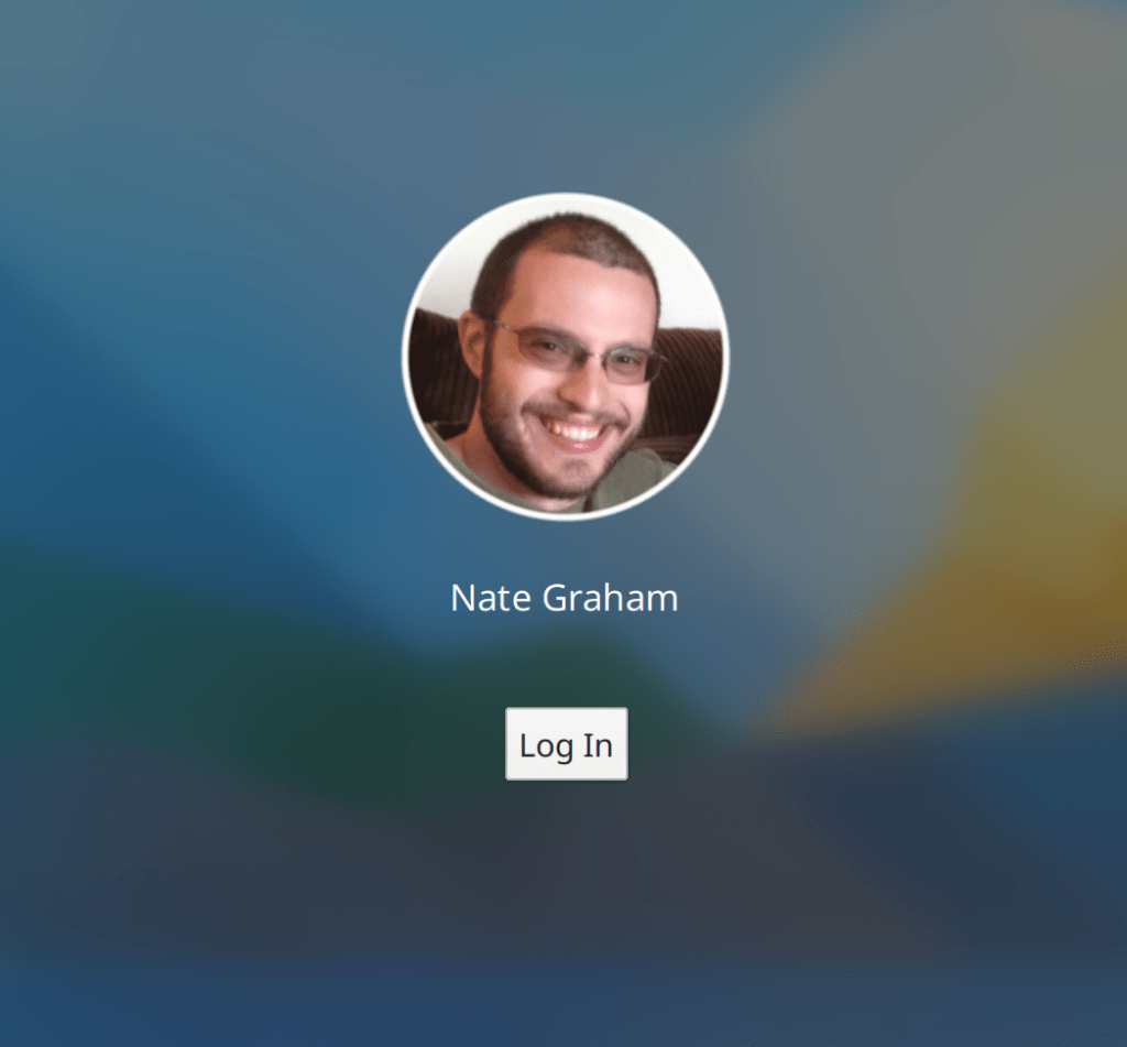
The Breeze SDDM theme now shows a more appropriate UI for accounts with no password set but auto-login turned off (Tadej Pecar, Plasma 5.23):
The clipboard now remembers 20 items by default, up from 7 (Felipe Kinoshita, Plasma 5.23)
Grid items throughout System Settings and the wallpaper choosers no longer lighten the content area when you hover the cursor over them, so that it is always presented accurately (me: Nate Graham, Frameworks 5.84)
…And everything else
Keep in mind that this blog only covers the tip of the iceberg! Tons of KDE apps whose development I don’t have time to follow aren’t represented here, and I also don’t mention backend refactoring, improved test coverage, and other changes that are generally not user-facing. If you’re hungry for more, check out https://planet.kde.org/, where you can find blog posts by other KDE contributors detailing the work they’re doing.
How You Can Help
Have a look at https://community.kde.org/Get_Involved to discover ways to be part of a project that really matters. Each contributor makes a huge difference in KDE; you are not a number or a cog in a machine! You don’t have to already be a programmer, either. I wasn’t when I got started. Try it, you’ll like it! We don’t bite!
Finally, consider making a tax-deductible donation to the KDE e.V. foundation.

Great work as usual. Thanks! 😀
LikeLike
You’re welcome!
LikeLike
I like the sound of this already. Just like the old question mark button (“what’s this”) from Windows, but much better.
It would be nice if there was an easy way to do this in regular Qt apps.
LikeLike
Honestly, “What’s this?” is an ancient relic from the 90s and needs to be removed. If some UI element is not self-evident, it should be reworked. If a one-liner in the tooltip isn’t enough to describe it, it should show a fully advanced tooltip right off the bat, no need to hide it behind yet another button press.
I think there’s a reason you don’t see those in Windows anymore (pretty much since the XP days) and I doubt MacOS and Gnome have it either. The reason is pretty simple: Almost nothing that could warrant a What’s this? in UIs actually has one defined. Either because the information was already crammed in the tooltip already, the element is self-explaining, or the explaining label was put somewhere near the element in a permanent label (or help link) due to the complex nature of it.
To put it differently, if it warrants a What’s this? it’s bad UI smell.
And lastly, I highly doubt the kind of users this is designed for even use it in the first place.
LikeLike
I don’t think I completely agree with this.
People have different levels of knowledge. Many advanced features will be *simultaneously* “dumbed down like GNOME always does” to one set of users, while still “not yet self-evident enough” to another set of users.
Now I do agree that “Terminal (F4)” is a bit useless right now, and could say “Show a terminal panel (F4)” instead. But I don’t agree that it should immediately show the full multi-paragraph text: for those who already know what a button does, immediately appearing /huge/ tooltips are distracting and annoying.
On the other hand, for those who have no idea what it does, “What’s this” and “Tell me more” could help discover new features that they might begin using daily, without having to dig deep into a nerd glossary.
LikeLiked by 1 person
Yes, showing the whole text immediately would be super overwhelming and annoying for the people who don’t need that level of detail–generally everyone who’s at least a little bit familiar with the system. It’s really intended for users who are very new to the app or one of its features.
LikeLiked by 1 person
Maybe you are right, but in between I think it is a useful feature right now.
LikeLike
Jan, while I totally agree with everything you wrote, I honestly don’t think that your comment relates to what Nat showed in his blog post. This is not about those little “What’s this?” buttons that we all remember from Windows XP. In the little video that is embedded in this post we see an ordinary toolbar button with a short tooltip, which I think is quite helpful for a user who does not immediately know what the button is for. And for those wondering “do I need the terminal???”, pressing SHIFT is a very easy way to get more information. If the entire text was displayed in the tooltip in the first place, I reckon it would get annoying pretty soon.
Yes, this is not for us power users (who’d just press F4 in Dolphin anyways and not bother about buttons and tooltips). But I for one have several family members on KDE neon that are “ordinary” computer users, and yes, I think for them it’s something that makes the computer less intimidating.
Just my 2 c, but I like this.
LikeLiked by 2 people
There are things that may need a little explanation – not because the UI is bad, but because some things require some kind of knowledge.
Think of the Tooltip as a kind of “interactive man page”…and for that purpose i REALLY dig Felix’ approach!
LikeLike
Indeed, I think it was a very creative solution!
LikeLike
Nice improvements, as always! Regarding the SDDM theme, “Log in” is the only action possible here, or at least the one that will be performed 99 times out of 100. Why such a small button, with tiny margins ? Wouldn’t something bigger and more obvious be more appropriate here ? It would also be great if this could be easily activated with keyboard (either Enter, Esc or both).
LikeLike
… and it would be great if the login button fit the other buttons (like poweroff, restart, etc). It appears alien on the page. 🙂
LikeLike
Yeah, it’s a bit small. Merge requests are welcome. Making it bigger is quite a simple change. A good entry point!
LikeLike
With all these IMPROVEMENTS have you yet to get around to a) Having Separate WALLPAPERS for each Virtual Desktop B) Allowing the USER to add separate Widgets to Each Virtual Desktop just as you were able to do back in say KDE 4.7 and above before you made a mess of everything with KDE 5.x?? The two features that that USERS have been wanting and waiting forever for. If you have ALREADY corrected this problem, would you PLEASE share how you do it? In 4.18 You went into System Settings –> Workspace Behavior –> Virtual Desktops –> Check the box that says, “Different Widgets for Each Desktop” . At least that straight forward way *WAS* the way it was done in KDE 4.7+ There was also You Tube video documentation that showed you HOW things were done in KDE 4.7+ Another thing that is lacking in KDE 5.x and you are now at what? KDE 5.22.2?!? When are you guys going to start LISTENING to what yours USERS want?!? Where are the YouTube Videos?!? Every video I’ve seen is a RUSHED PRODUCTION. Is there a way to have a DIFFERENT WALLPAPER in EACH VIRTUAL DESKTOP? If so HOW?!? Where is the DOCUMENTATION or in the ABSENCE of that WHERE ARE THE STEP-BY-STEP YOU TUBE VIDEOS? Sigh! I suspect there is no way that these two SIMPLE THINGS that were accomplished in KDE 4.7 + and perfected in KDE 4.14 are present in KDE 5.22.2. SAD!!! KDE 5.x is nothing but a Hot Mess. Maybe by the time KDE 6.0 launches the people are directing the project will start to LISTEN to the USERS. Instead of adding NEW FEATURES that few people are going to use, and then having to stomp out endless BUGS, how about adding back features USERS ACTUALLY WANT such as 1) being able to add different wallpapers to EACH Virtual Desktop and allowing people to add different Widgets to EACH Virtual Desktop 2) If you are going to screw around with the way these things get done then by God SHOW US HOW TO DO THEM EITHER THROUGH DOCUMENTATION OR CLEAR STEP-BY-STEP YOU TUBE VIDEOS. Most orf what is out there is pure GARBAGE as it is 1) RUSHED 2) Hardly CLEAR 3) Seem to be “REVIEWS” rather than INSTRUCTIONS on HOW TO USE THESE FUNCTIONS that you think are so GREAT, Yet for which you are still stomping on BUGS.
Oh well I suspect this will garner me (and other people like me who have been asking for the exact same things) another one of your pointless comments — pointless because YOU and your devels are not adding the features WE want and have been REQUESTING ever since KDE 5 first came out, but which are still ABSENT. If these now ARE Present (doubtful) then your documentation team has done a POOR JOB of showing USERS HOW TO A) ACCESS and B) How to USE these features. I’m now going to crawl buck under my rock and stick my head out the next time you start bragging about the great new UI. Until you add back the two features such as 1) being to add different WALLPAPERS to EACH VIRTUAL DESKTOP 2) BEING ABLE TO ADD SEPARATE WIDGETS TO EACH VIRTUAL DESKTOP 3) CLEAR STEP-BY-STEP INSTRUCTIONS and/or YOU TUBE VIDEOS KDE 5.x will go down as the UI that has a LOT of features that few people know how to use, and features that USERS actually KNOW how to use are still absent. KDE 5.x will still be an UGLY PIG to which someone added lipstick.
LikeLike
You seems to behave like a pig (with all due respect to this animals).
LikeLike
Project is opensource, patches welcome.
LikeLike
Your “style” ( Uppercases and stating your wishes and thought as matter-of-fact-wishes of all users…) makes it really hard to take your post serious.
But you could for example use activities instead of virtual desktops to get the behaviour you describe…
Besides that i totally not agree with you – Plasma 5 has evolved to something so much better, smoother and more beautiful than KDE4 ever was.
LikeLike
You’re so tiring, I got bored reading what you wrote!
LikeLike
I’m sorry for you that the high point of your day apparently is s***ting on volunteers trying to improve an open source project. Really. Sucks to be you.
With that bit of empathy out of the way, CLOWNS like you who RANT FOR PARAGRAPHS about issues, assuming THE WORLD REVOLVES AROUND YOU (I don’t care about the wallpaper behind my key tiled windows at all, but I don’t complain about work on it), without even the courtesy of BUG NUMBERS, and lacking any HUMBLE APPRECIATION for contributors, are a CANCER ON OPEN SOURCE PROJECTS. Please please abandon KDE for another software environment and make yourself and everyone involved in the project happier.
LikeLike
Great news! But as for me, I’ll go and try to look for hidden files, in a hidden folder, from the newly added git repository. Using standard Dolphin search.
LikeLike
Press shift to go back to windows 95 ui 🙂 Can you fix how that tool-tip looks?
LikeLike
Tried to switch from GNOME to KDE dozens of times already and went back to GNOME every time because KDE is just not as reliable & bug-free as GNOME is. For sure KDE is more fancy and maybe modern but I need my machine for work not for tuning.
I remember the times of KDE 3.x which was a rock solid DE, no comparison to the GNOME of 15 years ago. With KDE 4.x you guys screwed up everything. A DE that was from the ground up broken in every possible way. With KDE 5.x the situation changed but there is still of bad & buggy 4.x legacy inside.
Stil KDE is gaining reliability and this should stand above all, yes also above any crude performance fetishism.
LikeLike
I tried to switch from KDE to Gnome and always go back to KDE because my usage habits of Gnome don’t match my muscle memory as much as KDE.
You said very solid KDE 3x, but as far as I remember, Gnomeists were making their criticism today in KDE 3x time…
Long story short, Alex, I wish you good luck with Gnome. I hope you are always well.
LikeLike
I tried to use gnome just for a change but gnome is laggy and animations can’t provide constant 60fps, crashes every one hour. I had to use extension even for simple tweaks. Even windows 10 works better and feels lighter than gnome shell. It makes me frustrated and I came back to KDE.
LikeLike
Is this bug for Wayland ever going to be fixed for KDE Neon User Edition?:
https://bugs.kde.org/show_bug.cgi?id=438313
Application menus, Latte Dock, and Dolphin launch the wrong (previous) application when an application is clicked. It only happens in Wayland and it started with the plasma-framework 5.83.0 release. The bug is marked as “RESOLVED FIXED” but it is still causing issues with KDE Neon User edition.
LikeLike
There must be a packaging error in Neon user edition, then. You should contact the packagers about it. 🙂
LikeLike
Hey Nate, sorry for the off-topic, but I found that any file that I open from the notification popup by clicking on it (like clicking on image in screenshot notification), opens in Firefox, but not in the default application. This happens in openSUSE Tumbleweed, but not in Neon. How can I fix this?
LikeLike
No idea, but it’s possible it’s already fixed by a code change made this morning. If you can test git master, that would be nice.
LikeLike
I’m pretty sure this isn’t a Plasma issue (as I noticed, this doesn’t happen on Neon). Looks like Firefox is handling the file:// protocol, but I haven’t found any settings to change that.
LikeLike
Installing xdg-open (xdg-utils package) fixed this issue for me.
LikeLike
When starting KDE Neon 5.22.1 I get a notification that there are 14 updates available (56mb), I click on update everything, a message appears that a reboot is required, I restart and it still keeps showing the same message of 14 updates available and that a restart is required to complete.
How how to solve this?
https://imgur.com/undefined
LikeLike
Wait for Plasma 5.22.2 where it’s fixed. The fix is mentioned in the post, BTW. 🙂
LikeLike
It’s true that I didn’t realize that the solution was in 5.22.2, I thought that would be it, sorry and congratulations for the excellent work!
LikeLike
Here’s a screenshot:
LikeLike
All tooltips in system tray header are broken for me, I just completed a clean install of KDE Neon 5.22.1!
But someone with the same problem?
LikeLike
Congratulations on the great job, I use Tumbleweed, the only problem I have had with this new version of Plasma, is the system monitor, which does not show any graphics of the cpu and memory, no graphics. The oddity is that on the other pc it works fine. I have attempted to report this as a bug, however the only report of the bug is a crash on shutdown which appears to be unrelated to the problem.
Do you know if there is a way to fix it?
Thanks and greetings to all.
LikeLike
Great job Nate and the whole KDE team, Plasma is getting better every day!
I would like to suggest two UI improvements:
I think it would be more consistent and visually better if the blue dash indicator in the system tray were to be aligned with the top edge of the taskbar, as it is with app icons these days.
I think the forward and backward files buttons in Gwenview would be better positioned at the bottom of the window.
LikeLike
The first one is already fixed for the clock applet, and it looks really cool – it will be available in Plasma 5.23. However, you could check it already in Neon unstable live image.
If the same could be done for the remaining system tray applets, that will be great.
LikeLike
I like the new concept, but the screenshot will also show that sometimes dark theme is better for image, video apps for or example.
LikeLike
Really like the idea of the expandable tooltips! Can’t wait to try it out!
LikeLike
Even though I prefer GNOME because of their fast minimal sing-entry workflow (like parachute) and I like their application design with headerbars, KDE is my favorite development team and the most enjoyable to follow. And I have to say as far as community engagement and update blogs you’re the best around dude.
I’m hoping with maui apps and parachute I may be able to stick to just using my KDE hard drive. The global menu search and really not trying to stifle global menu/dbusmenu efforts is a huge thing for me. For now though I’ll keep using both but I tend to creep back to GNOME due to the workflow I prefer being the main concentration and not a third party script.
LikeLike