
Do you like things? I like things! Have all the things:
New Features
Kate and KWrite now have basic touchscreen scrolling support! (Daniel Tang, Kate 21.08)
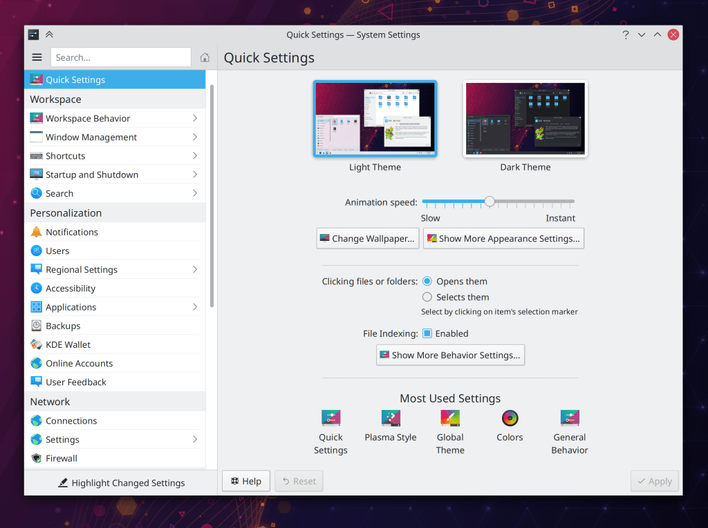
System Settings now opens to a new “Quick Settings” page that displays some of the most commonly-used settings, and even includes a link to the wallpaper settings as well! (Marco Martin, Plasma 5.22):
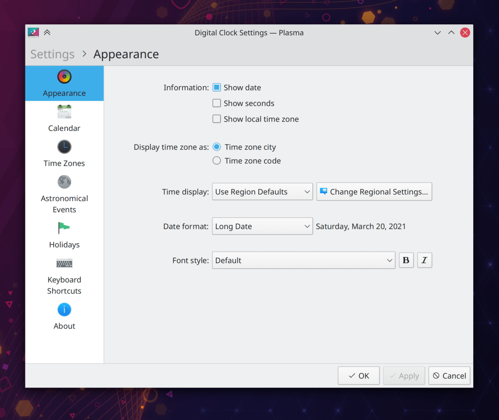
There’s now an option for Digital Clock applets placed on a horizontal panel to force single-line display of both date and time irrespective of the panel’s height (Momo Cao, Plasma 5.22):

Bugfixes & Performance Improvements
When activating KDE Connect’s standalone “Reply to message” window, it now comes to the front automatically instead of hiding annoyingly behind existing windows (at least on X11; on Wayland, nothing comes to the front automatically, but it will soon once our proposed cross-app activation protocol is merged and then we adopt it) (Bharadwaj Raju, KDE Connect 21.04)
Substantially improved the speed and performance of taking high DPI screenshots in Spectacle (Vlad Zahorodnii, Spectacle 21.08 or newer with Plasma 5.22 or newer)
Color scheme previews once again show the correct colors in the inner view section, and the preview no longer sometimes gets cut off at the bottom (David Redondo, Plasma 5.21.4)
In the new Plasma System Monitor app, the right sidebar’s content no longer sometimes gets cut off (David Redondo, Plasma 5.21.4)
Changing the volume no longer sometimes causes it to get increased or decreased by one percentage point more or less that the amount you would expect it to be adjusted by (me: Nate Graham, Plasma 5.22)
In the Plasma Wayland session, changing random settings in System Settings or switching Global themes no longer sometimes randomly causes Plasma or KWin to crash (David Edmundson, Plasma 5.22)
In the Plasma Wayland session, the Task Manager is now capable of cycling through windows of a grouped task on click exactly as in the X11 session (Usarin Heininga, Plasma 5.22)
KRunner’s history drop-down menu now always works even if you’re using a crusty old Plasma theme that’s a fork of an old version of Breeze and hasn’t been updated in ages and ages (Alexander Lohnau, Plasma 5.22)
The National Geographic picture of the day wallpaper now works again, and has been future-proofed a bit to hopefully make it less likely to break in the future if the source URLs change again (George Dietrich, Plasma 5.22)
System Settings now shows whether the Window Behavior page has any changed settings with the customary orange dot in the sidebar when using its “Highlight Changed Settings” feature (Cyril Rossi, Plasma 5.22)
Drag-and-drop operations in the Plasma Wayland session no longer activate every single window that the cursor passes over while dragging (Xaver Hugl, Plasma 5.22)
Pressing the Esc key in the new Plasma System Monitor app while a popup is open no longer closes both the popup and also any other closable thing below it that was also open (David Edmundson, Plasma 5.22)
KRunner no longer sometimes launches apps as the wrong user under certain circumstances (Fabian Vogt, Frameworks 5.81)
Unmounting a mounted volume after opening and then closing any files on it no longer gets stuck (David Faure, Frameworks 5.81)
Dolphin no longer sometimes crashes when playing a video preview in the Information Panel, and also uses a bit less memory when doing so (Harald Sitter, phonon-vlc 0.11)
User Interface Improvements
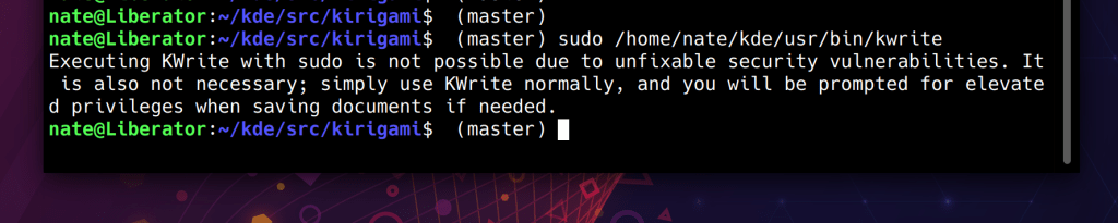
Kate and KWrite now tell you what to do instead if you mistakenly run them with sudo or kdesu to try to edit root-owned files (me: Nate Graham, Kate 21.04):
The subtitle for Plasma Vaults items now wraps, so that the error next never gets elided before the useful part of the message can be printed (me: Nate Graham, Plasma 5.21.4):
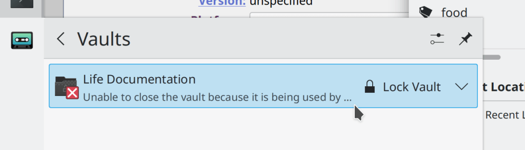
NOTE: this is a screenshot showing what WON’T happen anymore! Don’t go thinking that this is what I changed it to! I just had to share a screenshot showing the problem to be solved because of how Kafka-esque it was!
Discover’s notification now retains its interactive button when viewed in the notifications applet, so you can click on it to open Discover and start the update (Kai Uwe Broulik, Plasma 5.22)
Klipper’s hidden feature to show a pop-up with all the saved clipboard entries right at the cursor position is now bound to the Meta+V shortcut, so now it’s super easy to press that and see all the saved clipboard entries and call up whichever one you want! Apparently Windows 10 just implemented something like this, but it turns out we’ve had it for years, probably decades. 🙂 (me: Nate Graham, Plasma 5.22):
Taking into account user feedback, we have reverted the change to System Settings that put the Global Themes item into the sidebar’s header area, in favor of a new approach that simply indents all the child pages below it. This also restores the ability to click on the whole header area to go back (Marco Martin, Plasma 5.22):
The configuration windows for Plasma applets have received a visual overhaul which makes them more consistent with other modern KDE apps and also fixes a bunch of bugs, particularly regarding the desktop configuration view not remembering its size and sometimes abruptly changing its size (Carl Schwan, Plasma 5.22):
The Highlight Windows effect that is displayed by default when switching windows no longer shows ghost outlines of non-highlighted windows that can cause a bizarre jumble on the screen when many windows are stacked on top of one another at the same or similar positions (Bharadwaj Raju, Plasma 5.22)
Breeze tabs now have a subtle colored line on the top of the active tab, which makes it clear which tab is active when there are only two, especially when using a dark color scheme (Jan Blackquill, Plasma 5.22):
It’s now possible to delete installed Splash Screens installed using the Get New Splash Screens window straight from the System Settings page itself, without having to go back to that window (Alexander Lohnau, Plasma 5.22)
The Emoji Selector window now offers an option to clear the history of recently-used Emojis (me: Nate Graham, Plasma 5.22):

The scrollbar mini-map in Kate and other KTextEditor-based apps now respects your active color scheme (Jan Paul Batrina, Frameworks 5.81)
Kate, KWrite, and other KTextEditor-based apps no pointlessly longer prompt you to save your changes when you close a document that’s both blank and also unsaved, because in this circumstance, there are no changes (me: Nate Graham, Frameworks 5.81)
…And everything else
Keep in mind that this blog only covers the tip of the iceberg! Tons of KDE apps whose development I don’t have time to follow aren’t represented here, and I also don’t mention backend refactorings, improved test coverage, and other changes that are generally not user-facing. If you’re hungry for more, check out https://planet.kde.org/, where you can find blog posts by other KDE contributors detailing the work they’re doing.
How You Can Help
Have a look at https://community.kde.org/Get_Involved to discover ways to be part of a project that really matters. Each contributor makes a huge difference in KDE; you are not a number or a cog in a machine! You don’t have to already be a programmer, either. I wasn’t when I got started. Try it, you’ll like it! We don’t bite!
Finally, consider making a tax-deductible donation to the KDE e.V. foundation.

Always love seeing these updates 🙂
LikeLike
WOW.
LikeLike
Sweet Lord baby Jesus! The things just keep coming! =) That quick settings thingy, THAT’S some big braining going on right there. A thing you didn’t know you need, but now you need it. And now you HAVE it! The scary KDE settings are way less scary now, also with the highlighting of changed settings feature it’s just a BREEZE (heheee..) to use now. This is just a superior DE now, hopefully this KDE thunder of a rollercoaster development will kick some other DE developers ass into higher gear as well since it’s no longer easy to impress anybody by claiming to have a “light” DE and once every 3 years change the default wallpaper and the hue of the folder icons. Like infinitelygalactic said on youtube: THE RETURN OF THE KING!
Once again, I cannot thank you all in KDE world enough. It’s a pleasure to follow all this.
LikeLiked by 1 person
King of Desktop Environments 🙂
LikeLiked by 3 people
Love that passive aggressive stab at Manjaro “using a crusty old Plasma theme that’s a fork of an old version of Breeze and hasn’t been updated in ages and ages”.
LikeLiked by 3 people
Honestly though, Breath needs to be just a color scheme. And it is high time that it is spiced up a bit. The KDE edition of Manjaro feels a bit neglected, as if Manjaro devs don’t follow KDE development… Which is a bummer, because actually working closely together with KDE, they could do amazing things. For example, developing an AUR backend for Discover, essentially eliminating Pamac’s reason to exist. Or working with SDDM devs to achieve a seamless boot experience instead of the default, which is the ugly Matrix-esque Systemd log screen. They could work on hardware deals together, especially since Manjaro originates from Germany, which is also home to Tuxedo Computers, and Spain (home to Slimbook) isn’t too far either… There is a lot of potential here, that they are leaving on the table.
LikeLiked by 1 person
Yes, I also wish the Manjaro devs worked more closely (or at all, really) with KDE upstream.
LikeLiked by 1 person
Thank you KDE devs, you are so good
LikeLiked by 1 person
Yes that’s all looking really awesome!! Thanks for all the brilliant work. It’s great to see how users and devs can work together to create amazing software. KDE is a great community for sure.
LikeLike
I am always amazed by every week update, but this week is christmas before christmas
Amazing work from the kde dev, can’t wait to get my hand on those update
LikeLike
Hi Nate, great stuff! Just a thought about the Quick settings, I think the “most used settings” section should exclude Quick settings itself as you’re already there if you’re seeing it 🙂
LikeLiked by 1 person
I think that has already been fixed.
LikeLiked by 1 person
Heh yeah that’s already fixed for users, but my database got polluted due to an earlier version of the feature not excluding itself.
LikeLiked by 1 person
> Kate and KWrite now tell you what to do instead if you mistakenly run them with sudo
But still, for me editing of root owned files is hugely unpractical with Kate. The problem is that I need to reenter password EVERY time I save it. Please see this question: https://unix.stackexchange.com/questions/636916/make-kate-to-ask-password-only-once-instead-of-asking-it-at-every-file-saving
As a workaround for now I am using geany, as it runs from root normally.
LikeLike
You can use SUDO_EDITOR=kate sudoedit
LikeLike
First thing, I used SUDO_EDITOR=”kate -b” sudoedit to be able to edit in an already opened kate. OItherwise, it just failed saying that no changes were made.
Second thing: Yes, this way allows you to save file multiple times. BUT: it actually does not apply changes to the real file until you close file tab in kate. So this is not what I want.
For example, I make an edit to /etc/resolv.conf. Then I want to test some name resolving. Then again make another edit. Then again test name resolving.
But with sudoedit I am forced to exit file editing so that temporary file is save to real /etc/resolv.conf.
LikeLike
Nice. I applaud fixes and improvements as long they don’t break the paradigms and workflows that have developed in the industry for several decades. In that respect you are on a right path, unlike the early time of KDE 4 where you took an approach of “innovating” and being different for the sake of being different.
However you can do better. I will mention 2 things in brief. Single click to open folders and files is not standard and more importantly is not functional. The idea is that clicking should not have disruptive effects in any way.
The other thing is arranging desktop icons – horizontaly. Why oh why? Do you feel the need to be different again? Yes monitors are wider nowdays. Then again they always were wider. Though the paradigm in the industry is aranging them verticaly and most people expect that.
Anyway, did not want to sound negative. KDE 5 is the best DE IMO.
LikeLike
The default behavior in KDE is actually double click to open folders, and it has been for a while now, at least most distros ship KDE with that setting as default ¯\_(ツ)_/¯
The nice thing is that you can change this in Settings, if you want
For desktop icons, there really isn’t an “industry standard”. Windows arranges them in columns, GNOME doesn’t even have desktop icons anymore, yes macOS aligns in columns, but on the right…
This you can also change with a click in the context menu of the desktop.
LikeLike
Single-click is the default, it’s just the Manjaro and Kubuntu ship with double-click. I think Fedora does too now, or at least as of the next release.
LikeLiked by 1 person
Why is it the default? I agree with Dimitris that it’s counter-intuitive and rather not functional. Providing a high level of customisability is very important, but it’s equally important to have good defaults so that you don’t have to spend too much time tweaking settings. It’s also a bit strange the option is in the system settings and not in Dolphin. I guess the majority of users would prefer double-click as it seems to be a regular complaint. What about making a poll with KUserFeedback 😉 ?
LikeLiked by 1 person
I disagree that double-click is better. Most of the time you open but not select folders. For selection you can use “+” icon. Or even better select with movement while mouse button (and maybe Ctrl) is pressed.
Anyway, +1 for KUserFeedback 🙂
LikeLiked by 1 person
Double-click is better for familiarity, and better for selecting items, but worse for opening, and less intuitive for people learning the system for the first time (my kids prefer single-click, for example, and were confused by double-click).
So neither one is clearly objectively better, and instead they are just different and each one caters to a different use case, and people prefer one over the other according to their personal preferences. In such a circumstance, changing the default makes one group happy but makes the other group unhappy, so it isn’t considered a clear win, and we err on the side of not changing anything.
FWIW I personally decided to give single-click a try about a year ago and actually prefer it now, though I acknowledge that it makes selecting a single item slower and more awkward.
LikeLiked by 1 person
When Google Drive, OneDrive, Dropbox, and any other web service uses double click, not to mention any desktop OS the user might come from, if they are switching to KDE and it isn’t their first system, it makes sense to have that as default. Or if it has to be single click, there would need to be some mention of this in a Welcome tour or something, because people finding it out for themselves creates frustration, and people instantly switching away. Maybe the new Settings landing page remedies that, but it doesn’t deserve to be there every time I open Settings, it really is a one-time thing. Asking the user isn’t good practice, I agree with the Lessons Learned page on that, but at least educating the user about it would be rather helpful I think, towards a smoother onboarding experience.
LikeLike
@Evgen + @Nate Okay, I see – really good points!
LikeLike
“Single click to open folders and files is not standard and more importantly is not functional. The idea is that clicking should not have disruptive effects in any way.”
It is functional, if it weren’t then it wouldn’t be used by anyone. I use it single-click, and some of the clients and friends who I have installed Kubuntu on their computers prefer single-click.
LikeLiked by 1 person
Brilliant stuff. As always Nate, deeply and greatly appreciated. Wonderful happenings for Plasma 5.22.
Thanks guys or girls for ya comments here. Enjoyed them as well.
‘King of Desktop Environments’ 🙂
I really hope the nowadays always visible and apparent wayland support matures to a level to have no second thoughts or hesitations. I tested it for pure wayland only sessions, but too much of a churn in all kind of regards. Electron 12 for instance and chromium (even with special wayland variables), thunderbird stable on firefox’ lts engine,.. no equivalent for a pam_env or /etc/environment replacement yet, … etc.
In my humble judgement we’re really close. To all who care, big thanks for reporting bugs, developing, testing, writing blogs or any other form of engagement.
Again, thanks Nate for your efforts. Keep those weekly blogs coming.
Much love,
franky
LikeLiked by 2 people
I think in a year Wayland will be ready for normal use with no major showstoppers. As it is, the list of showstoppers listed on https://community.kde.org/Plasma/Wayland_Showstoppers has been growing progressively less severe as time goes on. The issues listed on that page were much worse a year or two ago!
LikeLike
Thanks for the link. Good to know there is something official for the wayland status and readiness.
I noticed something on that website:
“No feedback on the cursor when an app is launched: https://bugs.kde.org/show_bug.cgi?id=405624”
– I love those bouncing mouse cursors indicating an application has been launched.
Miss it, dearly, if there is no such behavior.
I agree with you. In about a year Wayland should provide a stable and pleasant experience overall.
Great times ahead. \o/
LikeLike
Thanks for being awesome!
Maybe you would like to check out the video below, it’s an outstanding (and very long) review of Plasma 5.21.
Also, it comes with a specific shout-out to This Week In KDE (at ~ 25mins).
Enjoy yourself, stay healthy and keep up the goog work!
LikeLiked by 1 person
Yep, that was a nice little ego boost lol. I had no idea it was coming when I watched that video!
LikeLike
LikeLiked by 3 people
the klipper shortcut is awesome. didn’t know about it. nice decision to match the windows shortcut map!
LikeLiked by 1 person
Thanks very much for your effort, Nate & kde team! The weekly blog provides a nice overview and helps discover new features. I’m using Plasma productively since some months now and feel very comfortable with it, especially because it has a friendly community and is well-maintained and documented :).
LikeLiked by 1 person
Hey Nate, amazing stuff as always! Kudos to the team, and to you for blogging about it.
A few things to consider though,
SIMPLE BY DEFAULT, POWERFUL WHEN NEEDED
– System Settings, Quick Settings and Global Themes:
I think that Settings should have an “EZ mode” or “Advanced” toggle right in the toolbar. I would move the Home icon to the left of the search field, and add this toggle between them, or on the right of the search. I would get rid of the Settings of Settings, which lets you choose the archaic icon view instead of the sidebar. Maybe if someone wants to, wipe the dust off of Icon View, and add it as a view toggle, like Get New Things dialogs have.
In Easy mode (Advanced mode off), a lot of KCMs would be simplified or not shown at all. I would only show the welcome page (and exclude the hidden KCMs from the “Frequently Used” section), and the following:
∙ Global theme (This would handle icons, colors, Plasma theme, Splash, application look, and everything. It would detect if a global theme wants to use Kvantum, and if installed, apply it with the appropriate theme, if not, prompt the user to install it. It would also handle SDDM if there is only one user: if there is an SDDM theme in the Global Theme pack, it would be applied automatically, prompting the user for admin password. If there isn’t one, it would ask to sync Plasma settings, and if the user chooses yes, copy the necessary files to a system location, prompt for admin password, set the ownership/permissions of the files, and sync to SDDM. If there are multiple users, it would ask the user whether or not to apply to the login screen, and then if answered yes, prompt for admin password and set it.)
∙ Fonts (system font and system monospace font selector on top, Font Management below)
∙ General Behavior (with a “Desktop Effects” toggle that does exactly what Alt-Shift-F12 does, maybe even a label next to the toggle with the shortcut, for visibility, plus a “Hotcorners” / “Screen edges” toggle for an easy way to turn it off, if it bothers people. This would include touchscreen edge actions as well.) This would include the most basic of window settings as well, and an “Automatic login” toggle that prompts for admin password and sets the current user as auto-login.
∙ Background (would be auto-applied to all screens and lock screen as well)
∙ Activities
(Virtual Desktops would be managed through the applet or through the Present Windows view, with one colun or one row, kinda like other desktops)
∙ Keyboard Shortcuts (as an unified page, with a “Custom” category at the bottom, and an “Add custom” button)
∙ Applications (would include Autostart, Default apps and maybe when such thing exists, an App Permissions page, like Android and GNOME)
∙ Search (File Indexing toggle plus KRunner settings, with a “Web Search” toggle)
∙ Users
∙ Localization
∙ Accessibility
∙ User feedback
∙ Accounts and Passwords (online accounts + KWallet + Vaults)
∙ Network (an unified page with a Connections list (Wifi networks + VPNs + LTE) a button linking to “Firewall settings”, one to “Clear cache”, one to “Clear cookies”, and a File Sharing toggle)
∙ A “Connected devices” category with Bluetooth, KDE Conenct, Removable Media, Printers and maybe a future Thunderbolt page
∙ Input Devices (Mouse and Touchpad simplified and unified)
∙ Screens (with a “Color correction” button and maybe Night Light)
∙ Sound
∙ Eenrgy Management (all the lock screen settings except its background would come here, plus the current Energy Management options simplified into one page. Activity-related settings would be a link to Activities page. “Run script” would not be an option. “Stop media players when suspended” would not be there, as it belongs in Advanced mode, no need to turn that off.
∙ System Information (with an “Updates” button to launch Discover at the Updates page, and a “Detailed Info” button to launch KInfoCenter). Plus of course “About settings” and “About KDE” buttons. This is all!
Advanced Mode would show Settings as currently is, with maybe a few reorganizations here and there, to be a bit more coherent with EZ mode.
I think this would resolve the dilemma of the Global Theme page having to stand out, but it not being a header item. It would also solve some dispute around Quick Settings, which right now, especially with single-click vs double click (a once-set-then-forget setting which really shoudn’t need attention, since the people used to single-click will find the setting anyway, while double-click is default in every other desktop OS/DE, so it should be that case in Plasma too) and File Indexing (a new user doesn’t even know what that is) being front and center, seems cherry picked, not to mention that the most important hardware and networking settings not being there, and not even visible in the sidebar, but actually being tucked away on the very bottom of a long and exhausting list of settings, most of which a beginner user would be unfamiliar with.
– Kate and KWrite:
Why are there 2 apps for the same thing? Why does KWrite still exist, if development is almost entirely parallel with Kate? Is it some kind of internal competition like in Google?
– Applet settings:
The new style looks weird. The “Settings > General” UI element is usually used where General is a subpage of Settings, and there actually is a Settings page that the General page originates from. With applet settings though, there is no such thing, as General, Kbd Shortcuts and About (and all other pages these dialogs might have) are already top-level pages. Just confusing. Then there is a whole thicc bottom bar for 2 buttons, which goes under the sidebar instead of starting on the right of the sidebar, which is super weird and not found anywhere in Plasma. It doesn’t make sense logically either, as the “Apply” button belongs to the specific page of the applet settings, not the entire settings.
When I find the right pages to post these on Invent, I will voice this opinion there too.
LikeLike
On Kate and KWrite: KWrite is simpler and more lightweight than Kate, with the former being an easy notepad, and the latter being a fully-featured programmer text editor. This is no competition or duplicated development, since they are based on katepart from the KParts concept (https://techbase.kde.org/Development/Tutorials/Using_KParts). I think it’s very good to have both. If you only want a small and clear solution with few dependencies, KWrite is fine.
LikeLiked by 2 people
I see, but most distros don’t even ship KWrite by default, they just ship Kate as the default text editor, but without most of the exciting plugins.
I still somewhat feel though that there is a lot of duplication of effort and fragmentation in KDE apps. Just going through apps.kde.org and invent.kde.org, there are 2 text editors (explained here, but a random user wouldn’t know the difference, just like I didn’t know up until now), at least 3 video players (which is interesting because many distros just ship VLC by default, which is perfectly functional, and well-known to users, so they would never discover those apps), 3 music players (used to be 4 when both Elisa and Amarok existed, and as far as I recall, for some time KDE was endorsing Cantata, although it isn’t an official KDE app), 2 different apps for personal finance management (which seem to be equally poorly maintained), 2 backup tools (but distros ship Timeshift if anything), 3 software/package managers (but only Neon and Kubuntu ship any of them, and it is Discover in both cases), half a dozen chat apps, a couple of time-related (stopwatch, timer, world clock, alarm) apps, 3 browsers, 2 file managers, a bunch of games that didn’t really age well, etc… KDE apps in total use at least 4 different graphical toolkits (including MAUI), that each have their own UI paradigms and design language… It is kinda sad to see these in this state, because most of them are really cool and useful. Half of these should be 3rd party apps, living in a KDE App Ecosystem, like GNOME has, but it seems to me that KDE tends to pull everything under its umbrella, to the point where any coordinated effort is almost impossible.
LikeLike
Lol. That sounds weird. I really don’t think kde use four different graphics libraries. All kde apps I have are based on Qt5/KF5 and written in C++/QML. Being split into many different programming languages and bindings rather tends to apply for gnome.
I like that a larger spectrum of applications is protected and maintained under the kde umbrella, because this helps ensure they all stay supported and also get adapted to newer versions of graphics toolkits (like the upcoming Qt6).
There is nothing wrong with having different choices for programs – these apps often have great differences in terms of usage and features. Some of the ones you mentioned are also rather old and will eventually be superseded by newer ones, but for the moment still get suppported both.
LikeLiked by 1 person
By 4 different toolkits I meant MAUI, Kirigami, KF5, and I recall there being older apps that use some other Qt-based library for their GUIs. While all of them are in C++/QML, they have fundamentally different paradigms, leading to inconsistency across KDE’s apps. Take, for example, Dolphin, Okular, and Kate: they are coherent, as in they have a menubar at the top (that can be hidden, and is hidden by default on some apps, e.g. Dolphin), and a toolbar that you can place on any edge of the window, but is on the top by default, and then window content, maybe a few sidebars that can also be rearranged, and maybe a statusbar at the bottom.
Then take a look at System Settings, Discover, Elisa and the new System Monitor app. They are Kirigami apps. They have a sidebar at the left, which houses the main controls, and probably has a header area with maybe search and 1-2 tool buttons, then the window content is to the right, with a massive title at the top (with hierarchic navigation like “Category > Subcategory > Item”, and maybe a few buttons that depend on the content. There is no toolbar at the top, there is no frame around things, there is no menubar, UI elements aren’t configurable, but the window is adaptive, as in it always finds the optimal way to arrange itself, regardless of the size or aspect ratio of the window, and these are also touch-friendlier. Then Elisa is a different story altogether, because it has the album art at the very top, the sidebar only starts below that.
Then there are the MAUI apps like Index, VVawe, Nota and Buho, with their bottom toolbars, sidebars that loosely resemble Kirigami. and a forced visual style that ignores what you set up in System Settings, and looks odd unless you set their theme as your global theme. MAUI apps were built for Nitrux, and their devs are kinda stubborn in that regard, they don’t even make sure that it looks okay with Breeze, they just force their style upon you, which is against the KDE spirit. They just released these for Android and upstream Plasma, so that people can use them… But they have no intention of making these apps look native on those platforms. Plasma Mobile ships some of them, because they are great apps for a phone, and KDE didn’t have a native alternative.
And there are the old apps which were hacked to not look like absolute crap on Plasma 5 and Breeze, but were really meant for KDE 4.
Compared to that, GNOME is really consistent (until you start using Elementary apps which are the Nitrux of the GNOME world), because you have GTK3/GTK4 apps which have the same UI paradigm (combined headerbar up top, then an optional sidebar and the window content below, and all extra options are inside a hamburger menu), and look very consistent with most GTK themes, and there are the ancient GTK2 apps which also look okay, but have the more traditional Titlebar-Menubar-Toolbar-Content-Statusbar layout.
Yes GNOME apps under the hood are a mess of Python, C++, Rust and Vala, but on the surface it is all GTK. There are clear guidelines, which 3rd party app devs also follow. GNOME has an app ecosystem that is working great. KDE doesn’t have such an ecosystem because they pull everything under their umbrella, so hardly any 3rd party community apps remain, because they become KDE apps.
A great effort in the development of Breeze goes to making sure it remains at least visually consistent across Kirigami and KF5, and the weird mixes between the two (*cough System Settings *cough), GTK apps even, but KDE officially supports 3rd party (and old 1st party) app styles (Kvantum, the awesome Lightly, the ancient Oxygen, Plastik, Fusion, Win98, Deepin’s Widget Style, QStyle, etc), but the Kirigami apps behave weird under all of those except Breeze (and Lightly), and MAUI apps don’t even follow the system style…
LikeLike
Ah, this made it more understandable for me what you meant. I was mostly thinking in the scope of programming languages rather than UI. I honestly never heard about Maui before, and have indeed none of those applications installed. It seems to be a rare niche UI kit that also builds up on Qt/QML and is used by only a handful of apps. When you wrote about MAUI, I was confused because I initially thought you mean .NET MAUI (which is a completely different UI library).
I didn’t think of Kirgami/QML as something separate, since it’s all from the Qt infrastructure. Even though both have different UI styles, they are still connected very tightly, and colour schemes work for both. I never felt like they would look much out of place among classical kde apps.
My personal opinion is that it doesn’t break coherence to combine Kirigami/QML and KF5/Qt apps; they fit pretty well. You can have two different UI paradigms without getting into a muddle. Also, the system settings seem consistent and good to use to me.
LikeLike
Hi there, not related with the contents of the blog but with the blog itself: is there any possibility of reading this amazing blog inside Telegram, as an Instant View? Also, is there any plans of translating it to other languages? I would be pleased of contributing with the second request. Thanks anyway and great job!
LikeLike
No, thanks for the offer, but I don’t have any plans to do either of those things. The blog is enough work as it is, published in one place and one language. 🙂
LikeLike
I think Quick Settings should include the setting to change where the windows open by default. In fact, that’s the number one “umm yeah, I don’t like this. Show me another distro” – comment I get whenever I try and introduce a windows user to linux. Being a hardcore windows user myself I always wanted to throw my computer out the window when KDE opened up windows anywhere but smack right in the middle of the screen. No idea if any distro uses the centered option by default, but all of them should. Also in the same vein: single click to open as default..what the proverbial F***.. New users run away, I guarantee it. Same thing happened on elementary where on top of everything, the minmaxclose buttons are on the left..oh wait there aren’t even 3 buttons are there..? Again: the response there was always: “yeah, it’s pretty. But it’s also stupid. Show me another distro” These are SEEMINGLY small, tiny things..but they are not. First impressions matter, and last. I still can’t convince anyone to try again, since it was “crap” the last time. That’s also a windows mindset, if it was crap before it means it will be crap forever =)
LikeLike
Well, I disagree. I’m also a relatively new user and window placement was really not an problem – minimal overlapping is a good concept. I think your comment is a bit exaggerated. There are certainly many interesting options which are too hidden, but we can’t put them all in Quick Settings. I think it is well-placed under `Window Management -> Window Behaviour -> Advanced -> Window Placement`.
LikeLike
do a real-world poll to convince others of your dramatic, exaggerated claims
LikeLiked by 1 person
Yes, I admit to being dramatic, but exaggerating..? Nope. I know it’s hard for linux users to accept that the majority of computer users are not used to doing things the linux way. The standard answer is always “you can change it to what you want, linux is amazing that way” sure, but there’s an undertone in that too, it semi-forces the users to adapt to the system first, not vice versa. And therein lies the problem. Why not cater to the larger audience first and let the tinkererers be the ones having to look for the other so-called “better” options? It’s like somewhere deep deeeeep down inside the linux community doesn’t even want linux to take over on the desktop. I mean when you try and sell a car to a new unexperienced driver, why would you shove them in a WRC Rally car with all settings on VROOM, GO! Here’s 4 million knobs for you to turn! The gaspedal is on the left, the brakes are hidden behind 5th gear and when you turn the wheel to the right, the car goes to the left. Oh and the first 4 gears all are for reversing. Happy driving!!! YOU CAN CHANGE ALL THAT IF YOU WANT, ISN’T IT GREAT???!!!! Then stand and watch while they try to leave the parking lot, and call them idiots when the car won’t budge and the confused driver gets out and doesn’t want that car. Nah, you set them in a WRC Rally car disguised as a Beige Prius and the most exciting feature is the familiar cupholder and the stereo. There; hit the road, drive safely! Oh and IF you wanna drive like a bat out of Hell, open up the glove compartment, there’s an UNLEASH HELL settings panel for you to tinker with.
That’s how i would do it.. but apparently I am weird in the head.
LikeLike
This is more or less our goal (“Simple by default, powerful when needed”), but we don’t think that explicit basic/advanced modes are the solution. See https://community.kde.org/Get_Involved/Design/Lessons_Learned#Basic.2Fadvanced_modes for an explanation of why, in particular the last few sentences:
LikeLike
Very true, but I also feel that the “users of great ego” are the ones screaming and shouting in forums like this, and getting their opinions heard. Opinions that are essentially ego-driven and not for the benefit of the greater masses at all. And that’s why we get unnecessary ego-crap as default all over the place with distros competing over who can have the weirdest default setup ever. To me, and I speak withthe deep voice of experience here, the average user does not know that youtube is a website and not an app. The same user has no idea what a desktop environment is and does not care either, he/she cares of how things look. Do they look easy to use and do they look nice. The same user can never ever grasp what a window compositor is or grub or anything else even slightly technical, this user is not an elderly person either, I have seen this in 20 year olds. You explain something to them, say for instance what adblocking is and they listen and look interested but the next week they ask again why there are ads on another computer they own. They don’t CARE what you explain, they just want a supernice easy OS that stays out of the way and let’s them look at cats on youtube. The average user is a COMPLETE noob, but with time and if said user likes his/her OS there will be a development where the average noob will want to tinker around a little bit and then it’s nice to have bonkers options like single-click to open or taskbar on the right and the windows open maximized only on monitor number 4 if its 8k. Absolutely nobody likes ElementaryOS because it’s good, they like it because it’s pretty. After using it, they don’t like it anymore. Same thing with XFCE, it looks like grandmas couch. Nobody but grandma likes it. Yes, the average user is that shallow “show me another distro” is a real thing you know.. KDE Plasma has a chance now, a real fighting chance FINALLY, to break into the big league. That is all thanks to the hard and amazing work all you guys have done for many many years now, things that the average user can’t see and frankly doesn’t care about. the inner workings. All that can be spoiled for the big “dumb” masses with dumb defaults like single-click to open. Yes, it can all crumble because of a tiny thing like that. Right now, I’d give the big masses exactly what they want, they have been molested by microsoft for far too long now. Don’t make them jump through hoops from the get-go to get a simple good system they can use right off the bat. And what do they want? They want something that looks and works exactly like windows. This I know is true.
LikeLike
I understand all of that. 🙂 I grew up with two low-tech parents who at times struggled even to use Macintosh computers, so I understand how hard this stuff is for normal people.
I don’t totally disagree with the idea that single-click is a turn off-for normies. That’s one of the reasons why we decided to make it easier to find on the new System Settings landing page.
LikeLike
Can you provide the latest version of the Qt Creator with support for the ClangCodeModel plugin for Neon?
https://bugs.kde.org/show_bug.cgi?id=418692
https://bugs.kde.org/show_bug.cgi?id=428212
LikeLike
3rd-party apps from the package manager are not supported in Neon, and also bugs in 3rd-party apps need to be reported to the developer, not KDE. Qt Creator is not a KDE app; it’s developed by the Qt company.
LikeLiked by 1 person
Our dear and loved Plasma keeps getting better with each update, especially in the Wayland session! Eternal gratitude to the developers! You are the best!
LikeLiked by 1 person
Aww, thanks!
LikeLiked by 1 person
Everything that Plasma needs is another page with settings 👍
LikeLike