Technically Akademy isn’t part of Plasma, but most of KDE’s movers and shakers were here in Würzburg for Akademy 2024 this week, so the list of technical work merged was understandably light; we were all busy with conference things! I’ve already blogged about my Akademy experience separately; check it out here if you’re interested.
Despite the pressures of Akademy, quite a few things happened anyway, including Plasma’s release manager Jonathan Riddell releasing a beta version of Plasma 6.2 while at the conference. I’m very happy with Plasma 6.2. It feels great already to me. I had no hesitation pulling down git master and compiling everything while at the airport waiting for my return flight, and indeed everything was fine. But please do test the beta and report bugs!
In addition some code work also got merged; check it out below! Expect the pace of work to pick up next week and beyond as we start implementing all the cool stuff we talked about during the conference. 🙂
Notable UI Improvements
Immutable tool view tabs (as opposed to tabs for documents) now have a fancy new style! We’ll be opting into it over the course of Plasma 6.3 and other following gear and Frameworks releases, and replacing other tab-like-but-not-actually-a-tab UI elements with the real one (Carl Schwan, Plasma 6.3.0. Link):

Pressing the Meta+B shortcut to switch power profiles now cycles through them as you continue to press the key, rather than showing an overlay from which you would choose an exact profile (Jakob Petsovits, Plasma 6.2.0. Link)
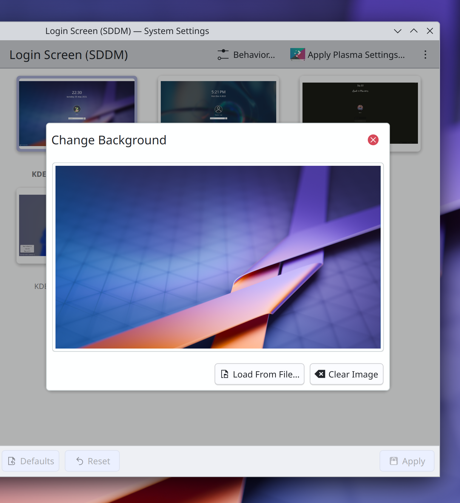
System Settings’ Login Screen (SDDM) page no longer shows blurry preview images, and the dialogs that contain them have been updated to use the new modern dialog style (me: Nate Graham, Plasma 6.2.0. Link):
The alternative actions in the context menus of Plasma’s “Peek at Desktop” and “Minimize All” widgets are now expressed comprehensibly rather than being static and showing a checkbox, which made them look like persistent settings (Christoph Wolk, Plasma 6.2.0. Link)
Pressing Shift+delete to force-quit a process using SIGKILL in System Monitor now tells you that this is what will happen, rather than leaving it a secret (me: Nate Graham, Plasma 6.2.0. Link)
Throughout System System Settings’ grid views, all elided text labels now appear in a tooltip on hover, rather than only some of them (Han Young, Frameworks 6.7. Link)
Notable Bug Fixes
Fixed a high-priority Plasma crash that could happen when certain apps did certain weird things with their windows in a way that the Task Manager didn’t approve of. This also fixed a similar bug whereby certain apps might be missing from the Task Manager (Demetrius Belai, Plasma 6.2.0. Link 1 and link 2)
Fixed an issue that could cause certain added keyboard layouts to not appear in all of Plasma’s various lists of keyboard layouts you can switch between (Ismael Asensio, Plasma 6.2.0. Link)
Custom shortcuts with commands that result in their .desktop files having the same file name as an app’s own .desktop file are no longer capable of shadowing the app in software that fails to respect the NoDisplay=True key in apps’ .desktop files (David Edmundson, Plasma 6.2.0. Link)
In Plasma’s wallpaper chooser view, image previews no longer sometimes have single-pixel lines gaps around some of the edges when using certain fractional scale factors (Méven Car, Frameworks 6.6. Link)
Special KDE-specific keywords of apps and System Settings pages are now translatable into German (Alexander Lohnau, right now! Link)
Other bug information of note:
- 1 Very high priority Plasma bug (same as last week). Current list of bugs
- 32 15-minute Plasma bugs (same as last week). Current list of bugs
- 73 KDE bugs of all kinds fixed over the last week. Full list of bugs
Notable in Performance & Technical
Fixed a performance bottleneck in KWin that caused it to sometimes unnecessarily copy textures across GPU devices on multi-GPU systems. This fix also happens to make Plasma Mobile work on the Librem 5 phone (Xaver Hugl, Plasma 6.2.0. Link)
How You Can Help
Plasma 6.2 just branched for the beta release, so please test it! We have focused a lot on stability for this release and want to make sure we haven’t missed anything big before the final release in about a month. Your bug reports do not go into a black hole; we triage every one! So enthusiastic testing and bug reporting is encouraged. 🙂
Otherwise, visit https://community.kde.org/Get_Involved to discover additional ways to be part of a project that really matters. Each contributor makes a huge difference in KDE; you are not a number or a cog in a machine! You don’t have to already be a programmer, either. I wasn’t when I got started. Try it, you’ll like it! We don’t bite! Or consider donating instead! That helps too.

These are not tabs, they look like buttons, they are taking a lot of vertical space for no reason. This is not a UI improvement
LikeLike
I agree.
LikeLike
I second you two.
I also worry it won’t fit the Oxygen theme properly.
LikeLiked by 1 person
Also agree. Wouldn’t call it an improvement at all.
LikeLike
I honestly like the idea of redesigning, given prev ones were not so well designed but this one just don’t look so good.
Too much padding in tabs and margins down the content of the window, please take some feedback from UI/UX Designers. Also rounded borders and some gap in between tabs could have been appreciated.
LikeLiked by 1 person
I don’t think it’s bad but rather an improvement, though I also like the current Firefox tabs’ style. Not sure, if this could or should be applied to Plasma.
LikeLike
I agree that the new tabs are not very slick nor very recognizable. Also there are too many horizontal separators everywhere…
LikeLike
are mouse gestures on the roadmap?
LikeLike
They’re on my radar, yes. I’ve implemented a prototype for KWin that now needs to be integrated properly, and also settings will be a whole lot of work.
I keep getting sidetracked by other time-sensitive tasks, but I’m still planning to make time for it starting in 1-2 months from now. Anyone who would like to give it a shot first is welcome to do so, here’s the KWin issue with all the important info: https://invent.kde.org/plasma/kwin/-/issues/216
LikeLike
Apropo Mouse gestures.. , does anyone remember Scrolling lines configuration to set how many lines the mouse scrolls when scrolling? It would be nice if something like that could be implemented again, because then fine-tuning for scrolling in KDE would be possible again 🙂
Algo así se eliminó estúpidamente de Plassma en aquel entonces, como el cubo, pero fue muy útil en aquel entonces. Sería bueno si esta pequeña pero muy útil opción de configuración se pudiera encontrar nuevamente en KDE 😉
best regards
Blacky
LikeLike
I hope everything went well on akademy!
I think you should all do the same but without computers!
Make it an adventure, a camp or something like that! With so ojow people should be amazing!!!
About the tabs… I kind of agree with most of the comments above!
Remember: while technically they can be different things, for the user a tab is just a tab! (and it will look bad if tabs have two different looks on the system)
LikeLiked by 1 person
Not “ojow”, I meant “many” (sorry t9 keypad!)
LikeLike
I meant “many” not “ojow”
LikeLike
I’ve looked at the tab modification thread on Invent, and I approve (not that that means much). However, I didn’t see any explanation for the height increase. Was it deliberate? If so, why?
LikeLiked by 1 person
I wish there could be a 6.2 branch repo for openSUSE Tumbleweed, so I could test 6.2 beta and next branch pre-releases.
LikeLiked by 1 person
Is https://en.opensuse.org/index.php?title=SDB:KDE_repositories&oldid=185308#Adding_these_repos_to_an_existing_installation of use?
LikeLike
It switches you to dev repo, not only 6.2 branch. There are KDE Gear 24.11, KDE Frameworks 6.7 etc. And at some point it will have KDE 6.3 channel. At least I understand it so, I have it installed on a VM.
LikeLiked by 1 person
It switches you to dev repo, not only 6.2 branch. There are KDE Gear 24.11, KDE Frameworks 6.7 etc. And at some point it will have KDE 6.3 channel. At least I understand it so, I have it installed on a VM.
LikeLike
Sorry Carl Schwan but… no.
No way, seriously? I already feel Plasma/Breeze looks too flat, this make it so much worse in so many and all ways.
LikeLiked by 1 person
I don’t think anyone looking with fresh eyes would call that tab bar a visual improvement. The tall rectangle style is okay to me but the coloring, especially the highlight on active tab, is really hard to defend.
LikeLike
Will test asap! Thanks Nate!
LikeLiked by 1 person
Ew, these tabs are unfortunately the very opposite of an improvement.
They look ugly, out of place and are a massive waste of space.
I really don’t know why people need to constantly touch things that are not even remotely broken during minor releases. There are plenty of places that would need fixing or a visual refreshment, but that area was not one of them, and it certainly doesn’t improve things!
LikeLiked by 2 people
What about to return KSysGuard?
LikeLiked by 2 people
Dissatisfied with the “modern” KDE system monitor, I switched to LXQt’s qps. Just a simple task manager that does its job well (and fits my Oxygen setup well too). I recommend giving it a try if you’re looking for a simpler task manager.
LikeLike
I’m in agreement with others, the tabs are way too big. For touchscreen I think it would be good but otherwise they waste space. Also someone suggested tabs similar to Firefox, well that would be even worse.
LikeLiked by 1 person
I think the new “tabs” look good. Refreshing! My positive opinion hereby erases all the negative ones and the new tabs stay. This is how it works in linuxworld 🙂 Want them removed? Make a much better design yourself and explain why it’s better. Then come here and get your idea shot down. Game over.
LikeLike
Here, I fixed all our problems: https://images2.imgbox.com/63/d8/JCuAWgcs_o.png
The problem is not the new tabs, the problem is the way too skinny and cramped top bar. Make that taller and you have a nicer UI.
Yeah yeah, I know: “BLASPHEMY!” “WHO DO YOU THINK YOU ARE!!!” “NEVER IN MY LIFE HAVE I SEEN ANYTHING MORE ATROCIOUS!!!!” yada yada yada.. Linux gatekeeping explosions going off left and right…
Just look at it, isn’t it pretty now? =) You know it is.
LikeLike
It’s better than what’s in the blog post, but still far from good old Oxygen. (Calligra was pretty too then.)
LikeLiked by 1 person
Much better with a taller top bar here too: https://images2.imgbox.com/1c/24/PqpdtOlE_o.png
While editing that image I noticed this little flaw: https://images2.imgbox.com/64/73/YrwYGt2i_o.png Probably the worst UI mistake I have seen in the last 35 years!
Get to work KDE boys and gals!
LikeLike
The immutable tool views on the other platforms (ref. VDG Phabricator page)… don’t look anything like a tab, and I think that helps. Carl’s diligent work is admirable. However, having a 1 pixel line separate the “tool selector” from the page content could now be too thin / insufficient. Since the new frameless UI component seems to be incompatible with a connected tab, then maybe it’s better to not attempt to replicate that model and instead make a new immutable tool view that works visually for its own design. If this was already discussed in another forum, my apologies if I just didn’t see it. Best,
LikeLike
These tabs are the ugliest waste of space I have seen in 20 years of IT work.
It feels like KDE is in a critical lack of a main design line. A single person or small group that decides where the decision goes, prepares stuff and then adapts and releases once all is ready.
Currently it feels like random people are doing changes all over the place with close to no coordination, and release them bit by bit, which sums up to a fickle, inconsistent and ugly overall picture. And re-inventing the wheel over and over and over again, while other areas are in dire need of improvement. I do understand why all major distributions use GNOME as the standard, and it makes me sad.
LikeLike
Ugliest? In 20 years? Really now? You’re gonna love this: This is linux, you can change it to whatever you want! =)
LikeLike
@Mario, why so negative, why not give a suggestion for a configurations possibility
for have a choice and make it possible to use a checkbox or a pulldown selector for configure something.. and really trolling, is the badest possibility here in the tread where it is give us valuable information’s for see what’s new and and new usable… your opinion is important, but ideas for improvement are more welcome , like i guess.. 😉
CiaoCiao Marco 🙂
best
Blacky
LikeLiked by 1 person
Hi Nate,
Thanks for all the great work. I hope Akademy was fun and I look forward to try 6.2 🙂
One slightly beside the point question, it seems like Cosmic Desktop (system 76) is bringing back window tabbing. It feels kinda sad that this was a plasma feature years ago but now people are raving about it for Cosmic and “we” (the KDE nerds) don’t have it any more. Do you think there might be scope / interest from devs to look at how they did it and bring it back (my coding knowledge =null)?
See: https://system76.com/cosmic or more specifically https://github.com/pop-os/cosmic-comp/issues/262
LikeLike
If people were raving about it for KDE back when it was introduced, or raging when it was removed, that might have changed things. But the reality was few actually cared at that time. Let’s wait and see how it really turns out after the hype.
LikeLike
I have to agree with others here on the new tabs, I am not a fan. They are way too tall, and the highlight colour looks off. I don’t mind tabs spanning the full width like they do currently (seems to be a new change? I don’t remember them always doing that, although the sides have some visual oddities) but tabs’ focus colour should match the backgrouund colour of the window without a divide, to indicate that this is a tab.
The problems I have here are much the same as others.
I hope the design team reconsider this one, Plasma 6’s design direction has been a little bit worrying overall and this compounds the worry. Of course, themes are always an option, but they need maintained. Breeze defaults should give a nice experience out-of-the-box. I just want to echo again the voices of the majority above (majority at time of writing, anyway) that this is an unwelcome change.
LikeLike
I know my comment is late, but I also want to give my feedback on the new tabs. I agree with the majority, they are ugly and it looks like a regression or more like an UI glitch, not a feature.
I don’t mind tabs. Those are in use since Win95 or maybe earlier. Plasma also has them, for example in the Edit Program window – they look fine, much better then the new design. I fail to see what was the problem and why there was a need to change a thing that is so functional into the UI nightmare.
LikeLike