Continuing with our recent theme, this week KDE contributors squashed an astonishing number of bugs! In addition, we rolled out some nice UI changes that I think folks will enjoy and which make Plasma and KDE software more usable on those touchscreen devices that are becoming more ubiquitous all the time.
New Features
Elisa now lets you rate songs inline from in the playlist and the Now Playing page, rather than needing to go to the info window to do it (me: Nate Graham, and Javier Goday, Elisa 21.12):
The Plasma wallpaper slideshow configuration page now has an option to display all of the wallpapers in each folder before moving onto the wallpapers in the next folder (Mihai Sorin Dobrescu, Plasma 5.23)
The Networks applet now supports additional authentication settings/protocols/requirements for OpenVPN connections (Jan Grulich, Plasma 5.23)
Bugfixes & Performance Improvements
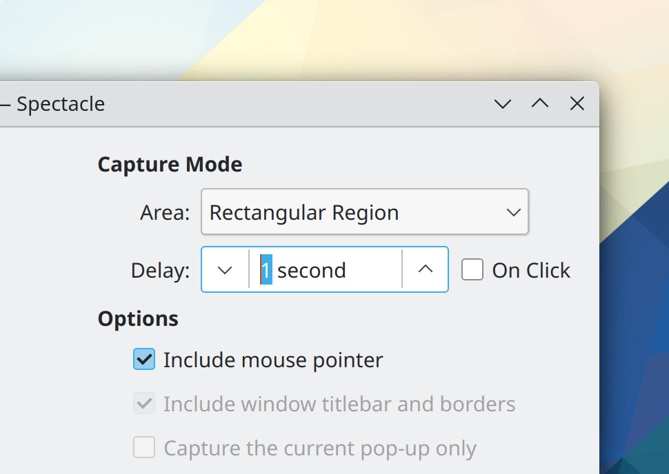
In the Plasma Wayland session, Spectacle no longer shows you an error message when you cancel the process of taking a screenshot in the middle (Bharadwaj Raju, Spectacle 21.08.1)
Elisa no longer shows a “Show in Folder” button on the Now Playing page for radio streams (me: Nate Graham, Elisa 21.08.1)
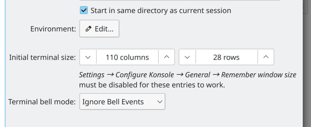
Konsole no longer sometimes flashes when its last tab/session is closed with the Ctrl+D keyboard shortcut (Tomaz Canabrava, Konsole 21.12)
Closing a Konsole tab when something is written on the prompt is now faster (Christoph Cullmann, Konsole 21.12)
Plasma’s panel edit mode now lets you move, configure, and remove applets with a touchscreen (me: Nate Graham, Plasma 5.22.5)
When you rotate Widget on the desktop by 90°, the tooltip for the Rotate button no longer covers up the Configure button and prevents its use (me: Nate Graham, Plasma 5.22.5)
When showing scrollbar arrows, the arrows themselves now show the correct hover color in QtQuick-based apps (Jan Blackquill, Plasma 5.22.5)
When the feature to show popup previews of desktop folders has been disabled, those popups no longer appear when dragging something into a folder either (me: Nate Graham, Plasma 5.23)
When you attempt to move or copy a file or folder onto a different filesystem that has any characters in its name that are incompatible for that filesystem, you are now warned of this fact and offered the opportunity to correct it, rather than the files or folders being silently transferred with invalid characters and being un-openable (Ahmad Samir, Frameworks 5.86)
The calendar no longer shows the wrong number of dots on each day/month/year under certain circumstances when it is pinned open (Eugene Popov, Frameworks 5.86)
The “Allow Folder Expansion” option in open/save dialogs is now respected in all relevant contexts (Ahmad Samir, Frameworks 5.86)
Headers in QtQuick-based System Settings pages no longer disappear when you scroll up the view using a touchscreen (Jan Blackquill, Frameworks 5.86)
Scroll handles in QtQuick-based apps no longer incorrectly interpret a click at the very top of the handle as a click in the track (Jan Blackquill, Frameworks 5.86)
It’s now possible to edit the icons for system-installed applications through Kickoff’s “Edit Application…” menu (Ahmad Samir, Frameworks 5.86)
The “Units” definitions for QtQuick-based software have been re-implemented in C++, which should provide a small boost to performance and launch speed for all QtQuick-based KDE software (Jonah Brüchert and Arjen Hiemstra, Frameworks 5.86)
User Interface Improvements
Breeze style spinboxes now locate the up and down arrows on either side of the text area in a bigger and more button-like clickable area, providing for a much more usable click target and also making the control touch-friendly (Jan Blackquill, Plasma 5.23):

The Breeze style scrollbar handle has been updated to match the new style for other UI elements: now it is slightly thicker (though the width of the track it sits in is still the same thickness) and has a more visually refined appearance (Jan Blackquill, Plasma 5.23):

Oh and we’re looking to get rid of the controversial scrollbar divider line too, once we change our list highlights to be more Plasma-style!
In the Plasma Wayland session, entering tablet mode with a convertible laptop now automatically causes the System Tray icons to become larger and therefore more tappable (me: Nate Graham, Plasma 5.23):
Please pardon the atrocious quality of this video; capturing something like this on camera is a bit hard! Look at the System Tray icons in the bottom left corner of the video.
Pressing-and-holding with a finger in Kickoff now opens the context menu (Devin Lin, Plasma 5.23)
The PageUp and PageDown keys now work to scroll the table views in System Monitor (Felipe Kinoshita, Plasma 5.23)
In Kickoff, hitting the return or enter key while a UI control (such as one of the power buttons) has been tab-focused no longer unexpectedly launches the last-focused app in the grid or list above it (me: Nate Graham, Plasma 5.23)
The Networks applet’s details tab now shows more information about the currently-connected network, when available (Francesco Bonanno, Plasma 5.23)
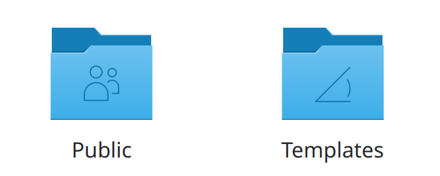
The “Public” and “Templates” folders now show nice new icons (Björn Feber, Frameworks 5.86):
…And everything else
Keep in mind that this blog only covers the tip of the iceberg! Tons of KDE apps whose development I don’t have time to follow aren’t represented here, and I also don’t mention backend refactoring, improved test coverage, and other changes that are generally not user-facing. If you’re hungry for more, check out https://planet.kde.org/, where you can find blog posts by other KDE contributors detailing the work they’re doing.
How You Can Help
Have a look at https://community.kde.org/Get_Involved to discover ways to be part of a project that really matters. Each contributor makes a huge difference in KDE; you are not a number or a cog in a machine! You don’t have to already be a programmer, either. I wasn’t when I got started. Try it, you’ll like it! We don’t bite!
Finally, consider making a tax-deductible donation to the KDE e.V. foundation.

Just a generally confused question from a 50-year old music enthusiast with a very large music library: what is the rating of songs useful for..? I might be old and weird but I have never ever understood what it’s for =) Is it to remember what music you like or..? Educate me, young people! PS: I like Nasum.
LikeLike
Rating songs is very useful when you keep discographies around and want to express how good you find certain songs compared to others. Or if you have big music libraries, sometimes it happens that you never get to listen to some of the songs at all (though there are music players who mark them as “unlistened to”).
LikeLike
They were useful in Amarok, where you could set up the player to create playlists according to certain criteria, ratings being one of those criteria.
I have no idea why Elisa needs it.
LikeLike
Track rating in Elisa would be useful if the track list or playlist could be sorted by rating.
Using Strawberry, I often load up all tracks from a particular genre or even artist but am only interested in listening to those that I really like. I like doing this when I am preparing for a job interview (must include theme from Magnificent Seven).
Perhaps newer versions of Elisa let one do this. I am still on 21.04 (Manjaro).
LikeLike
Elisa does let the user filter a track list by rating, which comes close to the use case mentioned above.
LikeLike
I use Rating of Music Title to set a kind of weigth to listen more often or less. Its just personal. I listen a lot of music from Netaudio labels and keep only Tracks that are matching for me. The Artist, Album or Release Year are not relevant for me and i want avoid having tousands of folders and subfolders. I also use Labels (Tags) very have to organize Genre, License and Source information. This is very useful to organize large Music Archives. Amarok ist still working for me but since modern filesystems use xattributes i think about moving Rating and Tagging to Extended File Attibutes (xattr). So i can use information in Dolphin and Elisa or other Programs that can read extended file attributes (e.g. Image Viewer for Cover Art or Search engine)
Rough Idea:
1) Export Amarok DB content (rating and tags) to a textfile (contains tags user.baloo.rating, user.xdg.comment, user.xdg.tags) which is compatible with Dolpin/KDE
2) Import xattr to file system via command setfattr -h –restore=textfile.txt
LikeLike
To be able to remember which songs in an album are my favorite ones faster than reading all the titles. Some times I just want to go straight to one of my favorite songs, and rating them makes it easy. In this mode, I only ever use five star ratings, which means that a more binary choice “e.g. favorite/not favorite” would work too. See https://bugs.kde.org/show_bug.cgi?id=430196.
LikeLike
Ah, I see. Each to one’s own I guess, I don’t listen to music that way and ALL my tracks are 100% 5 stars! =) On my phone I use Black Player EX, it has an “add to favorites” option (that I don’t use either haha..) and then there’s a separate Favorites tab to access all them favorited tunes quickly. A system like that is logical even for an old fart like me. It would take me somewhere along 20-30 years to rate every song I have with a 1 to 5 stars system, time I simply don’t have. So I just use a big grid of album covers and pick something.. which usually still are the same damn 5-6 albums I always end up listening to..since 1982. Too many options will cripple you.
LikeLike
O_O this is such quality work, devs! I particularly like the change of the increase/decrease arrows being easier to hit.
LikeLiked by 2 people
Thank you so much for the kind words!
LikeLike
And once again, I feel it’s worth pointing out that these awesome devs are fixing 15 year old bugs!! “When attempting to copy a file to a filesystem that doesn’t support some of the characters in the filename, inform the user of this fact”
LikeLiked by 2 people
Shoutout to Ahmad Samir!
LikeLiked by 1 person
-1 for new design of spinboxes. Displaying the arrow buttons together looks more logical, while displaying on opposite sides of the input field would make me to move the mouse cursor back and forth.
P.S. Why not do a survey about such UX/UI changes in the future?
LikeLiked by 2 people
Yep. They should be grouped together on one end of the field. Imagine a long field and the current solution instantly looks not so well-thought.
LikeLiked by 1 person
I also have concerns over the size of the new buttons vs the old. It works well for simple forms, but for complex applications which make heavy use of spinboxes (eg the mapping application qgis) the increased widget size would be incredibly painful. (The more space required by UI widgets the less space is available for content!)
LikeLike
On first look, I liked the concept very much and also think this has not seen elsewhere before.
However on second thought I also came across those possible downside. The good thing is that one is extremely unlikely to hit the wrong button now which might make the need for corrections more seldom. This will probably require practical experience and data.
In general I think that scrollable views for this like on Android and iOS are even better for touch. GNOME might also have this. One might even use different behavior for touching the item which then opens the scrollable view vs. clicking on the item with the mouse which could just place the cursor there without opening the scrollable view.
LikeLike
I like them very much, both visually and functionally. I don’t share the point of “more logical”. 🙂
LikeLike
You can also still use the mouse wheel to quickly change the value.
LikeLike
I’m 50/50 on the above sort of change being made to suit touch-screen phones over desktop mouse cursors, the old buttons were quite small but the above is a bit odd. And phones could swipe left/right on the field to go through the options.
LikeLike
This isn’t a touch-only change. The old version was fiddly and error-prone even with a mouse or a touchpad due to the ridiculously small size of the stepper buttons and lack of visual indication for the bounds of their clickable areas. Anecdotally, most people ignored them and instead entered the desired new value directly or incremented it up or down using a scroll or the arrow keys.
LikeLike
The arrows being on either side vs grouped together is an easy thing to change in the future if we need to, and it’s the one thing I was a little unsure about myself. But I can see both sides of the issue. Grouping them makes it easier to quickly adjust the value in both directions, but also increases errors from accidentally clicking the wrong button–especially with sloppier input methods such as touchpads and touchscreens.
LikeLike
Isn’t it a user experience thing to have the user move the mouse cursor as little as possible? While this change might be nice for touch users it’s nearly completely useless for classical mouse users but still this is forcing a change in control behaviour for probably 99% of people for the 1% that might actually tap on their touchscreen for this action. That’s not cool, to be honest.
LikeLike
“to have the user move the mouse cursor as little as possible” is important, but you’ve missed the other half of the equation: the size of the click target. Both together constitute “Fitts’ Law”, which states that the speed of acquisition with a pointing device is proportional to both distance and size. So if you make something bigger and put it farther away, it may be just as fast or even faster to acquire. That’s why we say that this change benefits mouse and touchpad users as well, not just touchscreen users.
LikeLike
Ok, fair enough. Why don’t you put the same sized decrement button beside the increment button instead of the other side of the input field? That’s less way to move but still bigger buttons. I just can’t really see how someone came up with this layout and everyone was like “yeah, that’s cool”, it does personally not feel right just by looking at it 😀
LikeLiked by 1 person
As I said in another comment, it’s on the table. That was the one element I wasn’t sure about myself.
LikeLike
It’s not useless for mouse users. The previous up/down arrows were extremely small which made them hard to accurately hit even with a mouse.
LikeLiked by 1 person
I see your point, but this is again one of those changes that redesign default behaviour without giving the user an option to opt-out of this change. I don’t want to move my mouse from one side of the field to another, because it is inefficient compared to old behavior. I appreciate the work you do, but in the recent past there have been multiple changes that significantly change the UX and force old users to use switch to a worse UX pattern without having any fallback.
I don’t mind having new UX developments, but there should always be a way to revert them back. Especially those changes that make sense only on touch devices, but not on devices with a mouse. Trying to fit both environments is ruining the experience of both. If I have a device with a mouse, I want a UI fine-tuned for this configuration and it as efficiently as possible.
For example, some time ago, Okular introduced scrolling with inertia that’s impossible to turn off. There has been some backlash and it’s possible to partially turn it off. Even if you turn it off in the menu and you click and vertically slide with your mouse, the document just keeps scrolling with inertia. This new behavior ignores the accessibility option that turns of all animations. There’s no benefit in having this feature if you want a snappy experience, but “it scrolls just like on your phone!”.
Another example are rounded corners on the selection box (e.g. when selecting icons on the desktop). What if the user likes sharp corners? There’s no way to turn off rounded edges even if the rest of the theme has sharp corners. Why are users unable to switch back?
I have seen the recently redesigned Application Launcher and the design is very confusing. There are 2 different “Applications” sections showing different applications. At the bottom there are some session management buttons which are always visible, but at the same time those that I personally use the most (Lock, Log out) are hidden under an arrow pointing left (what?). The old design was much more consistent. There was no option to revert back, so I had to change it to the “Application Menu”.
There’s also a slow creep-in of hamburger menus everywhere. These hide the basic functionality that was previously accessible through the window’s main menu. Some System Settings tabs now have 3 different “menu” buttons, each in a different place and each for a different group of actions. One main menu would make this consistent. Instead, it turned into a small game of discovering and clicking 3 different menu-buttons to find the actual action I am looking for. I want to get things done and hiding away options just to make new users less confused is getting in the way of an efficient workflow.
Sorry to say, but the UI/UX changes are really starting to look like they are steering away from the goal of being functional and more towards GNOME-like/Mozilla UX disaster – inconsistent UX that makes no sense from the traditional usability point of view and is done only for the sake of changing *something*, so the UX team can put something in the changelog (like changing the positions of standard widgets).
This new wave of touch-device-oriented UX is ruining what has been until recently a highly efficient UX that has been built over decades and users got used to it. The old UX on desktop computers allows expert users to work efficiently. On the other hand, touch devices are purposefully simplified (“dumbed down”) due to the input limitations and targeted audience being the general population. Mixing the two hurts both use cases.
As a long-term KDE user, I want a snappy UI without any effects, without all the fancy touch-device widgets, without the new modern inconsistent UX. I want it to work the same old way from one release to another and have the ability to turn off all the new changes that I don’t like.
These issues are slowly accumulating over time to the point I am considering building my own KDE fork without all these new improvements. I would like to contribute to the project, but I have a feeling the UX changes are a done deal, and no amount of discussion will change the pre-made decision. I am not even sure if it’s possible to even negotiate options to revert back to the old behaviour. Why else this wouldn’t have been the case already?
Best regards,
Peter
LikeLike
> These issues are slowly accumulating over time to the point I am considering building my own KDE fork without all these new improvements.
Does this then become an new “Trinity” aka KDE3.5 for Plasma5? 😀
LikeLike
> my own KDE fork without all these new improvements
I think it’s enough to just fork the Breeze visual style and adapt it for yourself.
LikeLike
I know change is hard and can be scary. But I think if you give the changes a chance with an open mind, you’ll grow to like them over time. Ultimately most of these changes are simply bringing more consistency and basic usability. For example we always had hamburger menus–we just used them inconsistently and their contents were poorly organized. We’re fixing those issues. We also always had animated scrolling–in some places. Now we are simply trying to make things consistent.Our old spinboxes with tiny stepper buttons were *not* better. The buttons were unusable for everyone except people with precision mousing skills–and even for them, interaction was slow because precise actions require more time to accomplish. And the tiny buttons being so close together made it very easy to mis-click. These are true facts; you can prefer the old style anyway, and that’s fine. But the only advantage the old one had was being more compact. We judged that solving the usability problems was more important than preserving the compactness of the control. Your personal judgment may be different, and, again, that’s fine. You’re welcome to use a different theme, or fork the Breeze theme to bring back the old control style and put it up on store.kde.org, or whatever. You have choice. You are not forced to accept anything.
In cases where the changes can reasonably be seen as a matter of preference rather than something objectively better, we do try to make the change reversible. For example you can use the old Kickoff if you like. It’s right there on store.kde.org. The change to the spinbox was made to the Breeze theme, which means if ultimately you come do dislike Breeze, you can use a different theme or even make your own. And if you hate hamburger menus in apps, then no problem, just show the menubar. The burger menu disappears and the old in-window menubar re-appears. In apps where you can’t do this, it’s because there weren’t even enough menu items in the first place to have a menubar. It would be silly because each menu would have only like one or two items in it. It would take up a bunch of space in the window and then other people would complain about *that*. UI design is a compromise, and one challenge that KDE has is a userbase that at times seems evenly split between people who say, “Everything is so small and cramped! Give it more padding! Get rid of useless space-wasting elements!” And people who say, “OMG I hate this modern design crap! I want the tried-and-true menus and toolbars full of buttons with lots of UI controls like I’m used to!” We try to thread that needle, but as you can imagine, this is a difficult challenge. 🙂
I cannot find any System Settings KCMs with three hamburger menus. Can you point me to an example? That would be an issue worth fixing.
LikeLiked by 2 people
Hamburger menus are bad. There are various reviews that confirm this. This is also logical, since you first have to open the hamburger to see the inside. Apple also used to have guidelines that explicitly stated that hamburger menus should not be used. I don’t understand why hamburger menus are now being used in KDE. They should be removed instead of added.
As long as those awful hamburger menus are only optional, you can live with it. But I still don’t understand it.
LikeLike
Hamburger menus used for *navigation* are bad. If you re-read the articles and usability studies you’re thinking of, you’ll find that this was the focus. To my knowledge there are no usability studies showing that hamburger menus used to display *commands* (just like traditional menus) are bad. Can you find any studies which show this?
LikeLike
You can make the new Application Launcher show session buttons (log out, lock, etc.) at the bottom instead of the power actions. Just go into the widget settings. And I personally just don’t see how the new layout is confusing, categories on the left, apps on the right.
And if you really don’t like the new launcher, then you can just use the old Kickoff:
https://store.kde.org/p/1468103/
LikeLike
> clicking the wrong button
I don’t believe that anyone can miss such large buttons 🙂
LikeLike
BTW, have you considered using different visual styles for desktop and touchscreens?
LikeLike
I don’t believe we have, no.
LikeLike
Hi Nathan. Just noticed there is no way of changing the hostname from KDE settings. The only way to do it is from the terminal or at install. This would confuse a normal user. Can you add a setting for that? regards
LikeLiked by 1 person
Sure, eventually.
LikeLike
Hate the new spinboxes for a slew of reasons mentioned by others. Plasma needs to decide if it’s ‘desktop first’ or ‘tablet first,’ because trying to serve two masters becomes a game of lowest common denominator – i.e tablet considerations win and lead to a suboptimal, dumbed down desktop experience.. which we are seeing the beginnings of right here. Please don’t turn it into another Gnome.
LikeLike
This isn’t a tablet/touch-focused change. The old version was fiddly and error-prone even with a mouse or a touchpad due to the ridiculously small size of the stepper buttons and lack of visual indication for the bounds of their clickable areas. Anecdotally, most people ignored them and instead entered the desired new value directly or incremented it up or down using a scroll or the arrow keys.
The old obsession with tiny controls isn’t just touch-unfriendly; it also hurts mouse and touchpad users and encourages overwhelming UI design with zillions of poorly differentiated and grouped controls displayed all at once like an aircraft cockpit. Moving away from that is a good thing for everyone, not just tablet users.
LikeLiked by 1 person
Agree with the rationale and love the change to the spinboxes Nate. We need more boldness to be able to improve these things, and I’m deeply grateful for this kind of creative thinking. Otherwise we stagnate functionally and visually. Kudos to the team for the well thought out design and implementation!
LikeLike
> The old obsession with tiny controls isn’t just touch-unfriendly; it also hurts mouse and touchpad users and encourages overwhelming UI design with zillions of poorly differentiated and grouped controls displayed all at once like an aircraft cockpit.
That’s fine for some categories of applications, but some applications are just complex by their very nature. An example would be blender, or Krita/gimp/Inkscape/ardour/… These will never be touch centric applications, and require exposing a LOT of controls to users in order to allow productive workflows.
My concern is that the very large increase in spinbox size comes at a very harmful cost to this category of applications.
I’m hoping some compromise can be made here so that both categories of users/applications can be happy!
LikeLike
Optionally hiding the buttons could be such a compromise. Spinboxes react to the scroll wheel, so you don’t really need the buttons if touch is not a use case.
LikeLike
Not everyone knows that it reacts to a scroll. Even if there is an invisible UI (e.g. scroll or right-click), you still need a visible UI. It’s one of our basic UI principles. 🙂
LikeLike
Is it possible to add the “open destination folder” feature in the context menu of any selected file listed in the recent folder of Dolphin?
LikeLike
Indeed it would be. In the meantime, there’s a “copy location” menu item in the context menu.
LikeLiked by 1 person
Hello!,
I am using the breeze icon theme in KDE neon version 5.22.4. Am I the only one who thinks the scrollbars are too narrow in Firefox (the width of the scrollbars in Chrome is fine I think) Is there a way to make these scrollbars a little wider?
Screenshot for Firefox: https://imgur.com/ho6toDv
Screenshot for Chrome: https://imgur.com/mY7Te0a
LikeLike
Wasn’t sure about the new spinbox design at first but after thinking about it, seems quite nice.
Just a tought, why not use – and + ? Seems a tab more logical to me and align with other OS
LikeLiked by 2 people
That’s not a bad idea!
LikeLike
It’s also a bit more distinct from the down arrow that’s used to open/expand the other selection boxes
LikeLiked by 1 person
Yeah, I also like +/- signs better in this case.
LikeLike
> spinboxes
IMO, making the width of the arrow buttons dependent on the height of the control is a bad idea. I believe they should have a some fixed width. See https://imgur.com/a/ecO9bJN
LikeLike
lol that seems like a bug. Wanna submit a merge request to fix it? 🙂
LikeLike
I believe the author of these changes will handle it better 😉
LikeLike
Perhaps. Have you let her know of your desire for it in the form of a bug report? 😉
LikeLike
How about NVidia Wayland with KDE Plasma 5.23? Nvidia will adopt alternative GBM support.
LikeLike
They will? Can you point me to a source for this information?
LikeLike
Best source we have: https://gitlab.freedesktop.org/mesa/mesa/-/merge_requests/9902
LikeLike
Looks interesting. I’m not sure what if any changes on the KDE side might be required though.
LikeLike
Plasma 5.22 Wayland + Nvidia already works ok-ish, works out-of-the-box on latest fedora btw.
LikeLike
Nice job as usual. Congratulations and many thanks to you.
But let me do a couple of criticims, without the usual condescendence but of course with no intention to be harsh:
– «“Public” and “Templates” folders now show nice new icons»
No, excuse me, but Public, Templates, Images, Documents, etc, Breeze icons for folders, generally speaking, are just dumb, practically undistinguishable unless you use a huge size -so you waste you screen’s space to show icons and not real, useful, content- otherwise you just see a cute blue folder icon with some scrawl you need to interrupt your workflow to com close to the screen to distinguish what the hell does said scrawl represent.
– Elisa’s sorting needs a tree view, like in Strawberry. Current design is a waste of time: instead of expanding/collapsing a “directory” tree and see all the albums under an “Artist” category and all the songs in an album, with two clicks, you have to click on Artist, choose the album it in the central panel and click so you are able to see which songs are contained, then you see the the song you look for isn’t there you you have to clock the back arrow and then repeat the operation with other album.
Its a clumsy and time wasting way to do it that may not be too annoying if it happens once a week but irritating if happens 5 times a day.
Also Elisa, it lacks a “Composer”, “Player” -or “Performer” I have seen in some players- and “Work title” left panel entries for cover versions -songs whose creators are others than the players-, classical music, etc. If I want to listen Alonso Lobo’s ‘Versa est in luctum’ -example is just happening while I’m writing this, can’t be fresher- how should I search for it using the menues? The file is correctly tagged: the composer’s name is placed in the “COMPOSER” field of the ID3 tag, the players, in “PERFORMER” -please see Kid3-, the piece’s title in “WORK” -again see Kid3-; there’s no “ARTIST” info, only the “ALBUM” ID3 field can be read by Elisa, but as you can imagine, in classical music, well, renaissance, in this concrete example, work titles and album names are very rather unrelated, every ensemble, every record label entitles the album as they want so you may have the same piece 3 times by 3 different editions and all the 3 albumes have a different title, so the album title isn’t very useful here.
Cr*p! I didn’t expect my comment to end being so extense. Sorry
I hope you’ll find my criticism constructive, I have had no other intention. Thanks for your great job anyway.
LikeLike
Glad to see thicker scrollbars make a comeback. It’s one of my only real issues with the Breeze theme.
Also an upvote for the new spinbox controls.
LikeLike
FWIW the increased thickness is just a visual trick; the actual clickable area is exactly the same as it was before. It’s just that it *looks* thicker now 🙂
LikeLike