Here’s week 81 in KDE’s Usability & Productivity initiative! And boy is there some delicious stuff today. In addition to new features and bugfixes, we’ve got a modernized look and feel for our settings windows to show off:

Doesn’t it look really good!? This design is months in the making, and it took quite a bit of work to pull it off. I’d like to thank Marco Martin, Filip Fila, and the rest of the KDE VDG team for making it happen. This is the first of several user interface changes we’re hoping to land in the Plasma 5.17 timeframe, and I hope you’ll like them!
In the meantime, look at all the other cool stuff that got done this week:
New Features
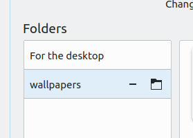
- Image slideshow wallpapers now permit you to set the sort order, rather than always being random (David Redondo, KDE Plasma 5.17.0):

- The Night Color feature now has a “Manual” mode that allows you to turn it on or off at will (Vlad Zagorodniy, KDE Plasma 5.17.0)
- The feature that syncs user settings to the SDDM login screen now syncs the screen DPI and NumLock key status as well (Filip Fila, KDE Plasma 5.17.0)
Bugfixes & Performance Improvements
- Opening the System Settings Fonts page no longer unexpectedly alters the font anti-aliasing settings (Antonio Rojas, KDE Plasma 5.16.4)
- When using the Application Dashboard, opening apps with a touch on the touchscreen now works reliably again (Luca Carlon, KDE Plasma 5.16.4)
- KRunner is now faster to return results, and entries no longer jump around once you’ve got something selected (Kai Uwe Broulik, KDE Frameworks 5.61)
- KIO’s FTP connection feature is now more tolerant of broken FTP server implementations (Enes Selim, KDE Frameworks 5.61)
- List items in QML-based software that displays inline actions on hover now have better spacing for the items, and take into account whether or not the view’s scrollbar is visible (me: Nate Graham, KDE Frameworks 5.61):
- Media apps using a sandboxing technology like FireJail can now be controlled through Plasma’s Media Player widget as expected (David Edmundson, KDE Frameworks 5.61)
User Interface Improvements
- The Networks widget’s Airplane Mode setting now persists across reboots, powers off Bluetooth as well, and no longer appears at all on systems without any wireless hardware (Jan Grulich, KDE Plasma 5.16.4)
- Code that controls widget positioning on the Desktop has been completely rewritten, which should improve remembering widget locations, and also now widget resize handles and icons increase in size when interacted with via touch (Marco Martin, KDE Plasma 5.17.0):
- Discover’s sidebar is now full of pretty icons! (Dan Leinir Turthra Jensen, KDE Plasma 5.17.0):

- The System Settings Fonts page now informs you that apps may need to be restarted before changes are applied with an inline message rather than an annoying dialog box (Filip Fila, KDE Plasma 5.17.0):

- The new Unsplash Wallpapers Picture of the Day plugin now lets you select which category you want — or all of them! (Yunhe Guo, KDE Plasma 5.17.0):

- The Audio Volume widget now uses the more user-friendly term “Recording devices” rather than “capture devices” (me: Nate Graham, KDE Plasma 5.17.0)
- The spinning busy indicator visible in Discover now spins more slowly (me: Nate Graham, KDE Frameworks 5.61):

- Improvements to Okular’s Stamp annotation tool: the configuration dialog is now more obvious about the fact that it supports user-specified images, and it shows a preview of your custom image; non-square stamps aren’t resized to be square; and finally it now warns you that it’s an experimental feature which may not work properly in all cases (Simone Gaiarin, Okular 1.9.0):

Next week, your name could be in this list! Not sure how? Just ask! I’ve helped mentor a number of new contributors recently and I’d love to help you, too! You can also check out https://community.kde.org/Get_Involved, and find out how you can help be a part of something that really matters. You don’t have to already be a programmer. I wasn’t when I got started. Try it, you’ll like it! We don’t bite!
If you find KDE software useful, consider making a tax-deductible donation to the KDE e.V. foundation.

Hi Nate ! Great work as always !
I just wanted to get back to a subject you mention(n)ed a few weeks back. The fact that by default, it seems, the Dolphin per directory view settings are not being retained, contrary to the former behaviour where it used to remember the view settings of each directory.
Actually, I could set a “sort order” different for my downloads directory for instance (by date / dirs not first / reverses) and still view my other directories in the normal alpha order, which used to be possible before. For some directories I find it extremely handy to have a custom sort order, it seems it is not possible (easily) anymore ? The former behaviour seems to still work on my other Neon machine that was installed a few years back and not on my newly installed one.
Just wondering ! 🙂
LikeLike
Sorry for the typo.
I did NOT manage to set a different set order for my d/l directory, contrary to what I used to 🙂 When I do, it also changed the sorting setting for all other dirs.
LikeLike
Yeah, there’s even a patch to fix it: https://phabricator.kde.org/D21937
There’s still some discussion on whether it’s the best way to fix the issue. But it’ll get in eventually, in some form!
LikeLike
Hi Nate, I’d like to talk you about Discover. Currently, mostly people use 2 update applications, the default one from OS, in my case Pamac, and then another one for flatpaks, Discover. Do you think it would be possible, in a future, bring in apt, pacman, zipper and other ones and get to use one only tool for manage it all?
LikeLike
This is already possible and it’s the problem package PackageKit was created to solve. If Discover currently does not update system packages for you, you need to install the PackageKit backend. The PackageKit backend should be installed by default on most distros. (posting twice since the first time didn’t register as a reply to you even though I clicked reply on your comment)
LikeLike
This is possible with Discover, but you need to install packagekit-qt5 on Arch Linux. I’m just not sure how reliable it is not to use pacman based updates.
LikeLike
That can be achieved with packagekit.
At least on Arch/Manjaro it works well. The only annoying thing about Discover is that you can’t modify the notification-behaviour on updates ^^
LikeLike
You already can use Discover to update your normal repo packages, in fact that is what it does primarily. It doesn’t update or install anything from the aur though, so you’ll need an extra tool for that which I guess is what you use pamac for.
LikeLike
Discover is a PackageKit frontend, and it uses appstream metadatas to “sync” with distros packages. So you can install/remove/update packages, not only flatpaks and snaps, as you do with Terminal/Synaptic/YaST/DNFdragora/Pamac-Octopi/etc.
However, for updates, sometimes it’s not possible, for example in openSUSE Tumbleweed which has snapshots, but it works well with openSUSE Leap or APT distros like Kubuntu for example.
It’s too complicated to support all package-managers. I’d love to be able to update any distro with Discover too, but some of them are too specific and don’t work well with PK.
LikeLike
I’m sorry for comment so late, I was on vacation. Thank you all for the answers guys, I didn’t know already it were a way. I’ll check it out and see how it goes.
LikeLike
This is already possible and it’s the problem PackageKit was created to solve. If Discover currently does not update system packages for you, you need to install the PackageKit backend.
LikeLike
Wow! Loads of great new stuffs!
Thank all of you guys 💪🏻
LikeLiked by 1 person
Excellent. The slower spinner is one of those details that makes a big difference.
LikeLiked by 1 person
Hi Nate,
Great work as always.
Could we have an option in the application dashboard to change the icon size and also ive got upwards of 2000 entries in it and it really slows down when a new application is being added, as in freezes and unresponsive until it updates. I know this may be an extreme case but im building a games computer and im adding games one by one
LikeLike
Wow, that’s a lot of apps. We can look into it!
LikeLike
Thank you Nate. It does leave a large memory footprint too when the application dashboard is fully loaded
plasmashell 4,011,636 K
LikeLike
I am curious why the divider between the panels has to be this blue color. It doesn’t look good imo. Ideally, you’d have dividers all be the same color, like in your inactive window on the left.
LikeLike
It’s left over from the old design. We plan to remove that part too and make it gray like the other one.
One nice thing about improving the design is that the remaining issues tend to stick out like sore thumbs! Makes it easy to notice them and fix them.
LikeLike
Is there a plan to remove to spread this new design to other apps? QT apps have a outlines around views. Here’s fragment of Dolphin where you can see the excessive outlines. https://user-images.githubusercontent.com/45201036/60602067-c6b97980-9dbb-11e9-9703-fe37872fcbe6.png (Breeze tries to hide them a bit, with limited success).
Look at Kate, there is a border encircling the editing area. Same with Okular. It would look much neater if the the editing area was just extended to the edge, like in the new Setting app.
This is one of the main reasons why Gnome apps look better (IMO). They don’t have these outlines. Insteadm, various regions of the UI are divided from each other with dividers that extend to the edge of the screen. Kirigami apps do this too, but most QT programs do not. I could never put my finger on the reason why the newer GTK programs look so much “cleaner” before I realized this.
LikeLike
Precisely. As a design concept, “Single-pixel separator lines” is just so much better to look at than “Everything is inside a frame”. We are most definitely planning to bring this kind of change to QWidgets apps’ main windows as well (at least when using the Breeze theme). We just decided to start with settings windows as it was one of the more glaring examples of something that could benefit.
LikeLike
Looks fine with the light theme though https://phabricator.kde.org/T11279
The optimal look would be achievable with CSD, which would eliminate the need for a separate title label (the “Icons” in huge font): https://aozoeky4dglp5sh0-zippykid.netdna-ssl.com/wp-content/uploads/2016/01/new-GNOME-settings-design-750×525.jpg (Ofc I know that’s not happening any time soon).
LikeLike
Even in your CSD image, the title is repeated twice (once on the left, and once in the headerbar). I wonder if it might make sense to not even show the second one at all. The highlighted tab on the left sidebar already makes it perfectly clear what tab you’re on and what it’s called.
LikeLike
Yeah, I agree with the idea of removing the title label. It’s especially annoying when you open KCM modules individually, because their windows are small in size and the label takes up a lot of precious vertical space (and doesn’t look good, imo).
LikeLike
I decided to give it a try so we can see how we like it: https://phabricator.kde.org/D22884
LikeLike
The new setting’s headline‘s padding/margin looks Insufficient (Appearance/Tab Bar/Applications in the pictures) . Also do we need this headline? This headline looks unnecessary.
LikeLike
Yet another example of “One nice thing about improving the design is that the remaining issues tend to stick out like sore thumbs! Makes it easy to notice them and fix them.”
I would tend to agree. Since the title is redundant with the title listed in the tab lar on the left, maybe we could just remove the one on the page entirely. We’ll discuss it and see if it makes sense.
LikeLike
Sorry, I haven’t notice this headline have already exist in old setting design (I realized just now). But the same suggestions apply.
LikeLike
A few suggestions from a gaming perspective… ! I’m really not sure at all it’s the place. But now that the Nvidia proprietary drivers work perfectly out of the box with no tweak (yeepee !!)… 🙂
– offer a “performance” mode that will change the cpu governors to performance, which could be toggled by a plasmoid and/or kwin rules (there’s a Gnome Shell extensions which allows to permanently toggle the cpu governor)
– and/or a Feral gamemode API support (there’s a Gnome Shell extension for it too)
– give some other options to suspend compositing for the numerous games that don’t ask kwin explicitely (incl. WINE apps — although it seems Proton does ask the compositor to suspend)
Just mentioning those, as “casual gamers” may just find performance is sub-optimal although it’s just due to not suspending compo, and using suboptimal priorities, cpu governors etc.
Steam might eventually automatically do all this by itself. But I’m pretty sure KDE fans also want to push OSS & DRM free games !
LikeLike
Very cool ideas. I’d like those too.
LikeLike
Nice work as every week reported here.
Plasma 5.17 is really taking a beauty form, seen the work of modernization you’re doing. It looks great, more consistent and modern, congratulations!!
Of course, it’s always good to read about the constant improvements made on KDE Software.
I reported a few bugs recently about issues with Wayland session, so i really hope they get fixed for Plasma 5.17.
Great work as always and thank you for all you do day by day, to everyone and Nate especially.
A huge hug and bests to all mentioned above ^^.
LikeLiked by 1 person
Awesome. However, is the okular stamp warning true? It WILL NOT work in any viewer besides okular? Or it MAY NOT? It’s not clear from the phabricator discussion.
LikeLike
It probably will not work, but it depends on the program used to view it. Better to err on the side of caution IMO.
LikeLike
Great work, as always! 🙂
Quick question though: when was the icon size slider added to the icons-only task manager settings and what repo is it part of? ‘Cause I can’t seem to find it on KDE’s cgit page.
LikeLike
Excellent work, but I have two thoughts.
In Configure – Konsole Tab bar, Position shouldn’t
above terminal area
be above
below terminal area
instead of below.
and in Put new tabs
at the end
come at the end, after
after current tab
LikeLike
Actually this is just an artifact of me using non-default settings in the screenshot. 🙂
LikeLike
Just thinking that this blog and the fact that you follow the comments of your readers may be the best thing ever happening to KDE. Thanks for doing this.
LikeLike
Hi, any possibility to address this bug (Present Windows)? https://bugs.kde.org/show_bug.cgi?id=385522
LikeLike
Extract: “As already said, the advantages to have a configurable dimming are many from a genaral UI point of view. Some of them:
– Dimmed windows that illuminates on mouse hovering is eye popping on the long run and causes eyes fatigue. Imagine using the computer at least for 3 hours a day and switching the windows in such manner… it’s better to have a setting.
– People are different so, for one could be ok for another not… it’s better to have asetting.
– KWin should be universal, so adaptable to any needs…”
LikeLike
Yes, I recall that someone’s working on it. Due to the fragility of the code, it’s not as easy as it might seem.
LikeLike
Hello,
First of all, congratulations on your and your team’s work. As it happens, I have a couple of personal nitpicks with KDE that I would love to see resolved in some future iteration. Wall of text incoming:
1) The folder view settings should IMHO be synchronized between Dolphin, the Desktop and the file picker.
First of all we have the preview function (whether previews are on or off and the various toggles for the items to be previewed), which I think should be a universal setting.
Besides previews we should also respect folder settings like sorting order (including details like folders-first or not) and hidden files toggle. Changing these settings for a folder in e.g. Dolphin should apply instantly to the other two cases (and vice versa) because these settings belong to the folder, not to the widget currently displaying that folder. That goes especially for the Desktop widget’s (applet’s?) Folder View mode, which shouldn’t, at least by default, feel like a separate piece in the folder hierarchy; in other words, the Desktop should absolutely reflect whatever settings are already in place for the ~/Desktop folder via Dolphin (or whichever folder the user may have picked for displaying on the Desktop); and changing something on the Desktop (e.g. showing hidden files – quick question: how DO you show hidden files on the Desktop?) should be carried over to the ~/Desktop folder itself.
As a final note, all three interfaces (Dolphin, Desktop, file picker) should visually be identical – e.g. currently, when hidden files are shown in the file picker, they’re not semi-transparent like in Dolphin but a solid color like normal folders.
2) And now, specifically for the file picker… It, or I should rather say “they”, should be made consistent across the various apps and toolkits. The two problems here are a) that depending on the app/toolkit the file picker is really a different app with its own settings for previews, hidden files, etc (off the top of my head I can think of the pickers for Firefox with xdg-portal-desktop-kde, LibreOffice with the kde5 vcl, LibreOffice with the gtk3_kde5 vcl, VLC, Gwenview, Okular…) and b) the all too usual “(in)sane defaults” issue.
As it stands currently, not only are the various settings all over the place but they also don’t have proper and above all *consistent* defaults, so the file pickers do not feel like they’re the same piece of the desktop machinery (which they should, even if in reality they’re different apps).
IMHO, the worst symptom of this is their size. Would that all these file pickers have a proper default, universal and consistent default size, instead of spawning like itsy bitsy tiny boxes that need to either be manually resized every time they’re opened or (if the user is advanced enough to know about Kwin settings) special window rules need to be added for EACH ONE of them for Kwin to handle them properly (i.e. initial position, size, etc), otherwise you’re left with a situation that the file picker in e.g. Firefox is working perfectly, but then you try to open a file through VLC or Okular and it’s back to the itsy bitsy tiny box again…
3) Addendum: a (probably very, if at all) long-term goal but please, when you find the time and the inclination, decouple the system tray icons from the Workspace theme settings and let them belong to the Icon theme settings. As it stands, if I set e.g. Breeze as the Workspace theme but a non-default Icon theme, the system tray icons will still be of the Breeze variety. What’s worse, any custom widgets I use (case study: USwitcher) will be a mishmash of icons from Breeze and the non-default Icon theme I’m using. It’s pretty grating, to say the least.
Disclaimer: I of course am not bashing you here, neither KDE itself nor your personal work and dedication in polishing it and fixing the little stuff like the ones I just described. KDE is already great (that’s why I’m using it after all) and it’s becoming even greater with each passing day. And I also understand that e.g. the difficulties with the file pickers are indeed due to KDE being by necessity a mix of different technologies, whose quirks aren’t always under your control. But still, as I’m sure you already know (hence the whole VDG initiative), it’s these “thousand paper cuts” that count most at the end of the day from a UX perspective.
Anyway, keep up the good work!
LikeLike
1. This is a known issue, tracked with https://phabricator.kde.org/T9226.
2. Using the KDE picker depends entirely on the app itself. Specifically, the app’s widget toolkit needs to be able to request a native dialog when run outside of its own environment. Qt does this for Qt apps run in GNOME, but GKTK does not do this for GTK apps run in Plasma. There’s some Flatpak technology that can be used to force GTK apps to behave properly, provided that they’re using the GTKFileChooserNative API. Again, this is 100% on those app developers; there’s nothing KDE can do about it. As for better default sizes, this is something I plan to work on soon.
3. This is under discussion, and I’d like it too. See https://phabricator.kde.org/T10046
LikeLike
1. Thanks, that’s great.
2. Yup, I understand how this works and I’m not suggesting to change the current situation (which, as you said, it’s not really up for debate anyway due to the choice being strictly in the app’s end). My issue was a) about the various file pickers’ default window size, and b) about their view settings not being shared between them.
If their window size is made to default to something proper, and if their view settings (previews on/off, hidden files, sorting orders, etc) are made to be shared between them (even though they’re technically different apps, from a user’s perspective they are/should be the exact same thing) then that’d be a good and proper solution to this issue.
3. Thanks!
LikeLike
The problem with making file pickers in KDE apps universal rather than per-app is that there are some settings that would be irritating to have synced–such as the default dir. It makes sense for each app to handle those individually. As for the view settings, I can see that both ways too. For a photo app, you might want its open dialog to always be in icons view, while for a text editor, a list-style view would be better.
LikeLike
Sorry to bother again about this, but once again I wanted to point out this thing about notifications …
Currently in my tray there are the following apps:
– Clipboard, with the button to clean up the notes but which does not have the settings button on the far right edge;
– Bluetooth, which has the first button to add devices inside the panel, and then the settings button on the far right edge;
– Network Manager, which has the first button to search for connections, and then the settings button on the far right edge;
– Volume, which has the settings button on the far right edge;
– Notifications, which has the settings button first, IN THE INTERNAL PART OF THE PANEL, further to the left, and the button to clean the notification history ON THE FAR RIGHT EDGE;
Is it just me finding the layout of the notification panel buttons slightly inconsistent (inverted) compared to the others?
Sorry for my english, I thank you for the love and effort you’re putting into KDE!
LikeLike
It looks pretty consistent that the settings button is always on the right. It looks like the only inconsistent one is actually Notifications. This was in fact changed recently: https://phabricator.kde.org/D22075
We can revisit it.
LikeLike
Exactly that! What I wanted to say at the end of all this is that all the panels are consistent apart from notifications, which has the button layout almost reversed compared to the others. It’s just a little thing but it’s nice to know that it will be corrected; Bravo!
LikeLike
another great report with great stuff from KDE community!
And another Spanish translation to spread the word!
https://victorhckinthefreeworld.com/2019/07/29/mejorando-kde-en-facilidad-de-uso-y-productividad-semana-29-de-2019/
join the game to KDE community!!
LikeLike
Very awesome updates! I can’t wait for the Plasma 5.17 as it will feel even more mature with many “obvious” (and yet so often omitted) and reasonable features.
I love that we can now set the order of the photos which with the right time frames allows us to use photo series like Mohave Dessert from Mac OS and it will change dependently on the hour of the day. Now we need more of such photo series to enjoy this cool effect :D.
LikeLike
In fact, there’s even a dedicated 3rd-party wallpaper plugin to implement that: https://github.com/zzag/dynamic-wallpaper
LikeLike
First of all, thanks for the excellent work you do, Plasma 5 is always more fantastic! I would have a small request if possible … the analogue clock’s plasmoid is fantastic, but with the dark theme it remains white, it would be nice if it also had the breeze dark mode. Thank you
LikeLike
Sounds like a good request! Please file a bug on https://bugs.kde.org, against Plasmashell | Theme – Breeze. Thanks!
LikeLike
Fantastic work. I can’t wait till we have access to the default theme.
LikeLike
Not too long now!
LikeLike