Get ready for your weekly load of Usability & Productivity! We’re all working to push Plasma 5.14 out the door, and have already starting work on 5.15. One thing I am personally looking into is improving the visuals of the login screen. As you may recall, for 5.13 we re-did the lock and login screens. The lock screen changes have been very well received, but feedback for got login screen has been more mixed, with many complaining about the (almost) permanently blurred background being a visual regression, since the background image is no longer as clear as it was before.
We’ve heard the feedback and I’m working on the issue. I hope to have a tweaked version ready for Plasma 5.15 that addresses this complaint. You can follow the progress here.
Anyway, here’s the week’s work:
New Features
- Okular has a new “Typewriter” annotation tool that can be used to write text anywhere, which can be very useful for filling out PDF documents without inline text fields (Dileep Sankhla and Tobias Deiminger, KDE Applications 18.12.0):

- It’s now possible to hide KSysGuard’s menu bar — and it reminds you of how to get it back, just like Kate and Gwenview do (Luca Sartorelli, KDE Plasma 5.15.0)
- Added calendar support for public holidays in the Ivory Coast (Lukas Sommer, KDE Frameworks 5.51)
Bugfixes
- Dolphin no longer fails to transfer large files to or from Google Drive (Fabian Vogt, KDE KIO-GDrive 1.2.5)
- The “Missing backends” section on Discover’s settings page no longer erroneously shows backends that are not in fact missing because they are already installed (Aleix Pol Gonzalez, KDE Plasma 5.14.0)
- Fixed a case where Discover (and other Kirigami apps) could crash after using a pop-up menu (Aleix Pol Gonzalez, KDE Frameworks 5.51)
- Discover no longer shows you update notifications while updating, and does show an update notification when there are updates available on a new install of Plasma (Kai Uwe Broulik, KDE Plasma 5.12.7)
- The weather widget now shows correct icon sizes when using certain 3rd-party themes that provide enormous icons (Friedrich Kossebau, KDE Plasma 5.14.0)
- The Plasma Vault icon now looks good when using the Breeze Dark theme (Noah Davis, KDE Frameworks 5.51):

- When a new desktop effect is installed from store.kde.org, it now appears in the list on the System Settings Desktop Effects page (Vlad Zagorodniy, KDE Plasma 5.15.0)
- Plasma configuration windows now raise themselves to the front when they get focus (Kai Uwe Broulik, KDE Frameworks 5.51)
- Dolphin’s search now works again when selecting From Here, if “here” corresponds to the base level of your home directory (Jaime Torres Amate, KDE Frameworks 5.51)
- When a folder has been added to the Baloo file indexer’s list of folders to avoid indexing, it’s now possible to remove the entry later if the folder itself has since been deleted (me: Nate Graham, KDE Frameworks 5.51)
- The balooctl command-line tool for controlling the Baloo file indexer now allows you to explicitly include sub-directories that are inside excluded directories (me: Nate Graham, KDE Frameworks 5.51)
- Dolphin (and all apps using KIO) now have improved network file transfer performance (Fabian Vogt, KDE Frameworks 5.51)
- Fixed a few cases where tabs in Dolphin could display the wrong name (Kai Uwe Broulik, KDE Applications 18.12.0)
UI Polish & Improvement
- Discover is now faster to load the list of featured apps (Aleix Pol Gonzalez, KDE Plasma 5.14.0)
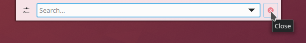
- KRunner’s Configure… and Close buttons now display tooltips (Silas Lenz, KDE Plasma 5.15.0):
- In the System Settings Displays page, the display’s native resolution is now indicated with a little star icon (Aleix Pol Gonzalez, KDE Plasma 5.15.0):

- When using an image slideshow as your wallpaper, the default time that each image is visible has increased to 15 minutes, up from 10 seconds (me: Nate Graham, KDE Plasma 5.14.0)
- The animated transition for collapsing group boxes now respects the global Breeze theme animation speed (Chrishoph Feck, KDE Frameworks 5.51)
- Gwenview now displays a warning dialog when you hide the menubar that tells you how to get it back (Luca Sartorelli, KDE Applications 18.12.0)
Next week, your name could be in this list! Just check out https://community.kde.org/Get_Involved, and find out how you can help be a part of something that really matters. You don’t have to already be a programmer. I wasn’t when I got started. Try it, you’ll like it! We don’t bite!
If my efforts to perform, guide, and document this work seem useful and you’d like to see more of them, then consider becoming a patron on Patreon, LiberaPay, or PayPal. Also consider making a donation to the KDE e.V. foundation.

Whatever final decision is made with the login and lock screen blur in 5.15, please provide an option to disable it.
We now understand that this is a design decision based on the visibility of controls with light colored backgrounds, but Plasma users should have the CHOICE of whether to use your solution or not. Please do not force this upon users.
For a lot of people you are providing a solution to a problem that simply does not exist.
Choice is what defines KDE and Plasma, please continue with this implementation ethos and don’t resort to imposing visual aesthetics upon users the way Gnome does.
Aside from that another very productive week, really looking forward to the 5.14 release.
Thanks.
LikeLiked by 1 person
Yes, adding an option to disable the blur entirely on the lock screen is under consideration.
LikeLiked by 1 person
It might help to use the general animation speed setting for the blur speed. For me, it’s the animation of the blurring that is visually unpleasant.
LikeLike
Hey, they’s not a bad idea! Can you file a bug to KScreenlocker | Breeze Theme? Thanks!
LikeLike
Hello Nate. First of all: a HUGE THANKS for making KDE consistent and more stable!!!
EXACTLY what is needed at this stage to “konquer” back some territory.
To chime in: What makes me want to switch to another desktop sometimes: the boring things that should ALWAYS work but don’t. Stuff that perhaps is not nice to work at, perhaps not visible to most users, but that makes all the difference in the daily life with KDE. Some things to think about:
– I think switching sound from usb speaker to headphones should not only work for eg vlc but also youtube (always works for my laptop, not so for the desktop).
– In the past switching from wireless to wired would freeze the GUI (fixed now?).
– samba should work reliably. Always.
Basically I have to to feel I can trust KDE blindly with regards to stability. Perhaps to make it even more clear: The whole thing is nice enough to look at, everything works quite well, but now make it really ENTERPRISE-READY!!
Just a thought: perhaps the advantage that Gnome has is that it is the desktop of choice for enterprise-grade versions of linux, and paid developers do the boring, but necessary work there… Does that make sense? Can we somehow get that stability and functionality and still keep it KDE?
Thanks again, I think you have one of the most important jobs at KDE!!
LikeLike
Thanks so much for your kind words!
The issues you bring up are exactly the point of the Usability & Productivity initiative. The first and third one are on my list, and the second one is fixed, I’m pretty sure.
LikeLike
I filled the bug request here Nate. https://bugs.kde.org/show_bug.cgi?id=399317
LikeLike
Every time I think going to another desktop
Come this weekly improvement make me say kde forever
It’s good feeling when I see this Coming every week
Really great job
Thanks for all who make this possible
sry for bad English
LikeLiked by 1 person
Awesome! I’m glad it’s making an impact. 🙂
What are the things that make you want to switch to another desktop?
LikeLike
Maybe I was thinking on elementary
I like the way it looks it’s so beautiful in fact and the simplicity out of the box of it
Maybe be plasma should care more about the default themes and out of the box experience
I talk here about my feeling iam not technically excperinced
LikeLike
Believe me, the VDG team thinks about this constantly. 🙂 We definitely want to tweak the basic appearance of apps to make them feel more elegant and less cluttered (without removing any features, of course!).
LikeLiked by 2 people
That’s good news to here and make me thinking that my decision to keep using kde is right
In past I was so excited about dwd but it seems that it will not come soon
But I enjoy using plasma this days
LikeLiked by 1 person
Awesome as always :)!
After 5.14 will be released you will be probably more busy with 5.14 bug squeezing then 5.15 ;). Just saying – that’s the nature of things.
Will there be a way to add image layers as well and not only text? Foxit and Adobe Reader have this possibility and it’s nice to add a scalable png stamp (without background) scans to the document. I’m aware that’s not the same as real signing with certificates but for many, that’s all we need. Just some graphic sign on the document and all is good. Currently, I need to have foxit reader for this functionality. For everything else, Okular does its job well. IMO Okular is currently the best Linux native pdf reader.
However, I saw many complaints about the old look of Okular and some other KDE software UI. I don’t have that problem, because with heaving theming from Kvantum theme it looks awesome but the default look and look on gtk DEs scare some away. I frankly don’t remember how it looks in a vanilla state so I’m not sure what is the fuzz about but I saw that many times.
My Okular looks like this:
https://imgur.com/a/OcFNSDt
So no complaints from my side but it’s worth to look at basic UI and look on Gtk DEs. Some other KDE apps were also mentioned as guilty of this but I don’t remember which ones. I believe Okular is the one most popular outside Plasma.
LikeLiked by 1 person
Okular actually already has a “custom image stamp” feature that is suitable for adding a signature to a document, but it’s not very discoverable. See https://bugs.kde.org/show_bug.cgi?id=383652. We are currently working on overhauling the annotations UI to improve this situation. See https://phabricator.kde.org/T8074 and https://phabricator.kde.org/T8076
Note that there is a bug that prevents the stamp annotations from showing up in some other PDF readers: https://bugs.kde.org/show_bug.cgi?id=395660. There is an upstream Poppler patch that solves this: https://gitlab.freedesktop.org/poppler/poppler/issues/139. I hope it gets merged soon!
As for improving the look-and-feel, that’s on our radar screen too, but it would involve changes to the default Breeze theme, so it would benefit all apps. I don’t have any links for this yet since it’s in the very early planning-and-discussing stages right now.
LikeLike
Even when you told me that there is a tool for it and I read the bug description and know there should be some text box for a path to a stamp file, I can’t see it anywhere. I went through all the menus and nothing. Maybe it’s sitting somewhere and it will be obvious once someone points that out, but finding it on your own is near to impossible.
It’s possible that the translation made it harder to find because instead “stamp” it may be named something different. I found something called “znaczek” and translating it into English it does mean “stamp” but real stamp should be named “pieczątka”. “Znaczek” is a paper thingy you glue on a letter envelope, so something entirely different. However, when I put a path to the “Name” text box, it didn’t work, just showed Okular icon so I’m not sure if that is the infamous “stamp” or something else. Anyway, this is screwed massively on many fronts:
1. Lack of “upload image” box
2. If it’s this tool I found, it shouldn’t be placed within “review” section because most of the use cases have nothing to do with a review, although I get that you simply put there all tools that made some overlay on the pdf, so in a way, it can be there but… -> see next point:
3. It should have clear name or icon point to what it is, so either stamp icon or image icon suggesting that we can specify image there. Now it’s just a name.
4. Bad translation adds to the confusion -> this calls for a translation bug, assuming this is the tool… since I can’t get it to work so I can’t be sure.
5. Tools and their setting should be put outside general Okular settings IMO, I may be wrong about it but let’s take for example LO, I see Format and other tools in the menu and access their various settings directly, not within LO settings.
6. To show overlay tools it is called “review” in Tools section while in Okular settings it is called “footnote”…. so it looks like the translation team was either drunk or didn’t care to check the context of what they are translating, so this is a big, big mess. I can imagine this can be similar to other non-English translations because usually, it’s too much work to check every single world so translators just “shoot” for the best meaning they think it may mean without checking what it actually does.
So it’s not only the issue of lacking “upload image” button but also the whole UI. If this feature exists, it’s really not findable even if one try to find it.
Should I post it to https://bugs.kde.org/show_bug.cgi?id=383652
I’m not jumping into it just yet, because I may be wrong and the tool is completely elsewhere but this all is too confusing to find out on your own.
Sometimes people are looking at the code to fix and improve things, while simple translations and UI design may prevent people from adopting a particular software. For English users, it may be great, for everyone else this looks like the unusable and confusing program…
LikeLike
Yes, we’re quite aware of the feature’s UX shortcomings. 🙂 That’s why we’re currently in the process of fixing it!
LikeLiked by 1 person
Please don’t remove the blur from the login screen. Maybe reduce it a little bit but don’t remove it entirely. That would be a huge step backwards.
LikeLiked by 1 person
Can you clarify why you think it would be a “huge step backwards?” I want to emphasize that feedback for the always-dark-and-blurry login screen has not been terribly positive, which is why we’re revisiting it. It’s important to listen to feedback, otherwise why are we even doing this?
LikeLike
I was running Kubuntu 18.04. (Plasma 5.12) till 2 days ago when I installed the new Neon, so I immediately noticed the difference – 5.13 feels much more refined and premium with the blurred background.
LikeLike
The thing is, the blurred login screen background was a visual upgrade for people who had not changed the prior background (a solid bright blue color), but it was a visual downgrade for people who had changed the background to a pretty image of their choosing, or the default plasma wallpaper, or anything else–because suddenly their chosen image was blurry and dark.
What we need to do is make sure that it’s an upgrade for both camps.
LikeLiked by 1 person
Nate is already taking that on phabricator , appreciated Nate! Until the option to disable blur is added the only way to remove it is using a SDDM theme from the store with no blur. But it only solves half the problem it only works on the first login because once you lock the system the default theme will appear and that haves the blur effect. Since it seems the lock screen and login screen use different themes.
LikeLike
To clarify: this is for the login screen only, not the lock screen. Right?
I really like the blur effect on the lock screen, but I don’t care that much for the login screen.
I only login to my laptop a couple of times per month (usually after some big upgrade) so it’s not a big issue for me.
Thanks!
LikeLike
Correct, login screen only. The lock screen on the other hand has gotten a really good reception, so we’re not going to touch it except for minor tweaks here and there as required.
LikeLike
Terrific, thank you!
LikeLike
Hello Nate!
Congratulations to all on the progress!
re: Added calendar support for public holidays in the Ivory Coast
I was going to manually type in the Australian Holidays after I could not find a complete ical to install. Let me know if I could do this for KDE so others can install it.
Cheers.
LikeLike
Cool, just click on the link for that one to see how the submitter did it. Feel free to submit your own! Let me know if you need a hand.
LikeLike
Hi! I use KDE Neon 18.04. If I set Breeze-Dark as my working area design, all colors and designs are set appropriately, with the exception of the GTK-2/3 designs. Same accounts if I move back to Breeze.
Is this already fixed or shall I open a bug report? Maby you can lead me how to fix it myself as it should not be too difficult.
Regards
LikeLike
You’re looking for > System Settings > Application Style > GNOME Application Style (GTK) > Prefer Dark GTK3 theme
LikeLike
Correct, I expected that would be checked automatically in case I choose Breeze-Dark or any other Dark-Theme and unchecked if I choose a bright theme. 🙂
LikeLike
Please feel free to file a bug for that!
LikeLike
Done: https://bugs.kde.org/show_bug.cgi?id=399271 🙂
LikeLike
Thank you!
LikeLike
You’re doing wonderful, critical, work, Nate! But dare you look into the quagmire that seems to have become of KDE’s/Qt’s inability to set ISO-style short dates in many locales ( https://bugs.kde.org/show_bug.cgi?id=340982 )? 😉
Whether it’s Qt’s (failed) responsibility or not, it’s certainly a usability thorn in KDE’s side.
LikeLike
Definitely Qt’s responsibility. That said, KDE developers submit a lot of patches to Qt, so there’s probably something we can do about it.
I’m afraid it’s all a bit beyond my current technical ability, though. I’ll keep it in mind
LikeLike
Hi Nate,
First of all: thanks for your effort. As a long time KDE user this is exactly what the project needed and needs: an eye for detail to fix all the small annoyances in stead of this on-going and relentless push for more functionality.
So a huge THANKS!
Now, on the part of the login / lock screen can I ask you to look into this very small detail: when the screen is locked I usually enter a key to get it out of the lock and to be able to enter my password again. However, the login dialog sees this enter as an input for the password itself, usually ending up in a ‘wrong password’ on every first attempt when the screen is locked (or coming back from standby etc.).
Small issue, huge impact on user experience 🙂
LikeLike
So the problem is that if you hit the Enter key when no password has been typed yet, it tries to submit an empty password and tells you that you got the password wrong? Please file a bug using bugs.kde.org to kscreenlocker | breeze theme after reading https://community.kde.org/Get_Involved/Bug_Reporting. Should be a pretty easy fix, but we need a bug report to track it!
LikeLike
I’m already a filled bug about that, Nate.
https://bugs.kde.org/show_bug.cgi?id=395671
LikeLike
Hi Nate,
first, let me say I really appreciate the initiative and it has already brought very visible improvements to KDE.
I just stumbled about an issue, while trying to set a connection to a secure FTP Server, which requires SSL/TLS, and it is unfortunately not possible with Dolphin currently. As this is a more common scenario in the last few years, I wonder if you can help reprioritize it.
There is a very old open issue regarding this
https://bugs.kde.org/show_bug.cgi?id=66117
But if necessary I can also open a new Bug regarding my issue.
LikeLike
Thanks for the ping about that issue. I’m afraid I don’t have the skill to do it, but maybe another KDE developer does!
LikeLike
Hi Nate,
that’s fine nobody can do everything.
But it is so old that people not naturally look at it anymore 🙂
LikeLike
new review, new Spanish translation to spread the word:
https://victorhckinthefreeworld.com/2018/10/02/mejorando-kde-en-facilidad-de-uso-y-productividad-parte-38/
Happy hacking!
LikeLiked by 1 person
Just switched to Kubuntu 18.04 (from Ubuntu 14.04) this week for my production machines. KDE is looking very slick. Since you’re working on the login screen, there is some aspect that looks IMHO quite outdated, and that are the icons for the other users. This looks so 1995. Even worse, if you try to change the icon for the other users you get a list with even more silly icons. It would be great to have a list here with both some slick abstract icons and perhaps some ‘nature’, ‘flower’ or ‘animal’ icons that some prefer.
LikeLike
I know most of them are just terrible. I keep meaning to marshal our visual designers for this task! Your reminder spurred me to file a task to track it: https://phabricator.kde.org/T9910
LikeLike
Great! Thanks for your swift response!
LikeLike