This week the new Plasma System Monitor app had its first independent release! This app is a future replacement for the current KSysGuard monitoring app, and features a radically better user interface, an overview page with “just the facts”, simpler and more powerful customizability, and an easy to understand “Applications” page that shows individual apps rather than processes.
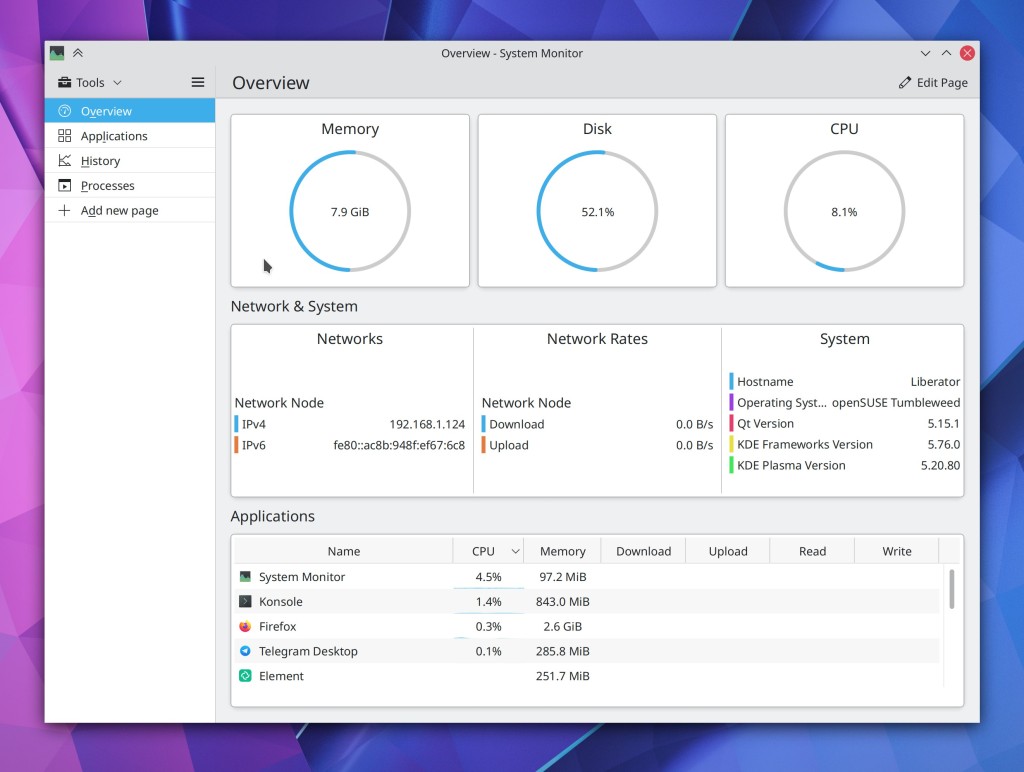
This app has been in development for almost two years and it’s really cool! We’re expecting it to eventually replace KSysGuard once it’s gotten some more use in the wild, but for now it is an independent release. Distros should be packaging it soon. Please install it and give it a try! Bug reports should be filed here.
But we kept plugging away on other stuff too…
New Features
Dolphin’s Places Panel now shows inline free space indicators for mounted disks in the Places Panel (Chris Holland, Dolphin 20.12):

Kate now supports the Zig language server (Matheus C. França, Kate 20.12)
Changing your user password now prompts you to change your KWallet password to match it so that if they previously matched, they don’t accidentally drift out of sync, which is baffling and rage-inducing when it happens (me: Nate Graham, Plasma 5.21):
Plasma Network manager’s OpenVPN module now supports multiple types of compression (Alfred Toth, Plasma 5.21)
Bugfixes & Performance Improvements
Dolphin’s git integration plugin no longer interferes with command-line-based git interactions (Sebastian Englbrecht, Dolphin 20.12)
Dolphin no longer sometimes consumes 100% of CPU resources while the Folders panel is open and showing folders that don’t have any sub-folders (Méven Car, Dolphin 20.12)
Konsole no longer sometimes crashes when re-arranging split views or closing split views (Carlos Alves, Konsole 20.12)
Back and Forward navigation in Okular after using internal links now works again (Kezi Olio, Okular 20.12)
When using Spectacle’s feature to return focus to the app when pressing the screenshot key while it’s already open, now doing so will un-minimize the app if it happens to be minimized (David Redondo, Spectacle 20.12)
When using Kate’s vi mode, the search field no longer disappears if focused again while it’s already open (Jan Paul Batrina, Kate 20.12)
The “switch user” action is once again visible in the Kickoff Application launcher for people using distros with an older systemd–for real this time! (David Edmundson, Plasma 5.20.3)
Switching users now actually works again after you invoke the action (Wolfgang Bauer, Plasma 5.20.3)
All the shutdown options are once again always visible for all people in the Kickoff application launcher (Michail Vourlakos, Plasma 5.20.3)
Fixed an obscure way that the Plasma Wayland session could crash (Lewis Lakerink, Plasma 5.20.3)
Opening the Network applet’s speed graph no longer erroneously causes the graph to show an implausibly high spike in data transfer that messes up the graph scale for all subsequent data (David Redondo, Plasma 5.20.3)
In the Plasma Wayland session, opening a laptop’s lid now immediately wakes it up, instead of this only happening after you press a key (Aleix Pol Gonzalez, Plasma 5.20.3)
The System Settings Window Rules page no longer automatically scrolls itself after creating a new rule and hovering the cursor over the list of rules when there are already a ton of rules in the list (Ismael Asensio, Plasma 5.20.3)
The “number of CPU cores” sensor now displays the right information (David Redondo, Plasma 5.21)
When using the Plasma Wayland session with multiple virtual desktops, the name of the virtual desktop is now correct in Task Manager tooltips (Lewis Lakerink, Plasma 5.20)
Plasma applet headers now use the correct colors when using with Breeze Dark Plasma theme (Dominic Hayes, Frameworks 5.76)
Fixed a common crash in System Settings when opening various QML-based pages (David Edmundson, Frameworks 5.76)
Notifications for file move or copy operations no longer include skipped files in the total number of files printed at the end (David Faure, Frameworks 5.76)
Thumbnails and previews throughout KDE software are now able to render 16-bit PSD files (Gary Wang, Frameworks 5.76)
User Interface Improvements
Inertial scrolling using the mouse now works when the cursor wraps around vertically after reaching the top or bottom of the window (David Hurka, Okular 1.11.3)
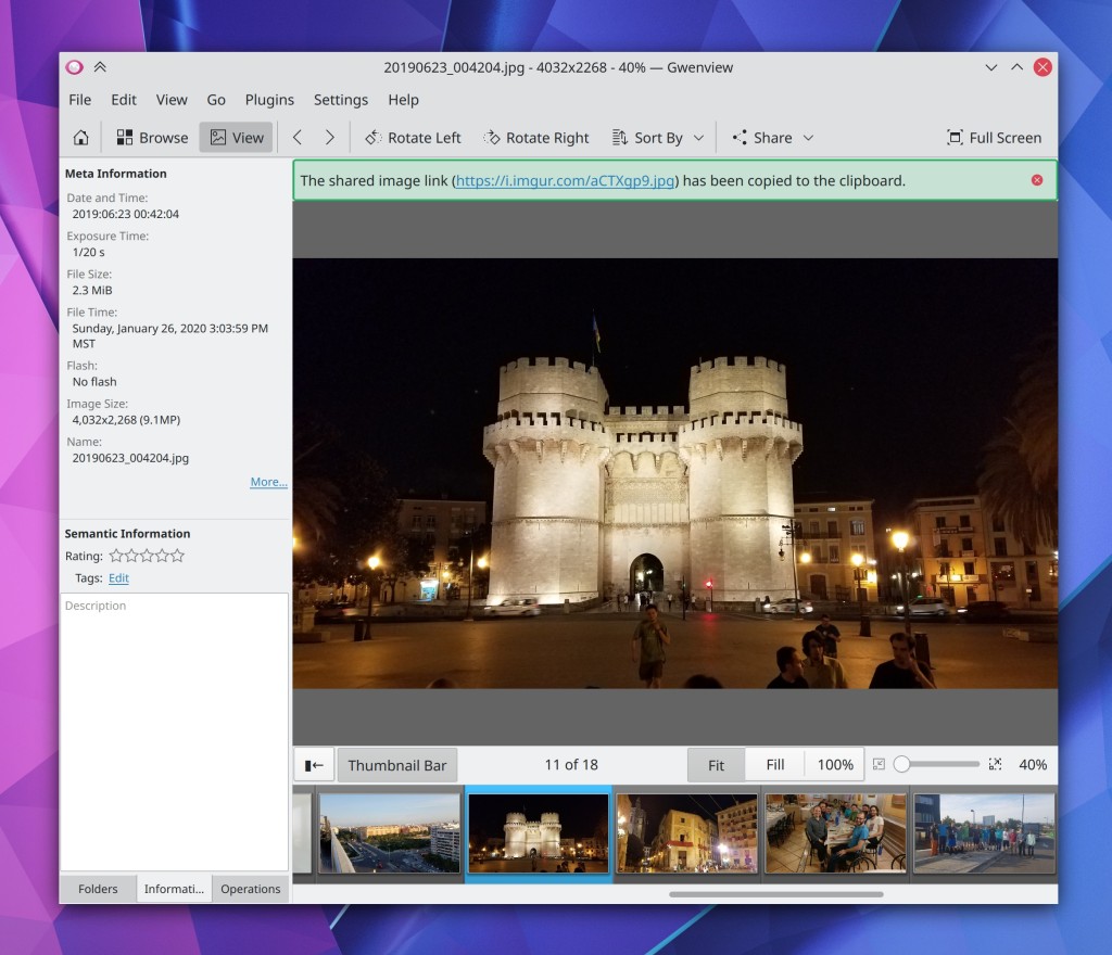
When you share an image to Imgur in Gwenview, there’s now a little notification in the UI that tells you it worked, shows the the link, and automatically copies it to the clipboard for you–just like in Spectacle (Nicolas Fella, Gwenview 20.12
The Samba server authentication dialog has been slimmed down and made more flexible so it can accommodate multiple different login types, with a handy help tooltip that helps you understand the various options (Harald Sitter, Dolphin 20.12):
Sheets in Kirigami-based software now close when you hit the Escape key (Ismael Asensio, Frameworks 5.76)
Draggable list items in Kirigami-based software now use the grabby hand cursor when the cursor is hovered over or dragging on the grab handle (Ismael Asensio, Frameworks 5.76)
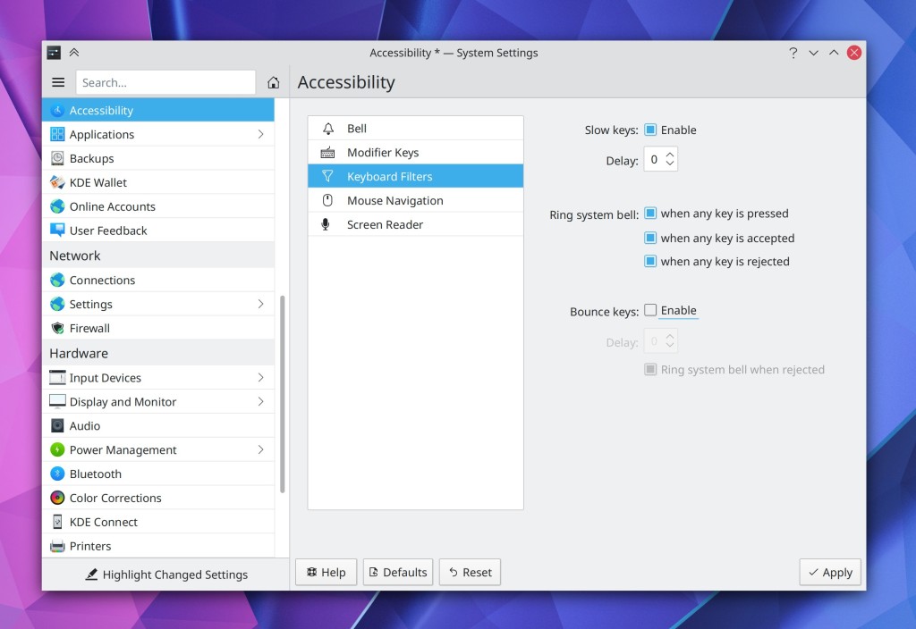
The System Setting Accessibility page has been rewritten in QML and given a fancy new user interface (Tomaz Canabrava, Plasma 5.21):
System Tray applets now all have a visible Configure button in their header, as well as a hamburger menu showing all additional actions. This makes all System Tray applets full functionality 100% usable on touch and without having to right-click anything (Marco Martin, Plasma 5.21):

Check it out: SSD headerbars in the Plasma System Tray lol!
Icons in the System Tray expanded view are no longer quite so close to the header (Niccolò Venerandi, Plasma 5.21)
System Settings’ Notifications page now supports the “Highlight Changed Settings” feature (Cyril Rossi, Plasma 5.21)
The little pop-up menu that appears when you hover over a Panel applet while in Edit Mode now looks prettier (Niccolò Venerandi, Plasma 5.21):

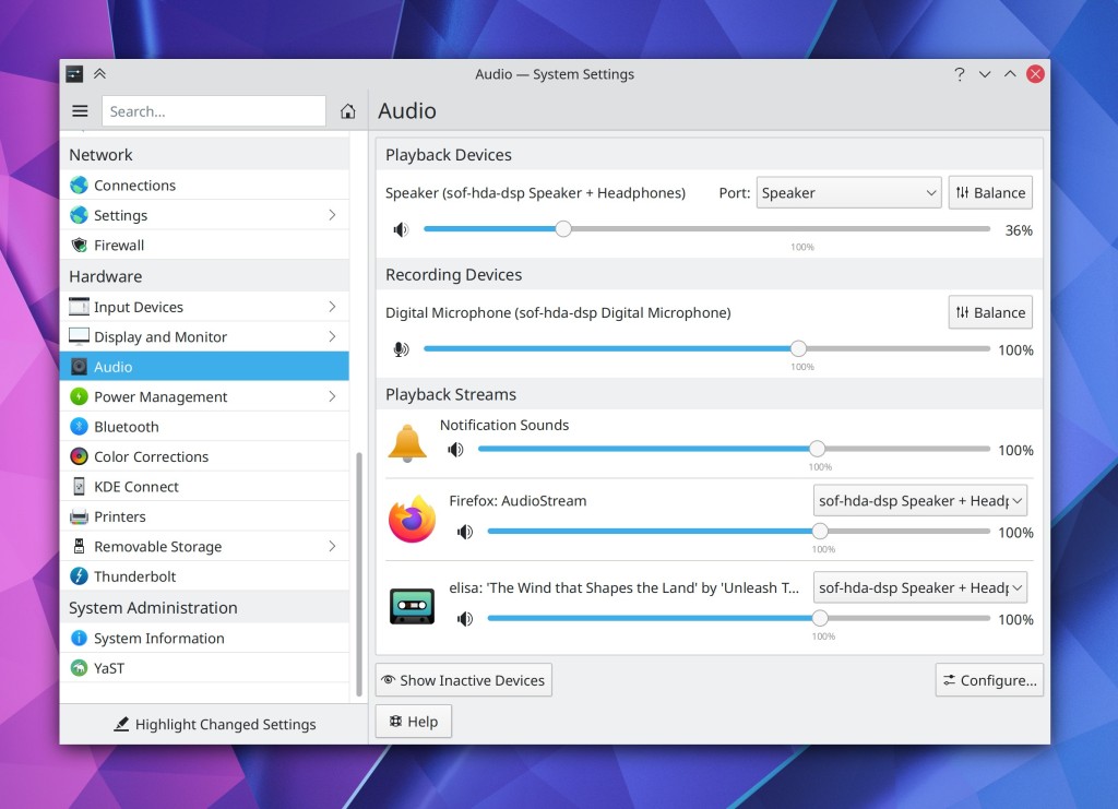
After last week’s mixed feedback about the new UI style for the System Settings Audio page, we made a few changes which should hopefully improve it a bit (with more to come): We now use standard style section headers, and the “Show Inactive Devices” button has now been moved to the footer area (Nicolas Fella, Plasma 5.21):
Changed the menu text for the “turn off do not disturb” feature to be a bit more clear (Thiago Sueto, Plasma 5.20):
Those of you who liked the old Alt+Tab switcher’s behavior of placing minimized windows at the end of the list can now get that old behavior behavior back by adding MoveMinimizedWindowsToEndOfTabBoxFocusChain=true to the [TabBox] group
of your ~/.config/kwinrc file. In the future we may add a GUI to control this, but the the moment it is a hidden feature that requires manually modifying the config file (me: Nate Graham, Plasma 5.21)
Icons in collapsed sidebars in various Kirigami-based apps (e.g. and the Emoji input panel and the new Plasma System Monitor) are now horizontally centered as expected (David Redondo, Frameworks 5.76)
How You Can Help
Have a look at https://community.kde.org/Get_Involved to discover ways to be part of a project that really matters. Each contributor makes a huge difference in KDE; you are not a number or a cog in a machine! You don’t have to already be a programmer, either. I wasn’t when I got started. Try it, you’ll like it! We don’t bite!
Finally, consider making a tax-deductible donation to the KDE e.V. foundation.

Not mentioned here but the Kirigami FormLayout was also improved on small windows: https://invent.kde.org/frameworks/kirigami/-/merge_requests/146 😀
LikeLike
This was much needed, thank you!
LikeLike
Yeah I didn’t mention that because it was primarily a mobile fix, and I typically leave the mobile stuff to the PlaMo-specific blog posts.
A very good improvement though!
LikeLike
Nate, please reconsider this. The problem is the plasma mobile blog goes silent for months due to the maintainer of it being very busy. I think you should have a small section on your weekly blogs talking about changes that affect plasma mobile as well, and then the plasma mobile blog could just do large posts whenever they get time for them which have a huge overview of all the changes over the past few months.
LikeLike
I would love to, and I might, but there are a few issues:
1. Time. Putting together this blog requires monitoring a ton of activity; doing it for PlaMo as well would require monitoring even more stuff. I’m just not sure I have the time to do so.
2. Stepping on other people’s toes. There is already a PlaMo blog. If it it not very regular, the solution is for more people get involved with it and help out, or for someone else to take it over. But if I were to usurp it, that would be quite rude.
LikeLike
Nate, when will we see onscreen virtual keyboard fixes/new features in Wayland? The onscreen virtual keyboard has been broken for me (won’t launch at all) in Wayland since the end of the 5.19 cycle (someone already submitteda bug awhile ago). The keyboard was very limited before it broke. This is literally the only thing keeping me from using a Plasma Wayland session on my tablet. Great job with Wayland support, BTW!
LikeLike
Off topic:
What is the plan with SDDM?
With the latest update my system broke. There is already bug reports and core developers are not responding.
Is the project abandoned?
LikeLike
SDDM is not a KDE project. Moving back to LightDM would make more sense, IMO. LightDM’s base is basically done and there’s plenty of greeter front-ends, including Qt-based ones.
LikeLike
Currently using Lightdm.
Working like a charm.
LikeLike
Since there was an update recently, clearly the project can’t be abandoned; those are two contradictory things. 🙂
I’m aware of two regressions in the latest 0.19 release:
https://github.com/sddm/sddm/issues/1313 which is an Arch packaging bug, as far as I can tell.
https://github.com/sddm/sddm/issues/1316 which is being debugged and has a potential patch in progress.
LikeLike
I have been following SDDM for quite some time now.
The git history says it actually a neglected project.
If it was part of KDE officially, I think it would receive more contributions.
LikeLike
That’s possible.
If you wanted SDDM to be an official KDE project, you would probably want to talk to the primary maintainer about that. It’s not like KDE devs can grab a project and turn it into a KDE project all on our own. 🙂
LikeLike
Reply from dev:
https://github.com/sddm/sddm/issues/1316#issuecomment-723815405
LikeLike
NEEDS A PICTURE! 😋
LikeLike
LMAO whoops. The picture has now been added. 🙂
LikeLike
I apologize if it’s the fault of my icon theme, but in the clipboard manager there are two “delete” buttons, one to delete all saved entries, and one that appears when we are filtering, the “problem” is that both have the same icon, I think it’d be more user friendly to differentiate them, specially considering that when both are visible they are close to each other, perhaps the delete entries icon could be turned into the trashcan icon? what are other people’s thoughts on this?
Overall, I’m liking the new system manager, but I hope there’s an option to change the hamburger menu with a proper menu bar, and hopefully circle indicators’ width will scale with size, cause they seem a bit too thin.
LikeLike
Yes, this is a problem of your icon theme. They are different with Breeze.
LikeLike
Currently using Lightdm. Working like a charm!
LikeLike
Which greeter do you use?
LikeLike
This one:
https://www.archlinux.org/packages/community/x86_64/ukui-greeter/
It is QT based. Looks good to me.
LikeLiked by 1 person
Those kirigami apps are begging for client side decorations 🙃
LikeLiked by 1 person
Mauikit offers CSD as a option (Mauikit extends Kirigami and adds it’s own theming). You can test it out with index file manager or something if you want and see if you like it.
LikeLike
Plasma System Monitor is an excellent improvement.
LikeLiked by 3 people
I’ve a long time problem on my optical drive. The slot is quickly closed after sent the command to open the tray. This happen once entering the desktop environment. What’s the cause? Has this issue been addressed so to be fixed?
LikeLike
Insert my typical “please file a bug report, this ia a blog, not a bug tracker” comment. 🙂
It’s not fixed yet. I would try to fix it if I had any machines with optical drives. Alas I do not.
LikeLike
The best :
“Back and Forward navigation in Okular after using internal links now works again (Kezi Olio, Okular 20.12)”
Thanks
LikeLike
Thanks Chris Holland, I’ve been waiting for this for a long time!
How about an arrow to expand and collapse the categories?
I know that all fields are the same size and are aligned with each other on the left, wouldn’t it be better to reduce the first field “Nate Graham” by 9px so that everyone is also aligned on the right?
I think the top margin could be at least 3x bigger than the current one, wouldn’t it be better?
Why is the delete user button so far away, to avoid accidental clicking? If the accidental click happens, wouldn’t it be necessary to confirm via password to complete the action?
LikeLiked by 2 people
Please report this on https://bugs.kde.org so they can be triaged and don’t get missed! 🙂
LikeLike
Why doesn’t KDE Plasma take the same approach as Xiaomi with its MIUI, and does it create a category in the system settings to report bugs, request improvements and new features?
Not all users know that this can be done through this link https://bugs.kde.org/, and many understand that through this link, they can report only bugs and not requests for improvements and new features, in addition to being necessary to create an account!
LikeLike
Isn’t it nice that our stuff is so good now that the only thing people have left to complain about is alignment? 🙂
The distance between the buttons is deliberate though. You generally don’t want to put a destructive button right next to a non-destructive button. The spacing reduces the possibility that people will accidentally click the “Delete User…” button when they’re trying to change their password. 🙂
LikeLike
If it weren’t for the remaining Wayland issues and missing features I’d wholly agree. But it will get there eventually… Assuming future updates don’t wildly regress things.
LikeLike
Wow!! These changes are fantastic!
LikeLike
The Plasma System Monitor app looks great too, something I’ve been hearing about for ages.
LikeLiked by 1 person
Can CPU clock speed shown in the new system monitor in the pie chart?
LikeLiked by 1 person
Yes! It’s entirely customizable, so you can make it show that if you want.
LikeLike
So exciting! And I love to see how the different apps will look on plasma 5.21 ❤
LikeLiked by 3 people
I tried KDE Neon Unstable as a live USB (currently 5.20.80), hoping to see those 5.21 changes brought to Breeze window theme, but it still has the 5.20 look. Am I way too early, or did I chose the wrong version?
LikeLike
You may need to manually switch the color scheme to something else and back to Breeze Light. Making that stuff work out of the box is still a work in progress (hence, “unstable” 🙂 )
LikeLiked by 1 person
Oh yes, thank you! That did it 🙂
LikeLike
It was nice to see Valencia.
LikeLike
It was such a beautiful city! And the climate reminded me a bit of home. 🙂
LikeLike
The Plasma System Monitor is a major UX regression. It wastes quite a lot of space on a side menu instead of the Ksysguard’s tabs. I don’t know why every app is switching to QTquick these days as if it is better than the QT widgets. Also its default window is to show a current state of some items out of which only half are stable and they are actually some sort of System Info. The default should always be showing historical data.
I am personally getting a bit concerned about the future of KDE as it is focusing too much on fixing some minor inconveniences for someone instead of looking at the bigger picture. I know that this is what is different from Gnome but, hey, we can certainly live with the knowledge that everything is configurable in ‘System Settings’ instead of adding shortcuts here and there.
LikeLiked by 1 person
Thanks for sharing your thoughts. Feel free to get involved in the development process and help guide the development more towards your preferred direction.
Personally I think our current direction is very strong and we are systematically working on addressing our historical weaknesses one at a time. Time doesn’t stand still, and neither can we.
LikeLiked by 1 person
I agree. I think you guys are doing a good job at striking the right balance. Obviously not everyone will agree, but that’s the nature of things in general.
LikeLiked by 1 person
When will KDE be able to work with network folders?
Now it is just torment, bullying, torture …
If a minimal error occurs during operation, then:
– You have to restart Dolphin to try to open the network folder (if you’re lucky). Connect via ssh and reboot the remote server and you will know all the pain of work.
– You have to reboot the OS if you are working with network files and a crash occurs. Because you can never save the file until the PC is rebooted.
– Network folders – cached. I don’t believe what I see. Because Dolphin always cheats on me.
KIO and Dolphin’s inability to function properly – this needs to be improved. This is the first thing the user uses.
LikeLiked by 1 person
I don’t have any of these problems. Please file bug reports–one per issue.
LikeLike
I have a proposition of renaming Dolphin to Explorer. There is a standard for shortcut (which is the default on KDE): Win+E which opens File Exploerer and KDE has a confusing name for File Explorer which starts with D. There should be a change and Dolphin should be renamed to Explorer as not to confuse users.
LikeLike
Oh yeah, and then we can rename Plasma to Windows! 😉
LikeLike
LMAO i love how direct you are to stupid comments 🙂
LikeLike
and to conform to well estabilished standards (ie. shortcut).
LikeLike
I use win+f to start Dolphin, unlike win+d is set to lower all the opened windows. By the way, why not a shortcut keys to lower all the windows in the taskbar?
LikeLike
I don’t see the issue. Win+E opens Eolphin? I would expect to keep standard shortcuts and rename the software. You didn’t have the issue copying Windows application switcher.
LikeLike
Your suggestion is useless.
LikeLike
Great idea about KWallet! It is indeed a rage-reducer!
I was watching your related video and your “What is KWallet?” link and hint made me think that, altough it was a well implemented way to inform user, not many would click that link and, then, would keep on not knowing what it is, not clicking fro changing its password and consequently up with their rage after the side effects.
So, trying to minimize the steps, how about performing the same checkings you do on KWallet (if it’s there and if passwords are matching – currently done after changing user password) but on loading Change Password popup, in a way that, if KWallet is there doing its thing, you show a “Change KWallet password” checkbox (and, I think, that “What is KWallet?” link and text under it) and, if passwords match, bring it checked? Being that, if user simply leaves it all as default and just goes for changing his passwords as less-reading as he can, we’d still save him/her from the rage.
LikeLike
Yes, I plan to do that later. It’s a much more difficult change.
LikeLike
Neat!
No matter the way, I’m glad *my* eventual rage (when I forget about the passwords) is addressed! Thanks for that! =)
LikeLiked by 1 person
Great improvements!
I would like to highlight some inconsistencies in the new audio settings screen:
1- Alignments.
2- Program name with lowercase letter.
3- Monochrome icon amid colorful icons.
LikeLike
In my opinion Plasma System Monitor seems isn’t good replacement for KSysGuard, which works well, at least for me. I cannot complain on it. Fist and most important thing is that it (new app.) works _only_ with Plasma Application Style and for example not with kvantum, just because QtQuick used mostly in this application doesn’t work well with kvantum or in opposite.
I think these 3 circles should show information, to be more clear, what percentages tell. Here user needs to wonder, think what means any colored line.
New audio configuration page in my opinion only provides mess. If someone has several devices will meet long view to scroll instead of logically split by tabs. And this button about “invalid devices”, which nobody knows what means. I complained on it more in proper thread in invent.kde.org. Unfortunately nobody answered me, nobody wanted to discuss. Author says “now has a fancy new layout that’s much simpler”, I think is more messed, because two categories are concatenated in one big scrollable view.
LikeLike
This is a bug in Kvantum. The author refuses to make it work well with QML apps because he hates QML. Go complain to him about it. 🙂
Doesn’t the header text above the chart tell you that? Still, this would be a trivially easy change.
That’s because you complained in the wrong place. The button (which is actually named “inactive devices”, not “invalid devices”) was already added months ago; you complained in a place where it was simply moves from one place to another. What do you think a better name for it would be?
True enough. We’re open to suggestions for further improvement.
LikeLike
Thanks for the great work, especially on Wayland, which is required when mixing 4K screens with other resolutions.
Unfortunately, I encounter bug https://bugs.kde.org/show_bug.cgi?id=399580 which makes it hard for me to use Wayland. This bug doesn’t seem to affect many people, though.
LikeLike
Can anyone send love for KMail on Wayland? It doesn’t work well at all, crashing frequently:
https://bugs.kde.org/show_bug.cgi?id=414955
https://bugs.kde.org/show_bug.cgi?id=413071
LikeLike
Is there a setting to turn off the new (20.12) file usage lines on devices in the places panel? It creates an accessibility issue for me. I need to not have a visually overwhelming interface. Those extra lines are adding clutter that create visual overwhelm. Now I have to turn off devices, but I use and need devices. All my mounts are there.
LikeLike