Plasma 5.20 is going to be one absolutely massive release! It already was but this week we added even more to it: more features, more fixes for longstanding bugs, more improvements to the user interface! Read on for details:
New Features
Plasma now warns you when your hard disk or SSD is about to die, and lets you monitor its health in the Info Center app (Harald Sitter, Plasma 5.20)
When using the Breeze GTK theme, GTK headerbar apps now use the same appearance for your window titlebar buttons as other apps (Mikhail Zolotukhin, Plasma 5.20)
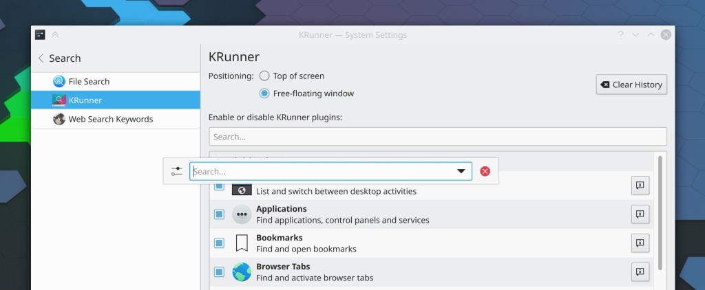
KRunner can now be configured to be a free-floating window, rather than glued to the top of the screen (Alexander Lohnau, Plasma 5.20)
It’s now possible to uninstall user-installed KWin scripts straight from the System Settings KWin Scripts page (Alexander Lohnau, Plasma 5.20)
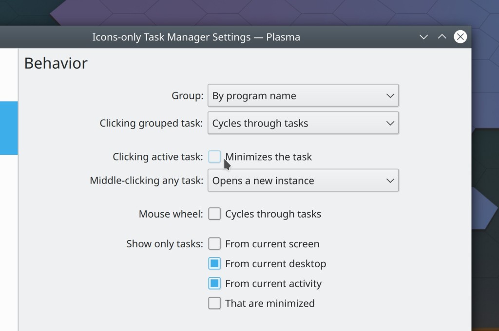
Those of you who became accustomed to the behavior of the macOS Dock can now optionally configure your Icons-Only task managers to not minimize the active task when clicked (me: Nate Graham, Plasma 5.20):
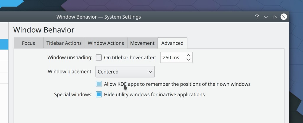
Those of you who were worried about the new “KDE apps remember their window positions” feature being disruptive can now disable it (me: Nate Graham, Plasma 5.20):
Bugfixes & Performance Improvements
Gwenview’s “Sort By” button now works properly and matches the behavior and appearance of Dolphin’s (me: Nate Graham, Gwenview 20.08.1)
Partition Manager no longer fails to create a single EXT4 partition on an unformatted SD card (Adriaan de Groot, KDE Partition Manager 4.2.0)
Ark now uses much less memory while extracting files (Alexey Ivanov, Ark 20.12.0)
Dolphin now detects your computer’s exported Samba shares no matter how you launch it (Harald Sitter, Dolphin 20.12.0)
Discover no longer incorrectly lists as installed things that you installed from a Get New [Thing] window in System Settings but then subsequently deleted in System Settings rather than the Get New [Thing] window (Alexander Lohnau, Plasma 5.20)
Global shortcuts to launch 3rd-party apps now work again (sorry this took so long) Méven Car, Frameworks 5.74)
Fixed a case where Discover could crash while performing updates that include Get New [Thing] content (Dan Leinir Turthra Jensen, Frameworks 5.74)
Fixed a case where Dolphin could crash while sharing files using Bluetooth (Nicolas Fella, Frameworks 5.74)
Add-ons installed using the Get New [thing] dialogs now install properly if they have slashes in their titles (Alexander Lohnau, Frameworks 5.74)
The highlight effect for hovered files and folders in the URL navigators throughout various KDE apps is no longer too wide (Ismael Asensio, Frameworks 5.74)
User Interface Improvements
When creating a Samba share, the dialog now automatically disables the option to turn on guest access if the system’s Samba configuration is set up to prohibit it, rather than letting you try anyway and failing silently, and also checks for the condition where your user isn’t in the correct group (Harald Sitter, Dolphin 20.12.0)
Spectacle no longer copies the file path of the newly-saved screenshot to the clipboard by default (Claudius Ellsel, Spectacle 20.12.0)
Elisa’s “Now Playing view” now has adequate internal side margins and wraps long song titles rather than eliding (me: Nate Graham, Elisa 20.12.0)
Arrows in table view headers now point the direction you expect: down when the biggest items are on top, and up when the biggest items are on the bottom (me: Nate Graham, Plasma 5.20)
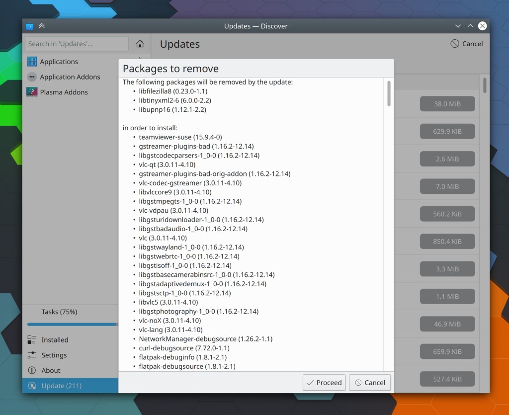
Discover’s “Addons” and “Packages to remove” sheets have received visual and usability overhauls (me: Nate Graham, Plasma 5.20)

The System Settings Shortcuts page now permits keyboard navigation (Carl Schwan, Plasma 5.20)
Kirigami Sheets now use more appropriate and visually pleasing colors for their headers and footers (me: Nate Graham, Frameworks 5.74)

KDE apps’ window sizes are now remembered on a per-screen-arrangement basis, just like their positions now are (me: Nate Graham, Frameworks 5.74)
Godot engine files now have nice icons (Michael Alexsander, Frameworks 5.74)
Keepassxc once again has pretty Breeze theme icons (me: nate Graham, Frameworks 5.74)
How You Can Help
Have a look at https://community.kde.org/Get_Involved to discover ways to be part of a project that really matters. Each contributor makes a huge difference in KDE; you are not a number or a cog in a machine! You don’t have to already be a programmer, either. I wasn’t when I got started. Try it, you’ll like it! We don’t bite!
Finally, consider making a tax-deductible donation to the KDE e.V. foundation.

Happy to see that my contribution of adding the Godot project icon made it here! Just one thing: It’s “Alexsander”, not “Aleksander”. 😛
Anyways, keep up the good work!
LikeLike
So sorry! 😦 Misspelling people’s names is the bane of my existence! Fixed.
LikeLike
“And when the sort criterion is “by name” or anything else not involving numbers or sizes or quantities, the arrows are meaningless no matter which way they’re pointing, so it doesn’t matter at all”
When sorted by name, I would very much expect the arrow to point downwards if sorted top to bottom A to Z. If not, I would shut down my computer and call the police.
LikeLiked by 2 people
+1
LikeLike
I agree with the commenter regarding the sorting criteria. When sorted by name, the arrow is pointing down when sorted from A to Z from top to bottom, and the arrow is pointing up when sorted from Z to A …
LikeLiked by 1 person
I initially praised the change to reverse the direction of the arrow, but multiple people made me see that an *arrow* should point in the direction in which the numbers increase. See the thread:
https://mstdn.io/@codewiz/104771185513972862
Nate, would it be possible to revert this change and instead add a stem to make the arrows look more like arrows?
LikeLike
Or else… we’re gonna shut down our computers and call the police! 🙂
LikeLike
Please see the comments on the merge request. At least for numbers everybody else seems to do it that way. I don’t know how they handle other things, though. That might be also interesting, maybe you get a chance to add that information, so one can compare it with KDE’s behavior.
LikeLike
Nice to hear that the sorting arrows are finally fixed.
That was pretty confusing.
But I hope that besides obvious cases like sizes, they work similar to how they Work in Windows, just not to have unexpected things for many of us who have came from Windows.
The only other thing that I would want to see about the headers or columns would be an option to show permissions, but in octal form, which I find easier to read compared to the existing one.
LikeLike
In Elisa there’s a size difference that makes my eyes bleed 🙂 https://images2.imgbox.com/25/2c/HJfFQYrf_o.png Sorry for re-using your screenshot, I’m not using linux atm.
LikeLike
The “Now Playing” title looks really HUGE and grasp too much attention. I think if font sizes for different sections would differ more subtle it would enhance the overall appearance of Plasma.
LikeLike
Not sure it makes sense to force those to be the same height, since they’re different things: the thing on the left is a list item, and the thing on the right is a view header. There’s no logical reason why these need to be the same height. If they were, they would also have to have the same font sizes or else one would have too much vertical padding or the other too little. And if we did that, then we would have two things that looked the same but were not the same, which is a mistake.
LikeLike
He might refer to the padding.margin.
LikeLike
Then I could live without the view header. I mean the “current window” is already explained right there on the left in the list items, and very clearly highlighted with a distinct blue background, I know that this is the Now Playing window. Instead I now get Now Playing and NOW PLAYING, twice. Or just make the list view hideable..?
LikeLike
Awesome stuff every week and it’s not even the tip of the iceberg of the undergoing evolution. 🙂 You guys are great!!!
@ the Discover overlays, they look great now, but they are centered horizontally but why not also vertically? Is there are reason they are glued to the bottom?
LikeLiked by 1 person
+1 for making it centered vertically.
LikeLiked by 1 person
As far as I’m aware, this is a Kirigami design decision. The overlay is centered vertically at a small height, but once it reaches a certain height (> 1/2 the window height I believe) it becomes glued to the bottom. We can look into changing it. 🙂
LikeLike
Here is an Idea: add a small icon to the read only drive( eg. Windows drive that did not had a clean shutdown). Or a small icon with a w if you can write into
LikeLike
Sure, we can do that.
LikeLiked by 1 person
Wow awesome stuff! Love all the attention GTK apps get, I still has KDE Plasma Desktop is one to use.
LikeLiked by 1 person
Many thanks!
LikeLike
You’re welcome!
LikeLike
Wow, I just love these Samba fixes and all the other little quality of life additions, like Plasma warning about failing disks, awesome!
Also, I listened to your entire recent interview and came away with a new appreciation for all that you do and bring to KDE. Very interesting that this is only 25% of what gets accomplished in a week.
Like others have said, I look forward to your blog post, and I have to thank you again for all the work you put into communicating this out to us, the community 🙂
LikeLiked by 1 person
❤ ❤
LikeLike
Nice to see the KDE version of gparted is being improved. So many parts of KDE are just plain ugly. Finally some others are changing this.
Since KDE is so flexible, can we please have UNDO, save configuration, load configuration, etc?
LikeLike
Thanks for the update, great to see so many improvements. But is it just me or is the folder sorting by size a previously unimplemented feature? I couldn’t find anything about it in the update… If it’s really coming it would be amazing!
Thanks
LikeLiked by 1 person
That’s already released in Dolphin 20.08. 🙂 You need to turn it on in Settings > View Modes > Details > Folder Size Displays > Size of contents
LikeLike
Wow, that is insanely cool, thanks!
KDE devs are awesome!
LikeLike
If you look at the screenshots of this blog post you see that krunner didn’t darken the other windows so it is very difficult to see on the screen compare to the other dialog windows.
LikeLike
Amazing and stunning work! Is there a chance Dolphin interface will be polished further? those spacings, padings (lack of…) and alignments are unpleasant.
LikeLike
Yes, it’s in the cards.
LikeLike
Hi, how or where can I ask for a new feature in energy management in plasma?
Thank you in advance,
Manel.
LikeLike
https://bugs.kde.org/enter_bug.cgi?product=Powerdevil
LikeLike
Thank you!
LikeLike