In addition to a ton of bugfixes for Plasma 5.19 which we just released, this week we started to land big improvements for Plasma 5.20. Take a look:
New Features
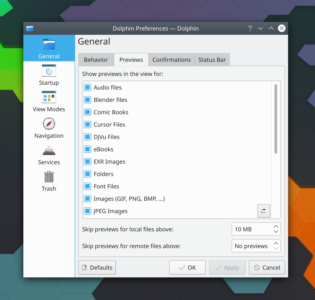
It’s now possible to independently configure the file size cut-off for displaying previews for local and remote files in Dolphin (Gastón Haro, Dolphin 20.08.0):
It’s now possible to tile a window to a corner by quickly invoking two edge tiling shortcuts within one second; for example by hitting Meta+Right arrow and Meta+up arrow one after another, the window will be tiled to the top-right corner (me: Nate Graham, Plasma 5.20):
You can now middle-click on the System Tray Notifications icon to enter and exit Do Not Disturb mode (Kai Uwe Broulik, Plasma 5.20)
Bugfixes & Performance Improvements
The drawing tools in Okular’s presentation mode toolbar are no longer blurry when using a high DPI screen (David Hurka, Okular 1.10.3)
Yakuake’s main window no longer appears under a top panel on Wayland (Tranter Madi, Yakuake 20.08.0)
Fixed a bug that could prevent Yakuake from opening when using a dual-monitor setup with a single vertical panel on a screen edge close to the center of the full desktop (Maximillian Schiller, Yakuake 20.08.0)
Kate’s “Open Recent” menu now displays documents opened in Kate from the command line and other sources as well, not just the ones opened using the file dialog (Christoph Cullmann, Kate 20.08.0)
Fixed a common crash in Qt applications when quitting (Vlad Zahorodnii, Plasma 5.19.0)
Disconnected Wi-Fi networks now display the correct security type (Jan Grulich, Plasma 5.19.1
The Bluetooth system tray applet’s tooltip no longer shows the name of the wrong device (me: Nate Graham, Plasma 5.19.1)
Fixed a bug causing high CPU usage when scrolling through the list of rules in the new Window Rules System Settings page (Ismael Asensio, Plasma 5.19.1)
Rows in the System Tray popup are now centered vertically in a correct manner (Eugene Popov, Plasma 5.19.1)
Right-clicking on pinned apps to run their app-specific options (e.g. to open a private browsing window in Firefox or Chrome) now works properly when the action includes command-line arguments (Alexander Lohnau, Plasma 5.19.1)
When you search for an application in the Kickoff Application Launcher and then right-click on the search result, the “Edit Application…” menu item now works (Alexander Lohnau, Plasma 5.19.1)
Various apps whose .desktop files specify the icon as a full path to an SVG file now display those icons correctly in the Kicker, Kickoff, and Application Dashboard launchers (Alexander Lohnau, Plasma 5.19.1)
The activities database now has backup and self-repair mechanisms, which should reduce (if not eliminate) the occurrences of favorites and recent items being corrupted or forgotten (Ivan Čukić, Plasma 5.20.0)
Recent documents accessed in private Activities are no longer visible in KRunner search results accessed from other Activities (Méven Car, Plasma 5.20.0)
Fixed an issue preventing the new header appearance from working properly when using the Breeze Dark plasma theme (Chris Holland, Frameworks 5.71)
Content can no longer overflow in the grid items in the new “Get New [thing]” windows (Dan Leinir Turthra Jensen, Frameworks 5.72)
When using a dark color scheme, the new “Get new [thing]” windows no longer display white squares in the center of each grid item before the preview image loads (Dan Leinir Turthra Jensen, Frameworks 5.72)
The Baloo file indexer no longer skips indexing the filenames of files with a blacklisted MIME type (i.e. those whose contents are not useful to index); it will now always index filenames, but only perform full content indexing for files whose content makes sense to index. This should make it better overall at finding files but use hardly any more resources in the process (Stefan Brüns, Frameworks 5.72)
User Interface Improvements
The default Plasma layout has been changed to replace the Task manager with an Icons-Only Task manager with some apps pinned to it by default, on a thickened panel. This should provide a more familiar and modern layout with greater touch-friendliness by default. Remember that you can always change back if you don’t like it 🙂 (me: Nate Graham, Plasma 5.20):

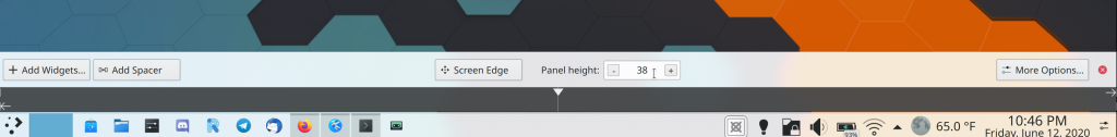
The panel’s thickness is now easier to adjust: you can use a spinbox to enter a numerical size or fine-tune the side with plus and minus buttons, and you can still drag on it to adjust the size in a very coarse way, as before (me: Nate Graham, Plasma 5.20):
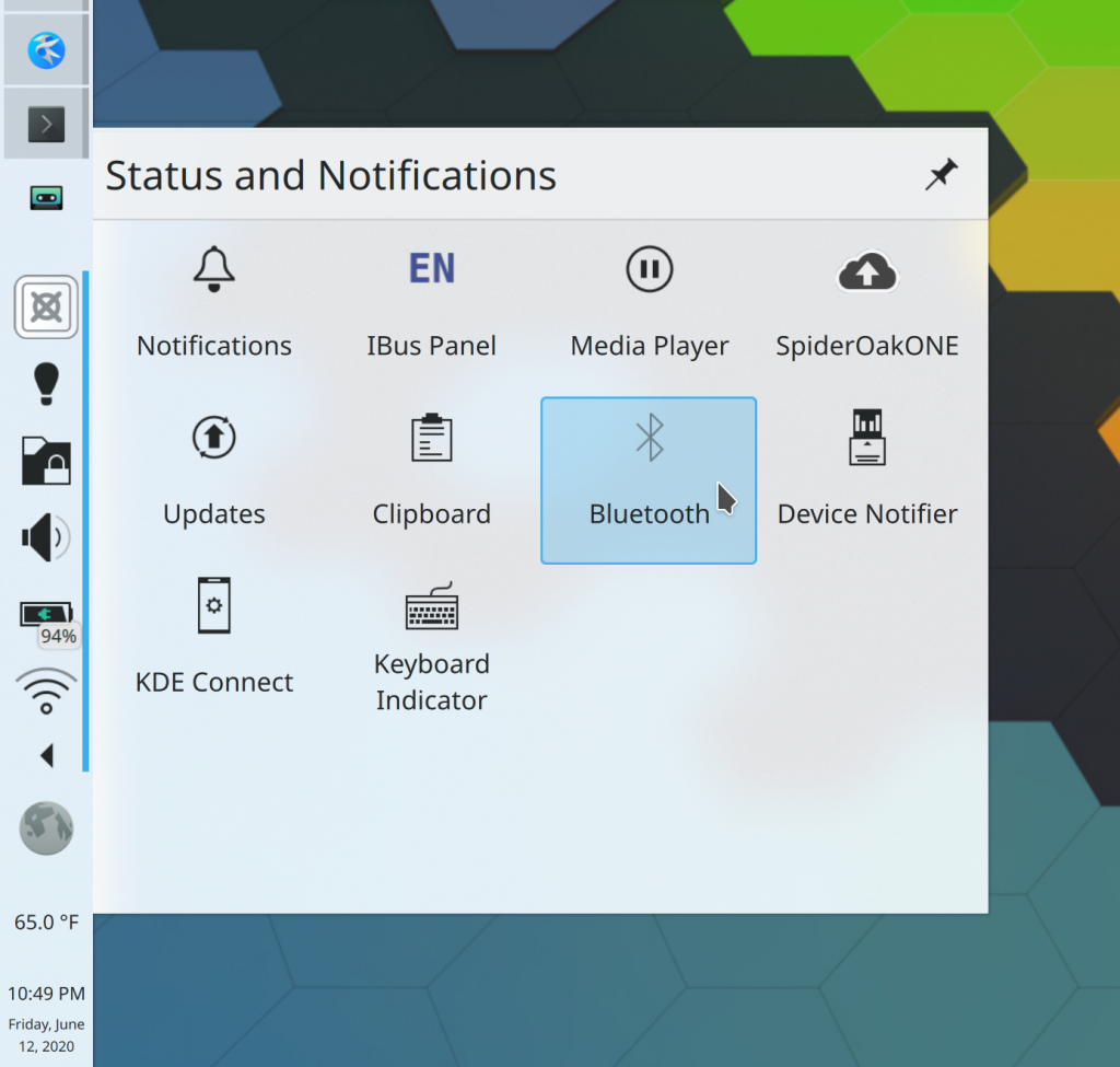
The System Tray’s expanded view of hidden items now uses a grid instead of a list, which makes it much more touch friendly and fixes a few bugs (me: Nate Graham, Plasma 5.20.0):
Task switchers now have shadows on Wayland, as expected (Vlad Zahorodnii, Frameworks 5.72)
How You Can Help
Have a look at https://community.kde.org/Get_Involved to discover ways to help be part of a project that really matters. Each contributor makes a huge difference in KDE; you are not a number or a cog in a machine! You don’t have to already be a programmer, either. I wasn’t when I got started. Try it, you’ll like it! We don’t bite!
Finally, consider making a tax-deductible donation to the KDE e.V. foundation.

Panel height are pixels? 😕
LikeLiked by 1 person
Awesome. 5.20 already looking sweet.
IOTM switch very welcome.
LikeLike
Scaled pixels, effectively. You’ll still see the same numbers when using a high DPI screen.
LikeLiked by 1 person
I very much like the System Tray’s new grid, even for non-touch screens. 🙂
LikeLiked by 1 person
Icon’s only task manager as default is a very good change, and saves me one step to do in a fresh install. I guess as a result of gathered info from users use?.
Thank you.
LikeLike
Yes it was commonly requested. We also discovered that most KDE developers themselves had switch to it on their own. Finally the fact that pretty much everyone else has switched to an IOTM by default made a difference too. It’s not always good to follow the common trend, but by the same token, you need a good reason for consciously rejecting it, too. We didn’t find a super convincing one.
LikeLiked by 1 person
Icon’s only task manager is the dumbest think ever. This is the first think I disable on any Windows desktop. And I hope I could still disable it on Plasma and you don’t remove that option in the future.
LikeLiked by 1 person
Icons only task manager is the shittiest thing evere. WTF?!!!!!!!!!!!!!!!!!!!!!!!!!!!
LikeLike
At KDE 3 times I used Linux until I switched to the Mac. Some time ago I bought a small AMD APU computer and installed Fedora.
In Gnome Boxes I installed OpenSuse tumbleweed to have a look at some KDE plasma. So I got the update to Plasma 5.19, too.
I like what I have seen so far of Plasma 5.19 pretty much. I think KDE Plasma is on a good way, also because of the excellent work of Nate.
I always found the whole design of the UI in KDE strange, inconsistent and without love. It’s still not perfect (see e.g. recent videos of BabyWogue) but so much better. A difference like day and night to the early versions of Plasma.
Also GTK applications don’t look so strange under Plasma anymore. The fact that GTK apps sometimes feel different (OK button e.g. in another place) than KDE applications is another problem that you have to live with in the Linux world.
And with 5.20 improvements are continuing. Some things that were listed in the blog post, for example, bothered me and are now being fixed.
The Global Menu, which I am not using at the moment, feels strange. But I think it will be improved in 5.20 (old blog post).
Thank you very much.
LikeLike
Glad you’re happy!
LikeLike
The preview sizes are nice, but I would like more to see previews for video files, something like what I have on Windows 7 with Icaros plugin (which is distributed as part of K-lite codec pack):
https://www.videohelp.com/software/Icaros
Seeing thumbnails for videos or even posters (cover arts) for movies is great to quickly identify a movie.
Being able to display the posters for movies is a great usability improvement because that movie could be easily identified even by the ones who cannot read, like children or the ones that could read but not understand that language of the file name.
Hopefully someone can look into implementing natively this feature to into Dolphin to bring the usability on par with Windows 7.
I’m not sure if I like the changing of the default to icons only. I don’t have touch screen and I don’t think I will ever have one since I don’t like to touch and make dirty my screen or to stress my hands compared to the keyboard and mouse.
Also I like to read the file manager location or browser website title.
I think it’s also more intuitive for new people and makes less sense now to be changed now when we have wider and wider screens.
Anyway, good that it can be changed back to the previous layout.
I’m not sure if I like The System Tray’s expanded view of hidden items in a grid instead of a vertical list.
I always find grids or multi-column layouts confusing like everything put together without any logic and knowing where to start from.
Also I thing it’s worse for usability for people with some kind of visual impairment like Tunnel-vision which restricts the field of view and a vertical list is easier to follow instead of “scanning” up and down, left and right, until the searched item is found.
I wish this would be configurable too so people who don’t have touch screen or don’t like the whole Windows 8 idea of touchscreen interface, could revert to the previous version and be happy.
O at least, make them reorder-able like on Android, so people can put them in another order to find them faster.
For the normal SysTray, I wish there was a visual separator somwhere, maybe even just a pipe (|), to separate the system icons from the ones opened by programs (music players, Steam, Lutris, etc. icons).
LikeLiked by 2 people
Movie Covers in Dolphin are possible since several years…
https://store.kde.org/p/1081129/
And before “MovieThumbs” there was another app, which was even better. It was using Nepomuk (the ancestor of Baloo) to save the meta data (genre, actors, …) for every movie, which it could retrieve from imdb. I don’t remember how it was called, but it was very cool to be able to find similar movies (same genre, actor, …) with just 1 click at the tags in the info sidebar in Dolphin.
LikeLiked by 1 person
Nice but it requires an active internet connection, while Icaros doesn’t because it extracts the poster from the .mkv file itself (if available, of course).
This is good for privacy.
For all the bells and whistles, poster, backdrop, year, genre we can use Kodi or other media centers.
I just want something simple that works offline and by default in Dolphing without the requirement do download a plugin.
LikeLike
Who the fxxk uses plasma on mobile?
optimising for touch screens by default is just idiotic.
kde is going down the drain, following the same counterproductive trends as gnome shell.
Meanwhile, wayland is a disaster on kde.
I guess sway/i3 is the way to go for now.
LikeLike
Please don’t be rude. You’ll get nothing this way.
I actually agree with part of your opinion, but this is no way to express it.
LikeLike
After years of polite critiques I have come to the conclusion that only rude wording may eventually trigger an answer. But anyhow, as Aah said: KDE is going down the drain.
LikeLike
Plasma Mobile is a major KDE project, so we’re quite hopeful that eventually someone will.
In addition, convertible laptops exist and are quite popular, so it makes sense to enable users of this hardware to use it efficiently in tablet mode.
LikeLiked by 2 people
I’m extremely happy you guys are pushing mobile. I’d love to use real desktop KDE on a tablet. Hell I’d install Debain + KDE on a freaking watch if I could :). As you mentioned I’m one of those with a new xps 13 laptop that sports a touch screen and would be very excited to see more of the kde apps like dolphin or konsole support touch scrolling. I’m very happy for the switch to icon only task manager, it was basically the first thing I’d do on a new install since like KDE4.
I personally love the direction kde is going. It can be a bit buggy on wayland at least, but it’s a beautiful desktop that offers me so much customization. It’s the only desktop that I feel I can get it to look exactly the way I want it to.
For everyone complaining about the taskbar switch, just do what I’ve been doing up until now: unlock widgets, right click the task bar, show alternatives, and switch it to your preference. They are changing the default, not removing the alternatives. I swear, it’s like people look for reasons to complain.
One thing I really, REALLY wish we could get in KDE is a change in how the virtual desktops work. I wish they could be built to work like they do in awesome wm such that when you have multiple monitors you can have the virtual desktops not linked to each other, for instance in awesome you can have monitor 1 on desktop 2 and monitor 2 on desktop 4, in KDE all monitors must be on the same desktop.
LikeLike
I think a lot of people would like that, yeah!
Glad you’re enjoying our software! Indeed, we’re developing with touch in mind and various old apps are periodically patched to add touch scrolling and the like. There’s an old patch for Dolphin that will make it in one of these days.
LikeLike
I use my Dell XPS 13 with KDE and like being able to just touch the screen to get stuff done from time to time… not my first instinct but I definitely do “touch” KDE from time to time. As someone who loves the Destkop metaphor and KDE this feels like nothing short of a great set of changes – thank you!
As a side note my employer is looking to switch default desktop from Cinnamon due to Wayland support (or lack thereof) and I’ve passionately made the case for KDE. We just need to get to a new enough version of Qt on our Debian-derived dist for Nvidia support and I think all will be good! Thank you!
LikeLiked by 1 person
>> The default Plasma layout has been changed to replace the Task manager with an Icons-Only Task manager with some apps pinned to it by default, on a thickened panel. This should provide a more familiar and modern layout with greater touch-friendliness by default. Remember that you can always change back if you don’t like it
YIKES. I’m probably a weirdo, but I doubt that icons-only task manager provides better usability for non-techy people than the regular one. And techy people can always change to this one, not the other way around…
I hate to be negative, because there’s a lot of great work being done by you all here, but one more to the pile of changes to follow fads… symbolic icons, icon-only panels, everything flattened, touch optimizations everywhere (building for a hypothetical future). I’ll shut up now, and go take care of my lawn…
But to end on a more positive note, I’ll thank all of the developers for the many many bugfixes, which are very welcome =)
LikeLike
Non-techy people have been using icons-only task managers in macOS for 20 years and in Windows for 10. If there was a major usability issue I think we would all know about it. 🙂
LikeLiked by 1 person
Yes, and that’s why when I set up Kubuntu on a new person’s laptop, I always switch out the task managers to icons-only. It’s what people have been trained with. I’ve found that it’s the exception rather than the rule who prefers the “icon + title” type of task manager.
LikeLike
Plasma 5.20 is taking such a nice form week after week.
The recent and near future revamps of some of the widgets, layouts (hidden icons at the taskbar, etc), look promising in my humble opinion.
The advance on Plasma 5.20 is evident and it’s showing clear symptoms that’s going to make it a really nice one, (again, yes), with a few really important things to be aware of.
I have to fix the 2 widgets I had working (showing information) before the Plasma 5.19 update, maybe it’s precisely because they’ve been changed, but they’re there now (with the now working under Wayland Global Menu, yay!!!!), showing no information, I’m talking about “Network speed” & “Memory Usage”, which they are 2 pretty useful/handy widgets in my personal preference, I’ll have a look on what’s going on there ASAP.
What can I add more to the message I add every week here?
Thank you very much for your continuous work, improving the existent software, adding some new features, polishing bugs, etc, you really rock a lot KDE Community and a special thanks, as always, to you Nate, the one who brings us the weekly updates about what’s been happening every week under the hooks, in a really transparent, clear and easy to understand way, so that’s it, a HUGE THANK YOU :).
I really hope you’re everyone fine, healthy, you and your beloved ones, families, friends, closest people, in these hard times.
I send you a huge, sincere, fresh & virtual hug to everyone ^^.
LikeLiked by 1 person
I’m not a fan of the super flat system tray expanded menu.
I think it’s missing the clear clickable (or touchable) area we can see at a glance.
For example a similar menu in windows 10: https://i.imgur.com/S7RSRny.png
I don’t have to guess where to click. I think with a thightly spaced list like it was before this isn’t a big issue.
LikeLike
I actually like the new menu, but I agree it should have some hint that the icons are buttons.
LikeLike
Please stop making windoze of my plasma! >:-[
it’s totally out of concept! ms copied icon only tm from mac but on mac they don’t have start menu.
What will you do with all those empty place? Put a search plasmoid next to kicker?
LikeLike
I love all this changes. Plasma has become awesome and i appreciate a lot the work you do.
The tiling for windows is something i always thought plasma lacked, i used meta+numpad to tile windows to borders, but is just not as convenient as the solution you implemented and i can only use it in keyboards with numpads.
Thank you so much!
LikeLike
Very good work addressing all of these papercuts! I was surprised by the System Tray’s expanded view of hidden items now using a grid instead of a list. But the more I look at it, the more I like it. Having the item icon larger and more dominant makes it faster and easier to process in my brain. I can recognize an icon faster than I can read a string. Also why I prefer setting up Icons-Only taskbar on new users’ KDE systems.
LikeLike
The grid view of system tray is a huge step for me. Current list view approach left many unused space. But how the behavior when I click one of the icon? Current system tray give me in window setting which is smart than opening another window.
Switching to Icon Only Task Manager is a good decision that means less customization step from fresh install for me and may be thousand of users there.
Keep up the good work.
I am just keep waiting this bug will got resolved
https://bugs.kde.org/show_bug.cgi?id=414157
LikeLike
You know, not too long ago I couldn’t wait for Plasma 5.18 which was supposed to be the best thing since sliced bread.. Now 5.20 has me all pumped up again, and it’s really making 5.18 look like mouldy, month-old bread. Sure 5.18 is advertised as “stable”, but let’s be real here: it’s lacking so many things that are NOW obvious, to the point I’d like to call it stable-beta. Very far from a “finished” product. Not really sure about the “stable” either.. Maybe KDE should rethink the whole LTS thing, since the development is so swift.. I mean, a system with 5.18 now feels like driving around in grandmas Prius.
LikeLike
Wow!
“Look at your windows and desktops from above. I think the opening animation resembles a parachute opening too.
This KWin script was inspired by the excellent work of several projects like: KWin (Present Windows and Desktop Grid effects), kwinOverview, qOverview, Gnome, Deepin.
The most promising feature isn’t implemented yet. I think that the possibility of working with Plasma activities in a faster and more natural way can be game changing in their daily use. In the future, this script may allow you to insert/delete activities, move windows between them, etc. For now, it works with virtual desktops and just ignores activities because I think some changes in KWin’s source code may be needed for the support.”
> https://github.com/tcorreabr/Parachute
> https://www.youtube.com/watch?v=CCOPpclzR6Q
LikeLike
Hi Nate,
AMAZING work, as usual! Really excited about the new features and all of the polishing work.
There is one planned feature I cannot find any info about (sorry if I’ve missed it somewhere):
1. Window tabbing. For a while it was listed as a missing feature in Plasma 5 from Plasma 4 but I can’t find anything about it any more. Is there still a plan to bring it back or is it now dead?
LikeLike
A KDE contributor I know is working on it. 🙂
LikeLike
I understood just now what you meant with icon only task manager. Did not know this has not been the default already, since my distro has shipped with it by default.
I really like it (also the increase in panel height) probably most from a visual standpoint but there is probably also a UX improvement. Having the icons increased makes them better distinguishable and clickable (especially on touch devices). This also leads to more space for parallel open applications in the panel and switching them with the mouse might be better because the distance between them is much shorter (I use Alt + Tab anyway).
Are there considerations to make it dark by default? I know – even more like Windows, but I think I prefer that visually.
LikeLike
This: https://phabricator.kde.org/D27845 is a complete idicracy. KDE is NOT WINDOWS or APPLE. I do want to distinguish which application is running and which one is a quick launch shortcut to the app and I do want to switch betweeen open apps/widnows with one click. This is bullshit. Please stop doing this usability regressions for the mere sake of change and more headlines on dubious websites. You already doing with with the kickoff replacement with some bull… Windows 95/lxde style menu. With kickoff we had favoritues and all functionality at the bottome with non-color icons. Now when you erase it with windows95/lxde style menu all themes will have missing icons when you further reclick kickoff (kde.store new themes will only have icons for windows95/lxde menu! since its default).
Stop doing changes befause of the sake of changes and fix all the bullshit regression starting from 5.18.6 onwards.
LikeLike
I welcome constructive criticism but please keep it civil.
If you don’t like the Icons-Only Task Manager, you can switch to the previous version with three clicks (right-click on empty area ofIcons-Only Task Manager > Alternatives > Task Manager)
LikeLike
The yakuake dual monitor bug that you mention affects my setup in opensuse leap 15.2. As it won’t update to 15.20 is there a way I can get that fix in 15.18 or am I out of luck?
LikeLike
You can always ask the openSUSE packagers to backport the fix.
LikeLike
Well thanks for the content
LikeLike
Still waiting for the ability to return the system tray to list view. The grid view display is unnecessarily large and finding the thing I’m looking for is far easier scanning a simple vertical list than searching in a grid with multiple rows and columns. Very disappointed with the current state of affairs.
LikeLike