This is going to be a double-header: today we’re discussing Discover as well as Kirigami–KDE’s UI framework that facilitates writing convergent apps that look and feel good on both the desktop and a mobile device.
…At least that’s the idea. The truth is, KDE users have voiced a lot of criticism for how well this works out in practice. An especially common complaint is that the desktop user experience gets short shrift, and Kirigami apps feel like big phone apps.
We’ve heard this feedback, and we’re acting on it. Over the past week, we’ve been hard at work to make Kirigami UI components behave more appropriately on the desktop, and have Discover make use of them instead of its custom components.
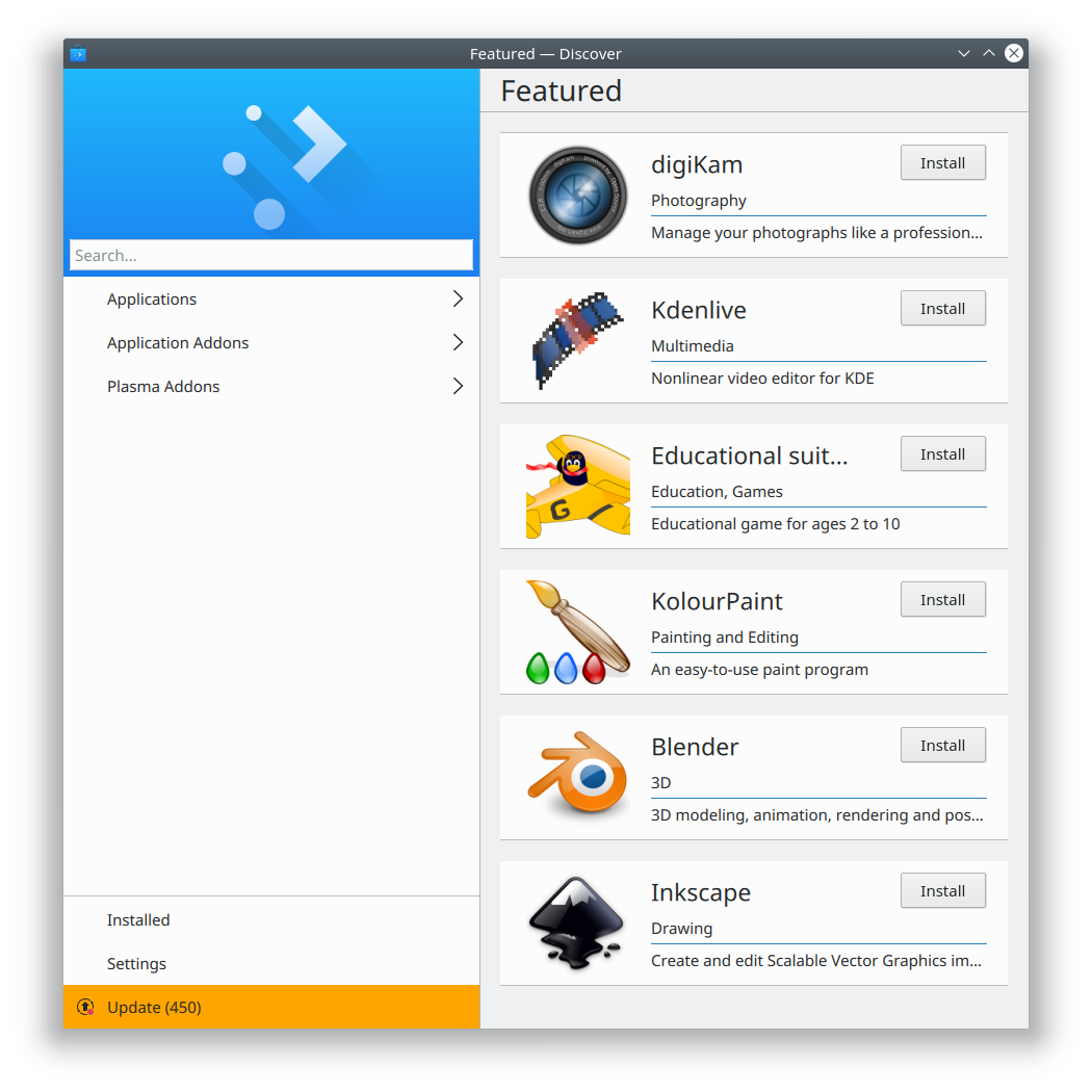
So I have exciting news for everyone who has complained about Discover’s design being too mobile-ey and wasting too much space: that’s going to be a thing of the past. Here’s how the Featured page now looks in git master:

No more huge header with the picture of the coffee cup that nobody liked! This is not the final appearance; there’s still polish work to be done, and we are heavily iterating over Kirigami to improve it to make the Desktop UI a first-class citizen. But it’s a model for what we’re going for.
We also added some other much-requested user-centric features to Discover, such as making reviews more prominent. Have a look!
- Discover now shows the top three reviews right on the app page (KDE bug 380514, implemented in KDE Plasma 5.13):

- Discover’s review submission pop-up is now more user-friendly and makes it impossible to accidentally submit a one-star review (KDE bug 390426 and Phabricator revision D10500, improved in Plasma 5.13):
 Note the presence of a close button! Another much-requested feature for Kirigami pop-ups.
 - You can now use Discover to write an app’s first review (KDE bug 390339 and KDE Phabricator revision D10476, fixed in KDE Plasma 5.12.1):

- Kirigami scrollable pop-ups (used for Discover’s review page) no longer let you scroll beyond the content in desktop mode (KDE bug 388942, fixed in KDE Frameworks 5.44)
- Kirigami non-scrolling pop-ups (used for Discover’s review input pop-up) now have correct bottom padding (KDE bug 390032, fixed in KDE Frameworks 5.44)
- Kirigami toolbar headers are bit taller their titles and navigation buttons have appropriate padding (KDE Phabricator revisions D10483 and D10524, fixed in KDE Frameworks 5.44)
- Kirigami pop-ups (used for Discover’s screenshots and reviews pop-ups) now have close buttons (KDE bug 387815, Fixed in KDE Frameworks 5.44)
- Discover’s “show more reviews” button now always shows the correct number of reviews, has slightly better text, and no longer lets you write the first review for apps that you haven’t installed yet (KDE Phabricator revisions D10527 and D10525, Fixed in KDE Plasma 5.13)
- Items in app lists now have better top padding, so they don’t touch the header (KDE Phabricator revision D10548)
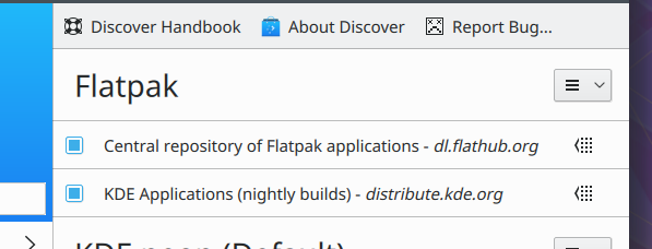
- Improved the metadata for the KDE Nightly Builds Flatpak repo so it has a more appropriate name, in preparation for encouraging our users to try it out (more on that soon…):

Well there you have it. We never stop working on improving Discover, and we really do listen to user feedback. Mark my words, Discover is going to become one of the most-loved Linux software centers, you heard it here first! Help is always appreciated, so feel free to start contributing and making a difference to a project that truly matters. You don’t have to be a programmer to have an impact!
And if you look at my efforts and like what you see, consider donating on Patreon to help me do it full-time, rather than squeezing it in before and after my regular job. With your support, I could bring forth even more for KDE!
I actually liked the coffee cup!
I am more interested in discover not crash when updating.
Also, In Kubuntu all the icons are pixillated.
Thanks!
LikeLike
That’s a packaging issue in Ubuntu, I’m afraid. Ubuntu doesn’t provide us with high-resolution icons. It’s a big pain in the butt, and I’m working with the Ubuntu packagers to see what we can do about it.
LikeLike
That’s great ! 🙂
Just one point : when submitting a review and the monde is on stars, the stars should be highlighted grouped (for exemple 4 stars) and not the fourth star.
LikeLike
“Mouse” and not “monde” sorry
LikeLike
Yep, that was pointed out during the review, but I couldn’t figure it out in time for this post (and I really wanted to include it). I’m working on fixing that.
LikeLike
Just pledged on Patreon. Don’t want to see you burn-out 🙂
LikeLike
Thanks so much!
LikeLike
Just started to try some flatpak apps in my work laptop and my home computer and feeling great viewing how you can fill a bug in some app and in a few days, it’s solved and you can have it without months of waitings.
But, what about make a flatpak version of Discover? In my work laptop with KDE Neon I have a much newer version than in my kubuntu 16.04.3 home pc (this one a little buggy).
I would be awesome if users can watch the advancements of Discover and flatpak integration using a flatpak version of the app.
LikeLike
Discover itself is, like all other KDE apps, available in Flatpak form from the KDE Applications nightly builds repo: https://community.kde.org/Guidelines_and_HOWTOs/Flatpak
I’m going to blog about that soon.
Once Discover is a bit more polished, we’ll consider submitting it to Flathub.
LikeLike
There are rather nice mockups of discover done by kde vdg. Why weren’t those used?
LikeLike
Can you point me to them? Are you talking about Andres Betts’ recent work?
LikeLike
sure:
https://community.kde.org/KDE_Visual_Design_Group/Muon_Discover#Layout_Design
except that gray gradient, everything looks great.
LikeLike
I believe that was the old interface, back when Muon existed, and before Discover was rewritten to showcase Kirigami. I quite like it, too. Much better than what we currently have. Thankfully, a lot of those design elements could be easily added to Discover’s current design. For example, the app tiles could look like that they do in those mockups.
LikeLike
any chance to convert it to layout used in the mockup? drop the drawer (and those slow animations)?
LikeLike
There’s always a chance. The lead developer has indicated that he’s not up for a total visual redesign right now, but we are moving incrementally in that direction.
LikeLike
Nate ! I’ve just pledged on Patreon. I’ve been following your excellent work on ‘usability and productivity’ and ‘discover’. Have a good time. Bye.
LikeLike
Thank you so much! I’m just blown away by the level of support. You guys are amazing!
LikeLike
“KDE bug 388942, fixed in KDE Applications 5.44”
‘Frameworks’, right?
LikeLike
Oops, thanks for catching that! Fixed now.
LikeLike