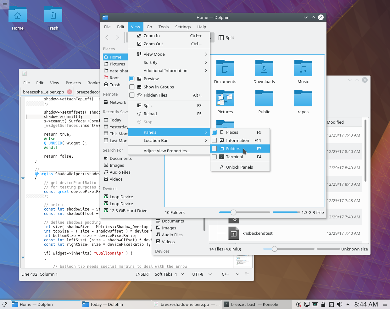
KDE’s Visual Design Group recently put some thought into shadows in Breeze. Right now, the default shadows are rather small, and can be almost entirely invisible on the left edge:

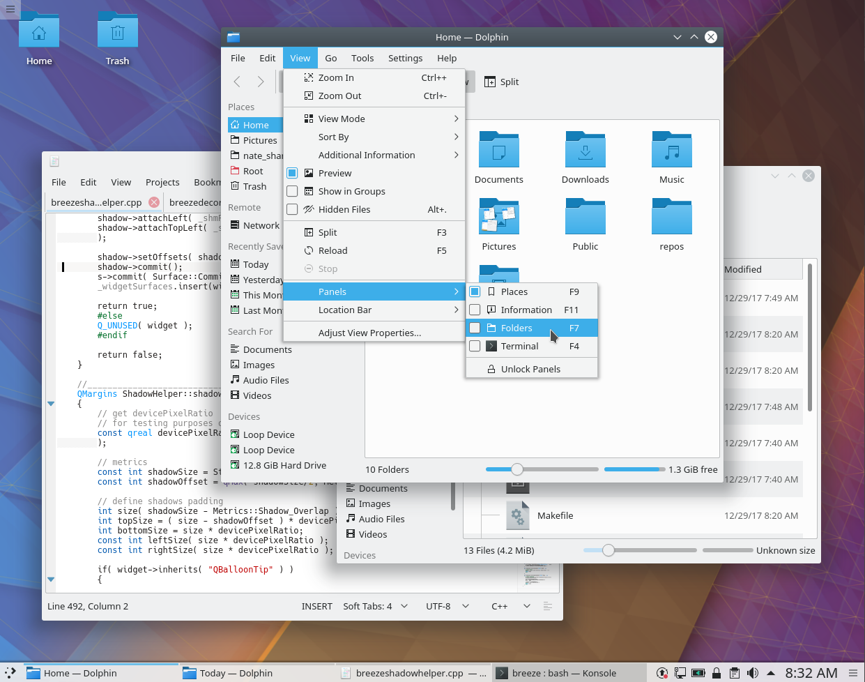
We decided to make them larger and deeper by default, and center them horizontally so that there’s a shadow on the left edges of windows and menus as well. I was honored to produce the patch, and I’m happy to report that it’s been accepted and merged! Starting in Plasma 5.12, here’s how shadows will look:

These are just default settings of course; if you don’t like big shadows, you can tweak to your heart’s content (System Settings > Application Style > Window Decorations > [click on the little menu button in the corner of the Breeze entry] > Shadows). But this new default setting provides a much greater sense of depth that I think most users will find quite welcome.
Didn’t we have those fat shadows a while back? I liked when they were changed for something more lightweight.
Did you measure how much performance / energy they cost?
LikeLike
If so, I wasn’t around back then. If you don’t like the new default, you can always change the setting. Performance measurement wasn’t a part of this initiative since it’s a very small change, but I have a hard time imagining that increasing the size of the shadows results in any negative impacts that are remotely measurable.
LikeLiked by 1 person
I think it was KDE 4 with the oxygen theme, which was heavier due to the gradient. I love breeze, because it’s so lightweight. Imo the shadow doesn’t fit the lightness.
I’d definitely say it impacts performance as the drawing area of every window is increased by some 50px. Every small bit adds. It doesn’t matter on desktops, but it does on laptops imo.
Anyways, decision is done, so hah, I’m just wasting our time ^^
Cheers
LikeLike
It would be interesting if Plasma has material design ripple effect on clicks.
https://material.io/guidelines/motion/material-motion.html#
LikeLike
What if shadows rather are larger for all windows, you just do it for active windows and small for inactive windows ?
LikeLike
That’s a great idea, too. I might have a go at that.
LikeLiked by 1 person
Excited to see the final render 🙂
LikeLike
Fantastic Nate! Thanks for working on the patch and submitting to help improve the default experience!!
LikeLike
Many thanks to all involved in this decision! I pretty much like the breeze theme but the thin to even not available shadows on the left side made it hard to distinguish window borders. That’s why I had to heavy tweak the shadow settings but it was more a workaround – the shadows were still unbalanced. Now there will be much better shadows on the left side, yeah! 🙂
LikeLike
This looks so much better! Nothing compared to the (IMHO ugly) blueish halo around windows from the old days
LikeLike
Tweaking shadows is one the first things I do when I do a fresh install of Plasma. I also do it whenever I switch from light to dark color schemes (or vice versa). With breeze dark, I’ve got a 50px size, 50% strength, and black color, which looks quite good. Otherwise I use a 35% strength with breeze.
LikeLike
What about having the ability to blur kwin’s induced transparency? It would be so mac-ish ❤
LikeLike
A big THANK YOU for doing this! I really like that the Breeze theme will create more of a sense of depth on the desktop. Before, the windows seemed to be on the same plane, with the too-small-to-be-noticeable shadows. I think this is great, keep going!
LikeLike
Do the updated shadows scale automatically with HiDPI screens? Currently Breeze specifies shadow size in absolute pixels so I have to manually adjust the shadow size for a HiDPI screen or the shadows are far too small.
LikeLike
They should scale now.
LikeLike
Why there is no shadow on context menus?
Would be great to have.
LikeLike
Context menus do have shadows–or at least they’re supposed to! If you’re not seeing them, it’s a misconfiguration, a theme issue, or a bug.
LikeLike